Exhibition Research
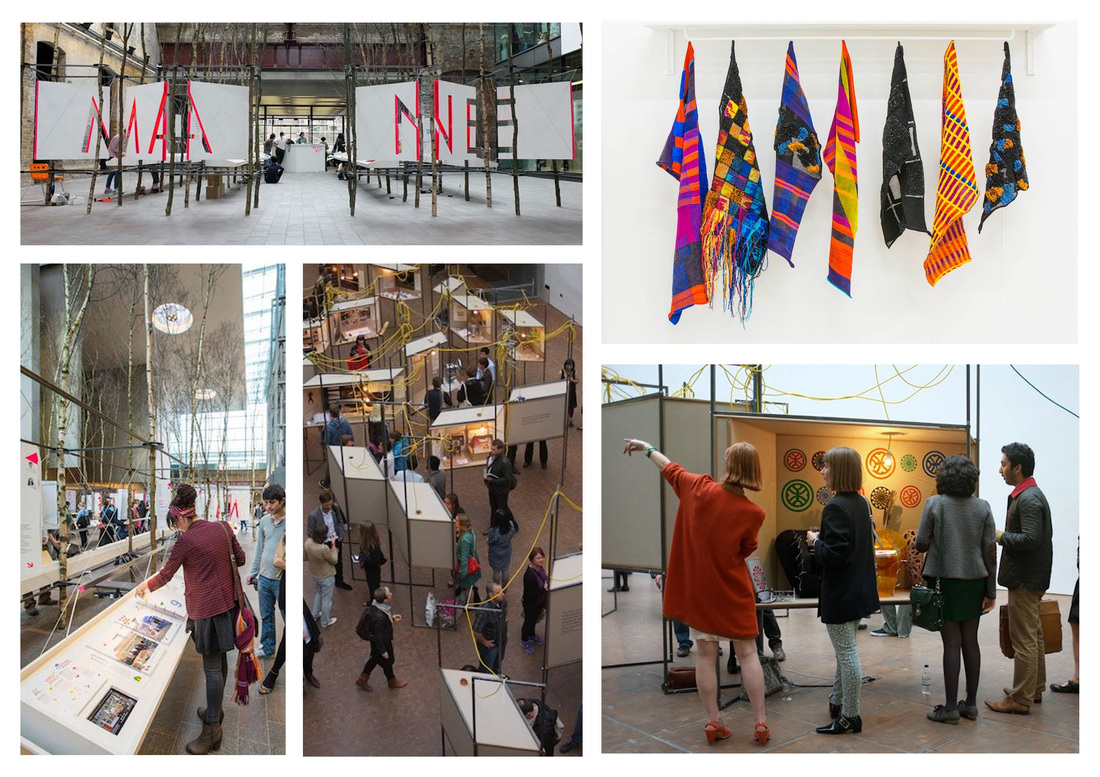
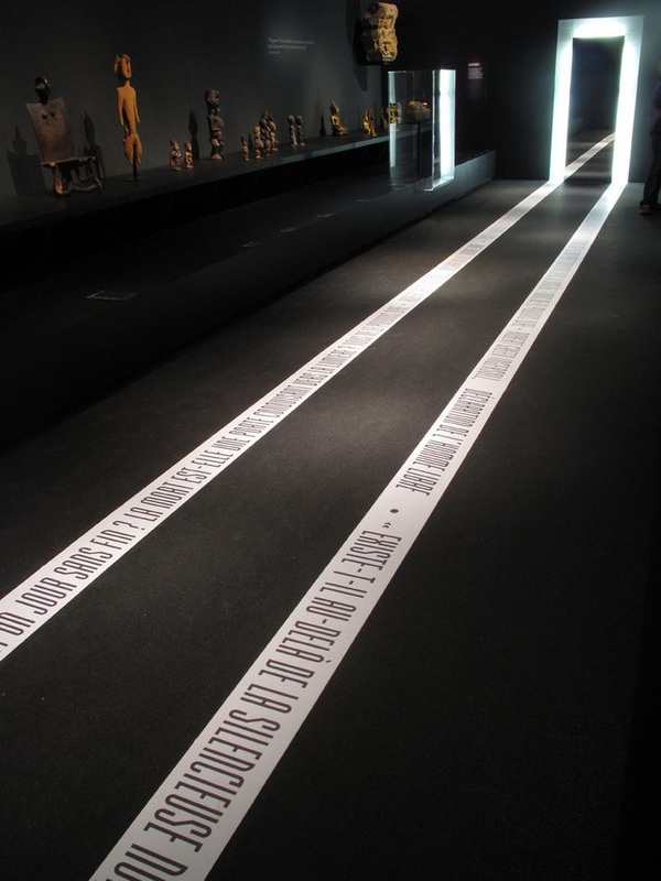
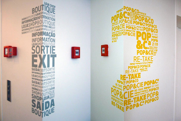
This exhibition called MANE was the exhibition of Central Saint Martins in London. Central Saint Martins is a famous fashion university however they also have media, graphic, jewellery courses and more. What I found surprising is the lack of consistency throughout the exhibition from a branding point of view it was quite lacking. Other that that there were some very cool set ups. The textile section for example was incredibly simple but very effective! My favourite set up though was the two bottom right images. What's cool about it is how it takes up such little space yet the designer has a whole cabinet to himself and is free to do with it as he desires. So far here at mcast all we have used is the top of a box, never the inside, this is something worth considering. They also make a lot of use of glass and walls which automatically create a lot of space and have a very interesting effect. Of course these rooms are much bigger because the university is much bigger but there are quite a few concepts we can pick up on.
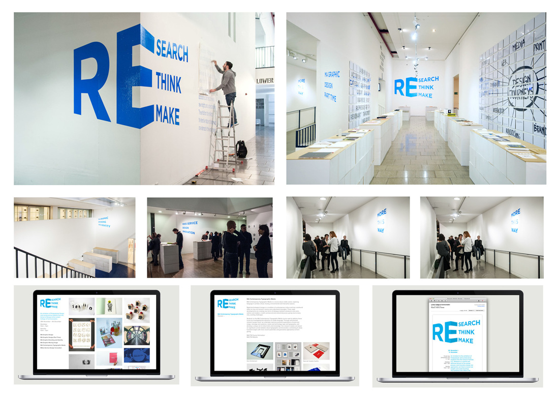
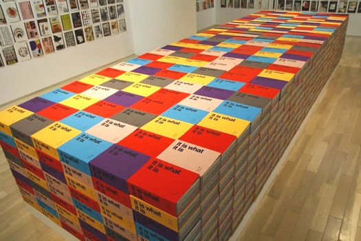
This is also a university exhibition. What I particularly like about this exhibition is it's simplicity because the work will automatically be the focus, as it should be. I also very much like the brand. I think it is very appropriate and the there is clearly thought behind it. The contrast of colour is also very interesting. I think the biggest think to pick up from this exhibition is it's sustainability. They did not go over board with design and the display area is simple boxes painted white and stacked on top of each other and a plank of wood running over it. I think this is very effective and like I previously mentioned, the importance is given to the work.
What I particularly like about this exhibition is the inclusion of the logo throughout the actual displaying of the work. I also very much like the promotional content. I think in previous years, the greatest flaw was always the lack of promotional material. I hope this year to have a much stronger advertising campaign.
Alternative to the Projection Mapping
What I would like to suggest rather than again having yet another projection mapping which take so much time, is something quite similar since it is so greatly desired. I suggest a making of video but with a mix of live action and animation. This would still be very interesting but would require less work and time spent on it. Allowing us to focus more on the over all branding, building and promotion of the exhibition itself. Although we had a very good experience working on the previous projection mapping it did take up very much of our time and was very tiring and doing it again seems a bit redundant in my honest opinion. Something of this sort could be very visually appealing, entertaining and as I said take much less time to put together. It will also be nice for the people to see and understand all the work, time and effort it involved. https://www.behance.net/gallery/UNLIKE-exhibition/4194273 this exhibition made a pretty cool making of video but I think with the use of animation as well, we can make something pretty cool.
What's really cool about this projection mapping is that it was projected onto this very abstract stage. The stage has a very interesting build and allows many platforms for the projection. It would be pretty cool if we could have the 3D students build us a cool stage like this and rather than projecting on the wall like we always do, project onto the stage. It would be cool change.
ORANGE / Show hello! 2013 from SUPERBIEN on Vimeo.
Projection Mapping
Although different to what we are currently looking at, this projection mapping, is a very cool option. The graphics are relatively simple when you think about it, it's the kinetic and the precision that make it so impressive. I guess what we can learn from this is, rather than focusing on detail and complicated, time consuming art works, why not go for something with perfect timing, outstanding illusions and a little bit of thinking outside the box ;)
Photographic Survey
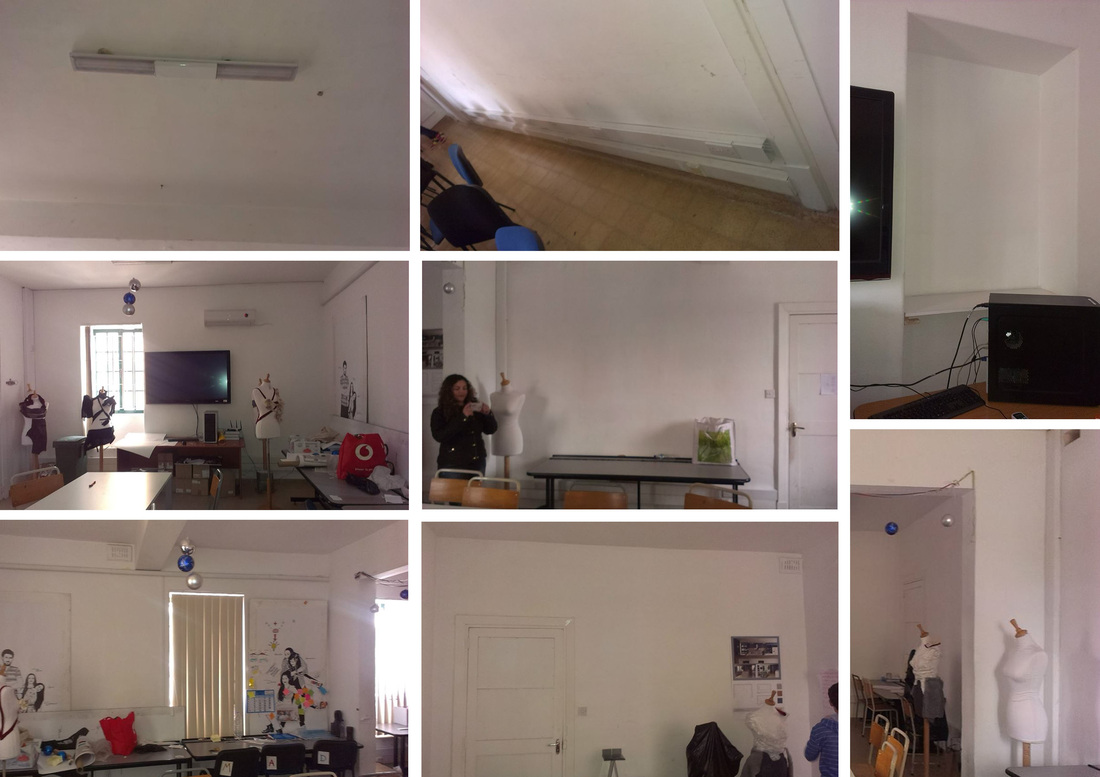
I'm very glad we got this space, which is very similar to last years space. The rooms are relatively big and have a lot of potential space wise. The area is very central and one of the most visited areas by viewers. It definitely needs a lot of cleaning out and there are certain things which might get in our way such as the arches, the plug and wire casing and certain indents in the walls, these however if cleverly thought out, may be used to our advantage. Over all I think we have a very good space and can produce something great.
Some cool stuff to possibly implement
Includes possible way finding systems, methods of display and even simple and clever methods of construction.
https://www.behance.net/gallery/Exposure-13/11973749
https://www.behance.net/gallery/Exposure/10730719
https://www.behance.net/gallery/Exposure/10730719
Paper to Screen & Everything in Between
Several names were discussed as the theme for this exhibition. Including Off The Wall!, You.I.We, but ultimately we decided to go for Paper to Screen and Everything in Between, which admittedly is longer than any other name previously used, however very unique as well as adaptable.
Why Paper to Screen & Everything in Between?
At MCAST Art and Design, every student begins their creative process on paper. Every piece of work also ends up on screen, be it because we've taken a photo to upload or be it to digitize the work, it always ends up on Screen, hence Paper to Screen the everything in between is of course the process.
Alternatively, it may be looked at as all the materials used in each and every course in this institute. MCAST Art and Design offers a large variety of courses, all requiring different medium which obliviously can’t all be named, therefore Paper to Screen & Everything in Between.
The Brand in it's simplicity is very adaptable and holistic. The title itself is very light hearted and is inclusive of everyone, highlighting the sense of community we have experienced at MCAST institute of Art and Design.
At this stage I worked mostly on Brand Adaptability and how the brand can be used in interesting ways. Here is a little bit of what I put together. As well as early logo concepts.
Possible promo video i put together http://www.youtube.com/watch?v=QrIt1NjRvTU
Design & Print
I chose to be sorted into the design and print team. I think having known the brand well I was able to help out very well in this team. Above all, I came up with ways of promoting the brand over social media, applying it in context and using it in as many creative ways as possible.
Posters and online content
Watch another promo video i put together http://www.youtube.com/watch?v=Zvs998TsHXk
Give Aways and Freebies
|
Besides the designing of name tags, which involved a lot of cutting and organisation and the give away booklets which are done every year, this year we put something together which has never been done before. People collected stickers which they were able to change in for a tote bag and/or note pad. All this required a lot of hands on work such as spraying, trimming and in my case a lot of driving around and I was also responsible for a lot of the communication with many of the suppliers particularly the printers.
|
|
Other Work
Above this, we also helped out in making sure that the brand was holistic throughout. We provided several student with tutorials on how to correctly adapt the brand as well as the use of the brand guidelines which was more time consuming than expected.
I feel in general I worked very well as a team member. Often I may have been too passive and not voiced enough of my opinion as I should have, however I think as a team we worked well and I am satisfied with the work produced.
I feel in general I worked very well as a team member. Often I may have been too passive and not voiced enough of my opinion as I should have, however I think as a team we worked well and I am satisfied with the work produced.
