Task 3 - Implementation / Projection Mapping
After being selected in the Projection Mapping Team, the first step was to start brain storming for ideas and visual concepts. Although we still needed to do the ‘Narrative’ part, we wanted to do something as different as possible from the previous years and from what we did in December for the V18 projection.
We started by dividing the tasks into 5 main parts:
Voices
The Fashion Show
Narrative
Performer
Interactive
The first three sections were done last year, however taking ideas from the proposals we decided to include two other ideas. As proposed by Toni Gialanze and encouraged by the administration we started working on something interactive which even promotes the new gaming courses to be launched during the next scholastic year.
Meetings
I was present for the two main meetings done with the administration and the people responsible for the technical equipment from Nexos.
In the first meeting with Mr. Vella and the lecturers involved in the production of the exhibition, the opening ceremony was discussed. The running order was finalised and our suggestions were proposed. We were given deadlines, especially on when giving the work to Mr Sean Vella for him to create the sound design.
In the meeting with Nexos, we discussed the possibility of projecting on the three sides of the tower. This was initially proposed to us by Mr Theuma, and as a team we liked the idea. However due to several reasons, this was eliminated, and we opted to project on the sides as done in previous years.
Performer
Although at first we started pooling ideas as a whole group, we quickly divided ourselves into smaller groups, and I started working on the ‘Performer’ part as it was something that was never done in the previous years. Our main inspiration was the group ‘enra’, an Asian entertainment unit which presents a fusion of images and live performance. We started by showing this to the Director Mr. Vella in the first meeting discussing the opening night. He was impressed by the videos shown, but showed his concern with the complexity of the synchronization between the performer and the visuals. However we (me, Toni Gialanze and Luke Saliba) were very determined to do this, and started working immediately.
The initial step was to choose the performer/dancer. We opened a call for auditions on the school’s Facebook page, and prepared a short sample of visuals and music for the applicants to create a choreography. On the 9th of June we had three dancers that came for the auditions and another dancer two days later. Our choice fell on the two dancers whose styles were similar to what we had in mind, and we decided to start working on a choreography that included both dancers simultaneously.
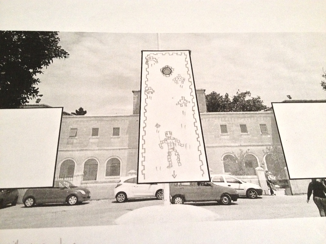
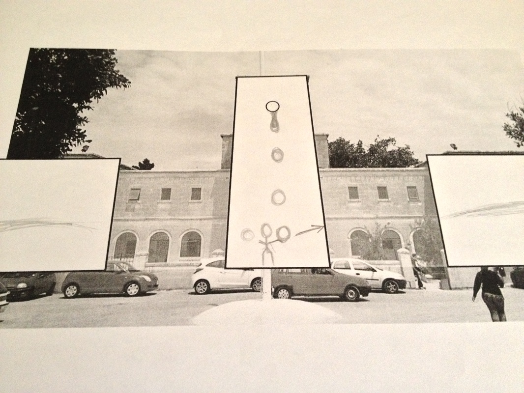
The following are some initial storyboarding sketches including our basic ideas we had in mind.
The following are some initial storyboarding sketches including our basic ideas we had in mind.
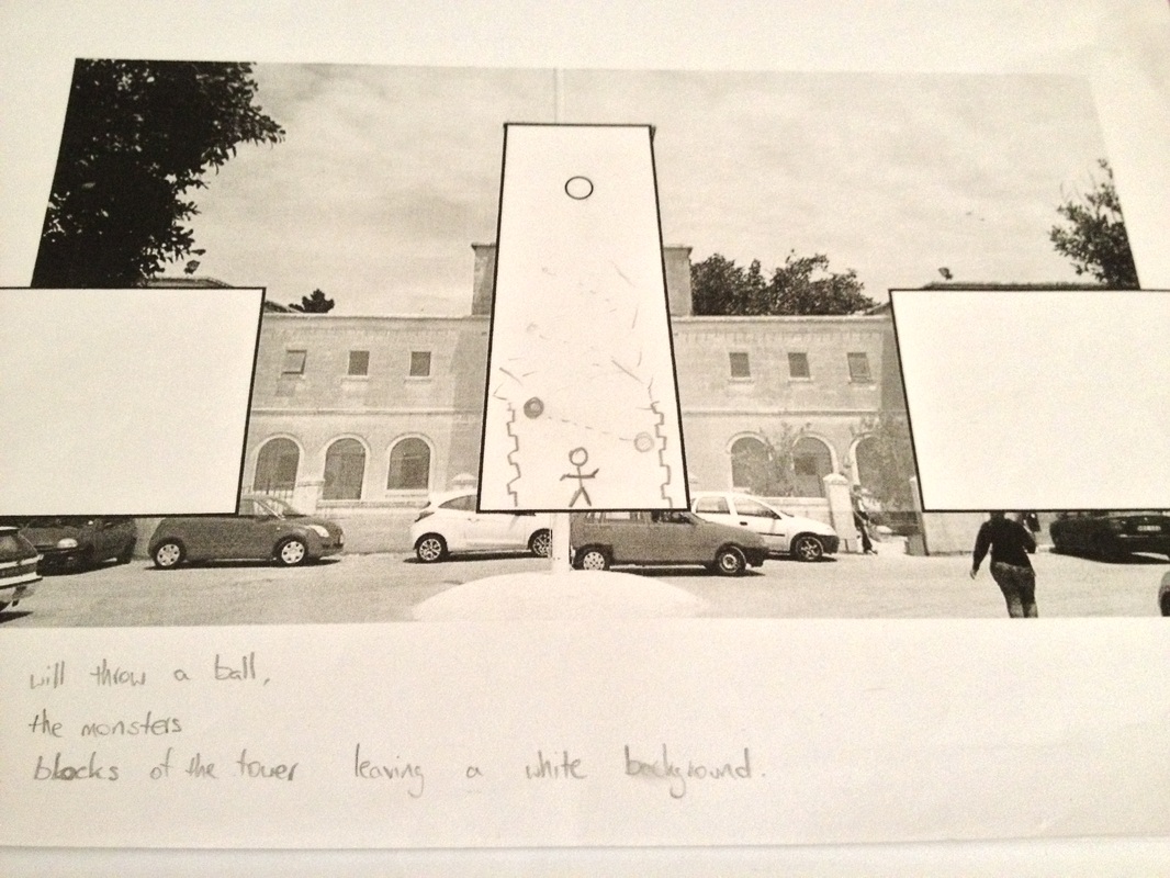
These were discussed with the performers on the first meeting and we started to generate new ideas and choreography based on these sketches. However, after the first meeting, the female dancer dropped out, and from then onwards we started working with Sergio Laferla.
During the first two meetings, we worked on the sequence of the whole choreography and developed links and transitions between our initial ideas. Together with the ideas from the performer himself, I, Toni and Luke created a three minute long performance which now needed to be translated into graphics.
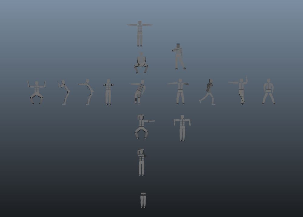
All of the graphics seen during the performance were done by me, apart from the finale, where the vortex graphics were created by Kurt Bullock. I started working on the ‘Tetris’ poses seen in the intro of the performance. These were created in the 3D software Maya, as it helped in speeding up the process by using the same shapes for every pose. 16 different poses were created in total. These poses were modeled on a series of poses that the dancers did on the first meeting, were I asked them to create a series of improvised poses for me to copy in 3D.
During the first two meetings, we worked on the sequence of the whole choreography and developed links and transitions between our initial ideas. Together with the ideas from the performer himself, I, Toni and Luke created a three minute long performance which now needed to be translated into graphics.
All of the graphics seen during the performance were done by me, apart from the finale, where the vortex graphics were created by Kurt Bullock. I started working on the ‘Tetris’ poses seen in the intro of the performance. These were created in the 3D software Maya, as it helped in speeding up the process by using the same shapes for every pose. 16 different poses were created in total. These poses were modeled on a series of poses that the dancers did on the first meeting, were I asked them to create a series of improvised poses for me to copy in 3D.
These 3D objects were done imported into Aftereffects where using the Plexus plugin, I shattered every pose as soon as it touched the ground.
The following is the first test piece done, without the actual timing with the sound design.
The following is the first test piece done, without the actual timing with the sound design.
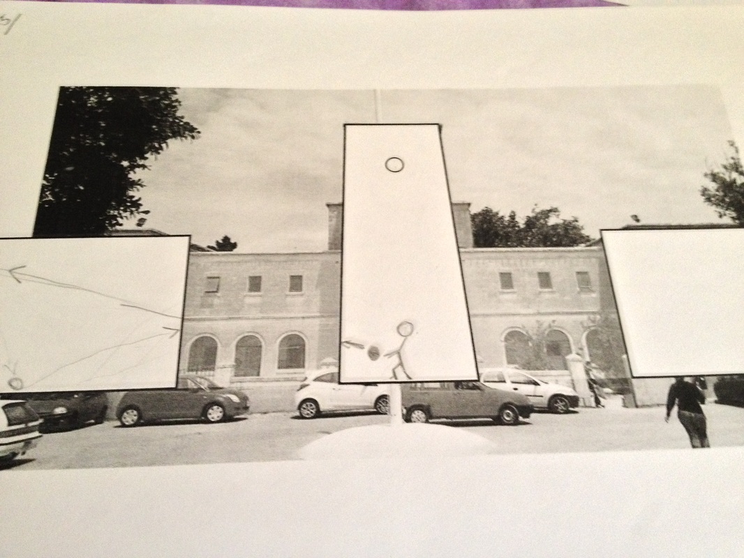
I also started working on some other visuals such as the red ball bouncing on the sides and the droplets falling down the clock tower and being splashed on the sides.
The next stage was filming. Filming was needed for two main reasons: some parts of the routine included silhouette projections of the dancer and the second reason was that I needed the recordings of the rest of the routine in order to map the graphics on the movements and timings of the dancer himself.
Filming was done in the TV studio in front of the green screen, with the help of Luke. We filmed on two days; on the first day all the routine was filmed for me to map the graphics, and on the second day we filmed the shots that were to be translated into silhouettes. All filming was edited by Luke, were the green screen was removed, and the black silhouette was left.
Filming was done in the TV studio in front of the green screen, with the help of Luke. We filmed on two days; on the first day all the routine was filmed for me to map the graphics, and on the second day we filmed the shots that were to be translated into silhouettes. All filming was edited by Luke, were the green screen was removed, and the black silhouette was left.
After I had all the recordings I could start to map the graphics with the movements of the dancer.
Part 1 – Tetris
After recording the movement of the dancer, I could now space the rows of falling poses correctly. With the progress of the sound design from Toni, I could now also time the appearing poses. I changed the ending of this sequence with increasing frequency, and lining the unbroken poses in a more orderly fashion so that it became more visually appealing.
I also manipulated the wrecking ball which the dancer performs at the end of the sequence. The timings were now more physically accurate and this improved the whole sequence overall.
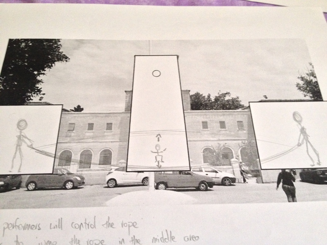
Part 2 – Unrelated graphics
This sequence is made up of three parts; the cube, the rope and the sphere.
The cube as created, animated and rendered in Maya. This idea that was developed after the filming, and so the movements and timings were to be modified several times until the performer could interact with the graphics in a believable way.
The rope animation was done in Aftereffects using the puppet tool. As Luke edited the green screen recordings, we realized that it was impossible to replicate what we had visualized on the storyboards. Firstly, the rope could not be translated properly into silhouette, as the filming on the first day was done using regular shutter speed. Thus we had to remove some parts of the routine and create some new moves.
Again, as the moves of the rope jumping were not filmed in the studio, I had to modify the motion of the rope several times until they were physically accurate for the dancer to jump.
The sphere was the easiest to animate, as I simply had to adjust the heights according to the recordings filmed previously.
Part 3 – The dance routine
Sergio created the choreography himself, and after this was filmed and translated the silhouette, it was a simple matter of placing the footage on the side buildings. However these had to be timed perfectly with the blackouts and the heartbeat sounds and of course in synchronization with each other.
Although this seems to be a very easy thing to do, it proved to be the hardest bit of the whole animation, as I had to animate this sequence in three separate compositions, and it was quite time consuming to get the timings synched on the three compositions.
Part 4 – Droplets
The droplets falling down from the clock tower were animated almost frame by frame. I used footage from an ‘enra’ performance as a reference and animated the drop accordingly. I also used a mask on the clock tower o make the drop as if falling from underneath. The splashes on the sides were created in Photoshop, and then masked and animated on the different side compositions in Aftereffects. Again this was a bit complex in order to get the correct timings and working on three separate compositions.
At first, the choreography included a routine where the dancer uses an umbrella in order to shield himself from the falling droplets and creates the vortex for the finale. However due to time constraints we eliminated this part and ended the show with the big black drop.
A first draft of the whole performance with the graphics re-sized to fit the performer. This includes the Umbrella ending described above.
The tower template almost finalised
Part 5 – Finale
We were under a lot of pressure from the director to create a big finale including fireworks and a confetti canon. However, I did not want to create a cliché but keep the stylized look of the whole performance. Taking some suggestions from Mr. Camilleri we created a platform related to the Kinect game which was to come afterwards and choreographed some moves and visuals with the sound design so to create a ‘big bang’ as it was emphasized by Mr. Vella.
We were under a lot of pressure from the director to create a big finale including fireworks and a confetti canon. However, I did not want to create a cliché but keep the stylized look of the whole performance. Taking some suggestions from Mr. Camilleri we created a platform related to the Kinect game which was to come afterwards and choreographed some moves and visuals with the sound design so to create a ‘big bang’ as it was emphasized by Mr. Vella.
A version done by Mr. Camilleri
After several rehearsals in the Photography Studio, we started rehearsing on the stage on the Monday before the opening night. The performer instantly synchronized with the visuals behind, and a few changes were needed for the final night where the performance came out almost perfectly.
A render of the bottom area of the Tower template that was used during the rehearsals in the Photography studio. This was projected on one of the walls in order to simulate the width of the tower, as we could not do actual rehearsals on stage until the Monday before the opening night.
As an experience, although it included so much work and sleepless nights (I spent from Tuesday 24th till Tuesday 1st doing all-nighters at school with the rest of the team) it proved to be a very successful one. I worked on the whole performance almost entirely on my own (visual wise) and I can say that we created something that was never seen before in Malta.
In the end, this was what was requested from us initially in the assignment brief.
In the end, this was what was requested from us initially in the assignment brief.
The final render of the Performer section of the Projection Mapping
TASK 2 - Proposal ( alpha / the crazy ones )
Inspiration Research
The first stage after being divided into 5 groups, was to look for inspiration and come up with branding ideas and concepts.
The following are some examples I found from different exhibitions.
The following are some examples I found from different exhibitions.
|
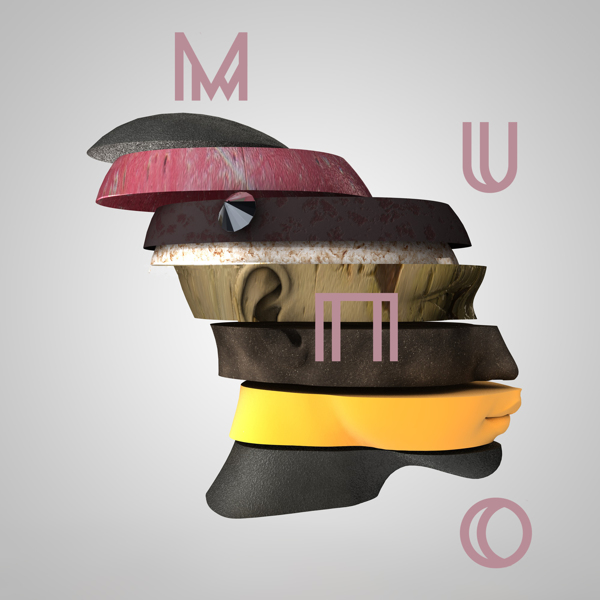
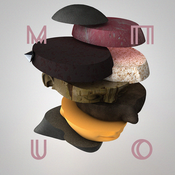
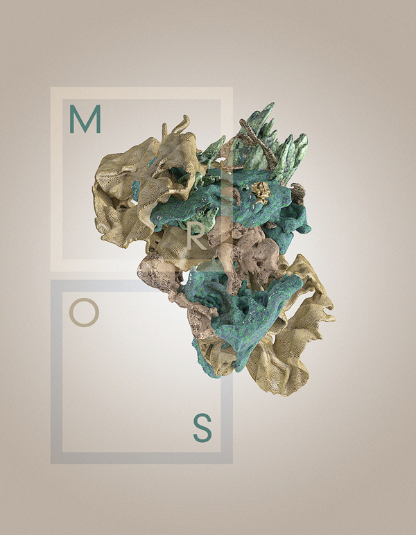
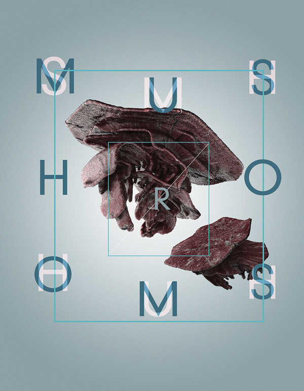
This example shows a logo possibility made of different materials, textures and colours. Again, the idea is to represent each Course with different materials and colours; wood, metal, ceramics, paint etc… Another idea was to create a title with more than just one word. We wanted to find a phrase that could be manipulated in different ways, which could create a stronger marketing campaign. This example shows how a brand can be applied in different interesting ways in order to create an interesting and exciting campaign. In this example, every letter in the brand Title is manipulated to show the same photo inside.
In our case, every letter could be manipulated to show different materials or objects to represent different Courses. This is a quick example of the ceiling could be used to create a positive space for work to be exhibited underneath. The flow of the exhibiting 'platforms' is also created in a way that can be followed randomly, and all the exhibits have equal importance. |
Projection Mapping Proposal
After the brainstorming and inspiration research process, our group divided itself into 3 smaller groups: Branding and Way finding, Spatial Design and Projection Mapping. I teamed up with Silvio Micallef to work on a Projection Mapping concept and proposal.
Our aim was to create something new, different from the projection mappings seen in the previous years. We wanted to stay away from the usual narrative, and create something more abstract and maybe combining the projection with the live performance that is usually included in the opening ceremony.
The following are some inspirations that I found, which when compiled together, can create something very innovative and interesting.
SYDNEY OPERA HOUSE | Facade projection
This example shows how architecture could be used in different ways than the usual storytelling, with ‘cool’ stone destruction effects. One of my favourite features is the use of filming and green screen illusions rather than 3D modelling and animation.
Effects such as silhouettes and movement ‘behind’ the tower can be more efficiently done with the help of students from the Media courses, where filming on green screen can create a much better and easier to do effects than 3D animation.
Picture 6 shows an example of different colours and materials. During the brainstorming sessions, one of the most important arguments was how to include all the Degree programs taught in our college. It would be something interesting to watch the tower turn from stone to wood, to metal etc…
The final pictures also show a more interesting way of doing the usual shatter effects, in a more abstract and stylised way.
An 'Augmented Sculpture' made for the Four Seasons Hotel Beirut. - May 2013
This example shows how a flat architecture can be manipulated using light and shadows to create an astounding effect. Something as simple as playing with lights can create a very interesting performance, especially when combined with music. Other effects, such as particles and fluids, can be added to create more drama and excitement.
IDOMENEO | operatic staging
In the example shown above, the stage and the set are used to increase the viewer's experience. It is not something that we are used to, especially combined together with a classical opera. However, one can see that if done carefully, this combination of modern visuals and classical music (or choir songs) can create a very interesting show.
These visuals are also a sample of what we can create. Even simple geometric shapes can be used in a way to create a stunning effect.
One of the most interesting features of this show, is the interactivity and modularity of the stage. This can be done only if Voices are represented by a few soloists. If however there will be a big choir, we will need to create a more fixed stage, and do most of the projected effects on a backdrop and the rest of the architecture.
Our Concept
After looking at various inspiration, it was time to plan our stage. As seen from the images above, I was inspired my both geometric and organic forms. The second image shows a set made up of large stones, similar to the architecture found in the Maltese Pre-historic temples. This inspired me to create the shapes of the final set, shown in the sketch and 3D renders.
The set is made up of 4 'parts'. The front for the ‘cat-walk’, the elevated part for the choir, the back-drop and the tower. After consulting with Ms Martina Caruana, who is responsible from the choir Voices, she estimated that there will be around 80-100 members singing on stage. This eliminated instantly the concept of creating an interactive set, and we opted for a more standard 3-levelled stair case.
Behind this, I created a backdrop that is mainly flat, where most of the projection mapping will take place. The geometric shapes, allow room for a lot of different effects as shown above. Finally, the tower could also be used for other parts of the projection, but more accompanying the rest of the set design, than being the main backdrop as it has been previously used.
The following are some visualisations done by Silvio of some effects that can be done during the projection mapping.
One can notice, that part of the set is also a reflection of the brand logo, which shows the feeling of continuity we wanted to give to the whole exhibition. (Picture 2)
This projection mapping, apart from the projectors, will include professional lighting to enhance and add more to the over-all effect. As explained before, this could be done in synchronisation to the music of Voices, or else, in a more general flow accompanying the show. The designs should be more abstract than usual, avoiding clichés like the tower falling down etc...
I believe that this could be implemented quite well, with a little bit more co-ordination between the different degree courses such as 3D for the set construction, and media for visual effects and filming. It would involve more than work than the previous projection mappings, but something more innovative and immersive.
I believe that this could be implemented quite well, with a little bit more co-ordination between the different degree courses such as 3D for the set construction, and media for visual effects and filming. It would involve more than work than the previous projection mappings, but something more innovative and immersive.
TASK 1 - Research
3 Spatial Designs-Expos Analysis
Rainbow Bright - Intel Corp.
“Powered by intelligent lighting, the 62-by-68-foot, L-shaped ceiling element in Intel Corp.'s exhibit featured 59 illuminated cubes. The cubes each measured roughly 5-by-5 feet and varied in depth from approximately 3 feet to a maximum of 8 feet. The undulating depths created a curvaceous overhead edge and added to the illusion that the so-called Digital Cloud was, indeed, a light, airy structure. The lights within the cubes were all programmed to predetermined sequences of colour changes, transition speeds and illumination intensity.”(http://www.exhibitoronline.com/topics/article.asp?ID=1080&catID=72)
So often, the ceiling space is wasted, but here, it is an important element of the entire design. This exhibition design makes excellent use of the ceiling to create positive space below every differently coloured square.
Although this may look hard to achieve in our exhibition, we could take inspiration from this and apply it for our scale. One example could be to colour code the different courses, and mark each location accordingly. At every entrance, especially those outside the main building, (fine arts, workshops, etc.), something similar could be placed so that one could easily find a particular building. Someone who is not familiar with the building could reach, let’s say, the Fine Arts exhibits by looking for a big red lit box.
Lock Box - by Emka Beschlagteile GmbH & Co. KG
"We'd like a sophisticated in-line booth that measures more than 30 feet long, sets up in 25 minutes, and includes built-in lighting. We plan to use it on the show floor, but we might also use it for corporate events, customer briefings, etc. Plus, it needs to fold up and fit inside a standard European rail, truck, or shipping container." (http://www.exhibitoronline.com/topics/article.asp?ID=1244&catID=72)
These were the actual guidelines given to the exhibit creators, who managed to create a highly-functional yet aesthetically pleasing space.
This 33-by-8-foot exhibit, is a perfect example of a very narrow and restrictive space, which was turned into a very efficiently used space. Something similar to what we have to do for our own exhibit space. This could be easily applied to our needs, as most of the exhibited work needs to be wall-mounted or displayed on a screen. Also, it is not very complex and expensive to create, but still is visually interesting.
Alphabet City - Brunner GmbH's exhibit for the Salone Internazionale del Mobile
This exhibit was inspired by simple, old-fashioned information boards and its purpose was to promote the new modular seating system for use in airports, hotels, and other public spaces,
Inside this space, visitors could look up at a sky of 26 contoured fabric "clouds." Surrounding them were coal-black medium-density fiberboard (MDF) walls and flooring saturated with 54,000 plastic letters, reminiscent of vintage analog information boards, once common in hotel lobbies and airport lounges. Positioned by hand, the white letters formed silhouettes. The individual letters also formed phrases from song lyrics and pedestrian phrases in German, English, and Italian. (http://www.exhibitoronline.com/topics/article.asp?ID=1368)
As one can see, this exhibition space is quite simple. A rectangular room (very similar to a classroom) but designed in a way that help it looks larger and more spatial. The ceiling flowing design helps to even enlarge the room more, while the black walls will help the attention to fall on the coloured exhibits in the middle.
This is something that could be applied in spaces which look narrow and small (such as our Degree studio). It is not expensive to create, but leaves a good impression on every viewer.
This is something that could be left there after the exhibition ends (maybe removing the ceiling decoration). It would be nice class to work in.
Addition/alternative to the usual projection-mapping project
IDOMENEO | operatic staging from URBANSCREEN on Vimeo.
Idomeneo, Rè di Creta is an Italian language opera by Wolfgang Amadeus Mozart. In cooperation with Theatre Bremen, URBANSCREEN conceived the stage design and visual composition for this production. The opera premièred at Theatre Bremen on March 27th, 2011.
As this year, it is being considered that Voices will be part of the Opening Ceremony, I wanted to propose something that can accompany their performance.
In the example shown above, the stage and the set are used to increase the viewer's experience. It is not something that we are used to, especially together with a classical opera. However, one can see that if done carefully, this combination of modern visuals and classical music (or choir songs) can create a very interesting show.
One of the most interesting features of this show, is the interactivity and modularity of the stage. This can be done only if Voices are represented by a few soloists. If however there will be a big choir, we will need to create a more fixed stage, and do most of the projected effects on a backdrop and the rest of the architecture.
In my opinion, the idea of creating a backdrop would be a very good idea to break off from the architecture that we already have, and has been used over the past years. Using a more 'interesting' stage, could help in giving us more liberty to create different and new effects.
Projection mapping example
O (Omicron) from Romain Tardy on Vimeo.
This projection mapping is different from the typical architectural projections we are used to; it does not recount a narrative or an occasion, but an installation that uses light and shadows to interpret the architecture.
The following is an analysis divided into sections, of why in my opinion this projection fall into the category of good design.
Art and Design Principles: The aesthetics of this projection are not the ones we are used to in projection mappings. All forms are geometrical simple. It has a unique identity, a combination of light and sound in perfect synchronization.
Elements of Design: The colour scheme used is extremely minimal; only white light and a slight touch of red on one occasion. However, the main feature of this projection is not colour, but the shadows created by the light on this complex dome. One cannot say that there are 3D elements. Although there are instances where most probably 3D software was used, the effects produced go in seamlessly with the rest of the visuals.
Formal Qualities: The precision of this projection is impressive. Technical wise, it uses a number of projectors overlapping each other in coordination with several other light sources, and everything is projected perfectly to the nearest centimetre. There are no textures used, and all the effects are created by the ambient occlusion and shadows projected on the architecture.
Function: This projection does not have a particular event to commemorate, but it is an entertaining installation. With its very unique style, it may please some viewers while by boring or annoying for others.
Form: For most of the time, all of the projection is symmetrical (with multiple lines of symmetry). It is very ordered and geometric, sometimes a digital visual representation of the sound.
I believe that although we do not have similar architecture in our school, we can do something much different than we are used to see on the main 'tower'. Something synchronised to music, playing on the architectural features on the sides of the tower (the individual stones embossed). It is something that has to be done very carefully, and ideally done using a laser scan of the building, not just photographs, as when proposed to Mr. Camilleri, this idea was quite toned down, as he said it would be very hard to project and align perfectly. But I believe that if we want to do something different, we should work harder than usual, and take a risk...
Photographic Survey
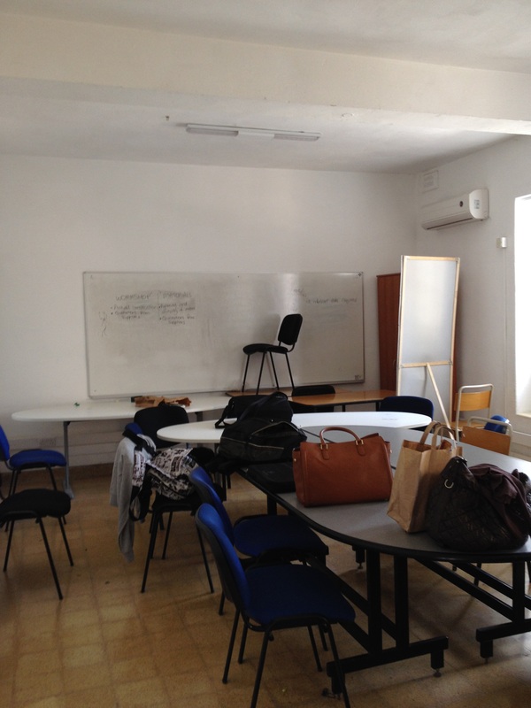
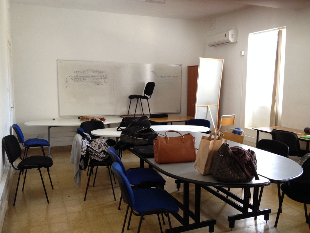
Personally I think that two class rooms are enough for us to display our work. However this needs to be done carefully. I believe that having separate podium like display areas will create a sense of a larger space especially if these are placed in a symmetric balanced way. This will be much more modular than building a desk like display areas as suggested by some of the groups.
The main disadvantage of the rooms is that the ceilings are quite shallow and they have beams across the width. Creating a greyscale or a white colour scheme will create the illusion of a larger space and give a breath of fresh air from the multi-coloured passage ways.
As the floor colours do not match, I suggest using some kind of material to cover them, and this will help to give the illusion of having a larger room, especially the one with the old yellow tiles shown above.
