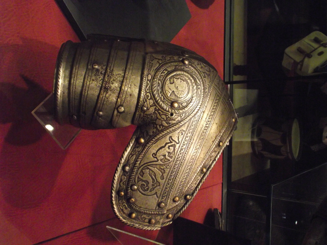
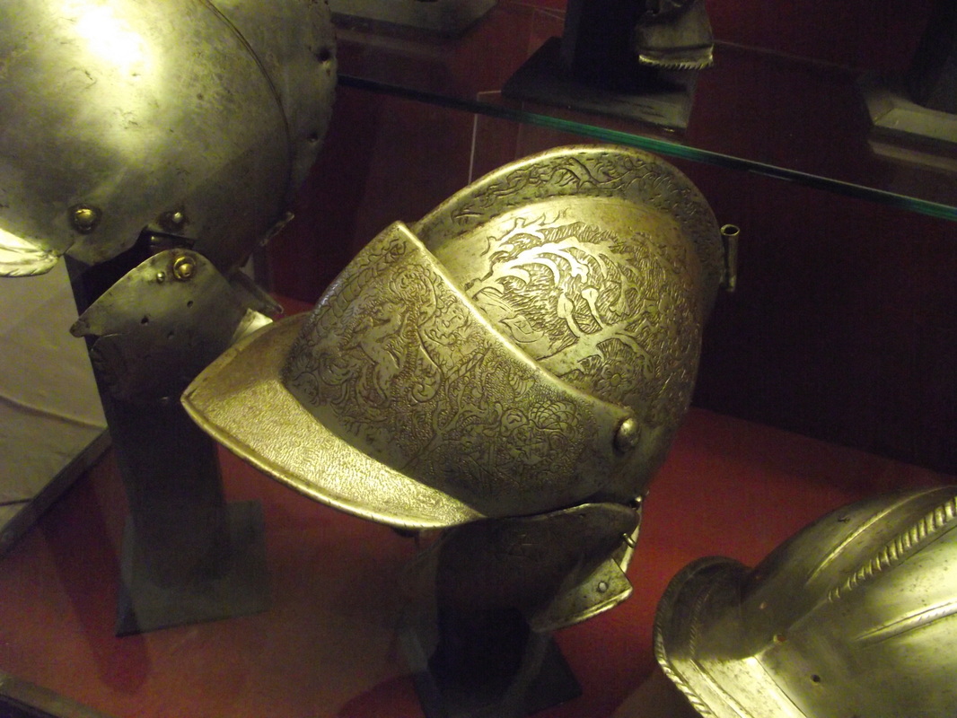
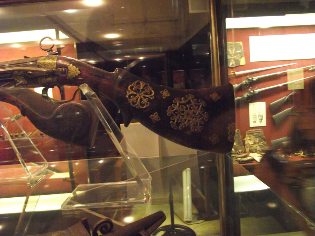
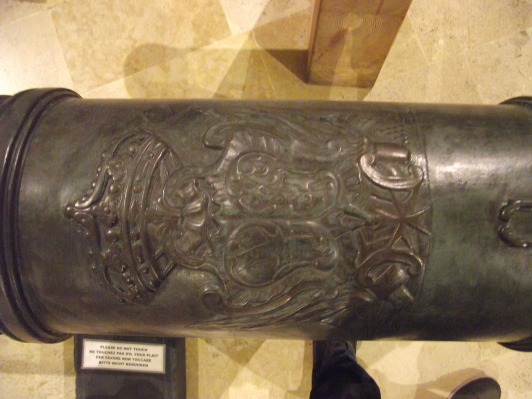
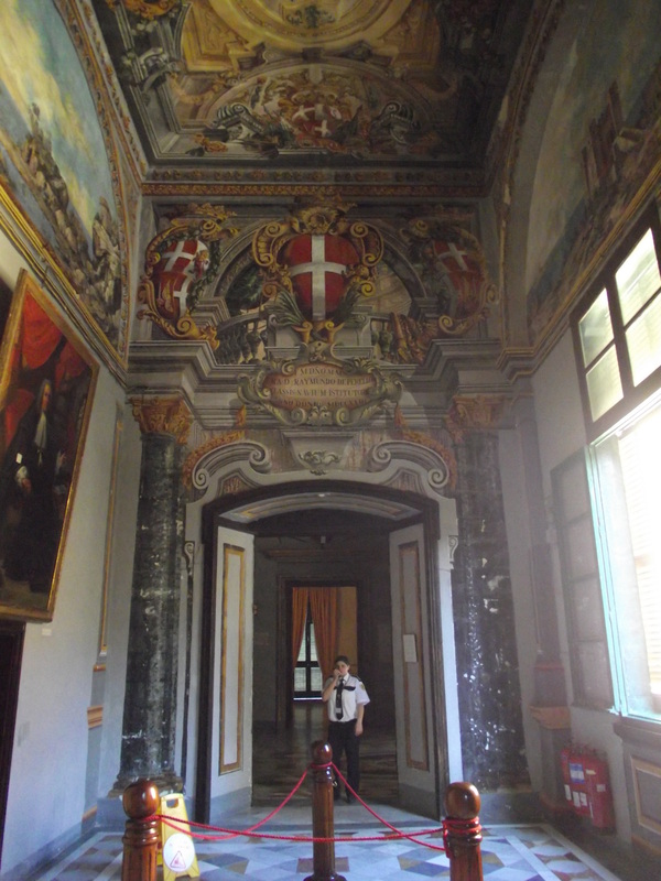
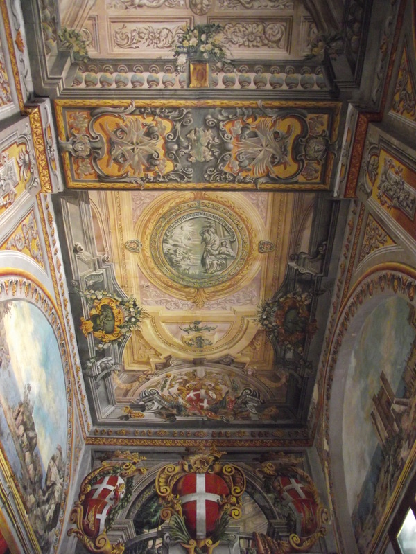
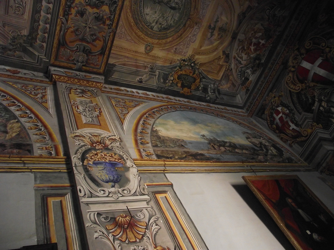
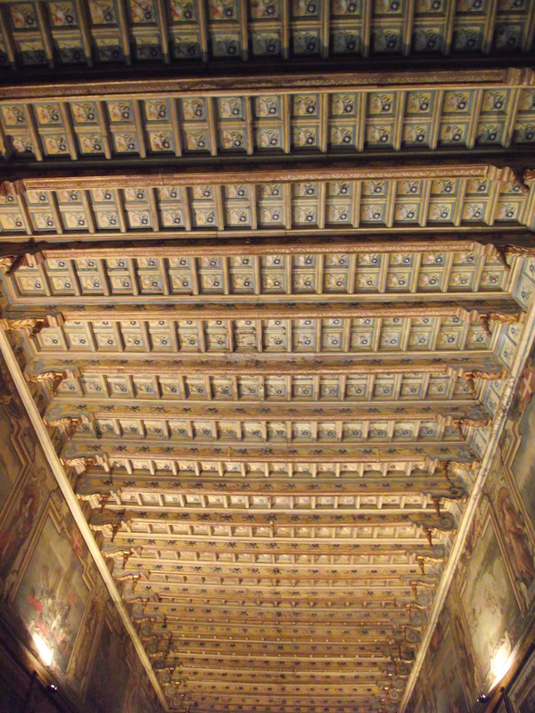
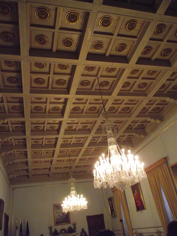
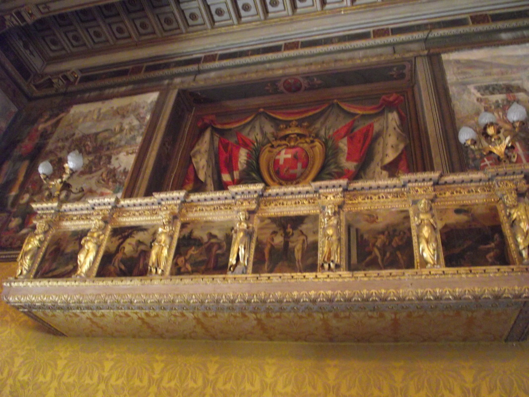
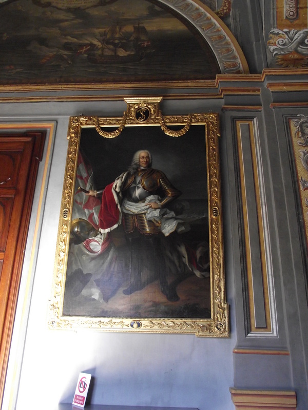
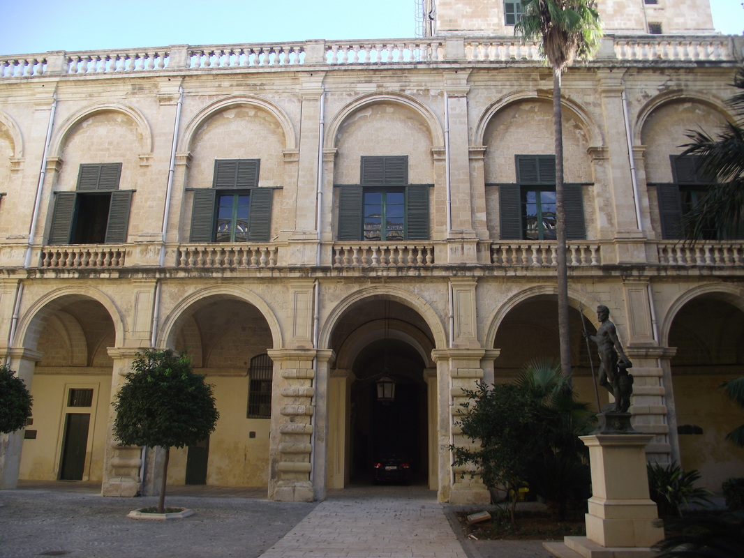
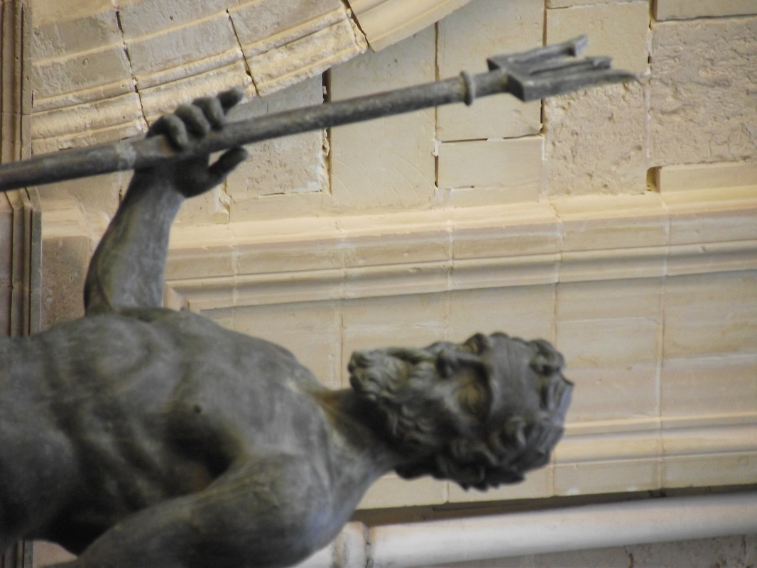
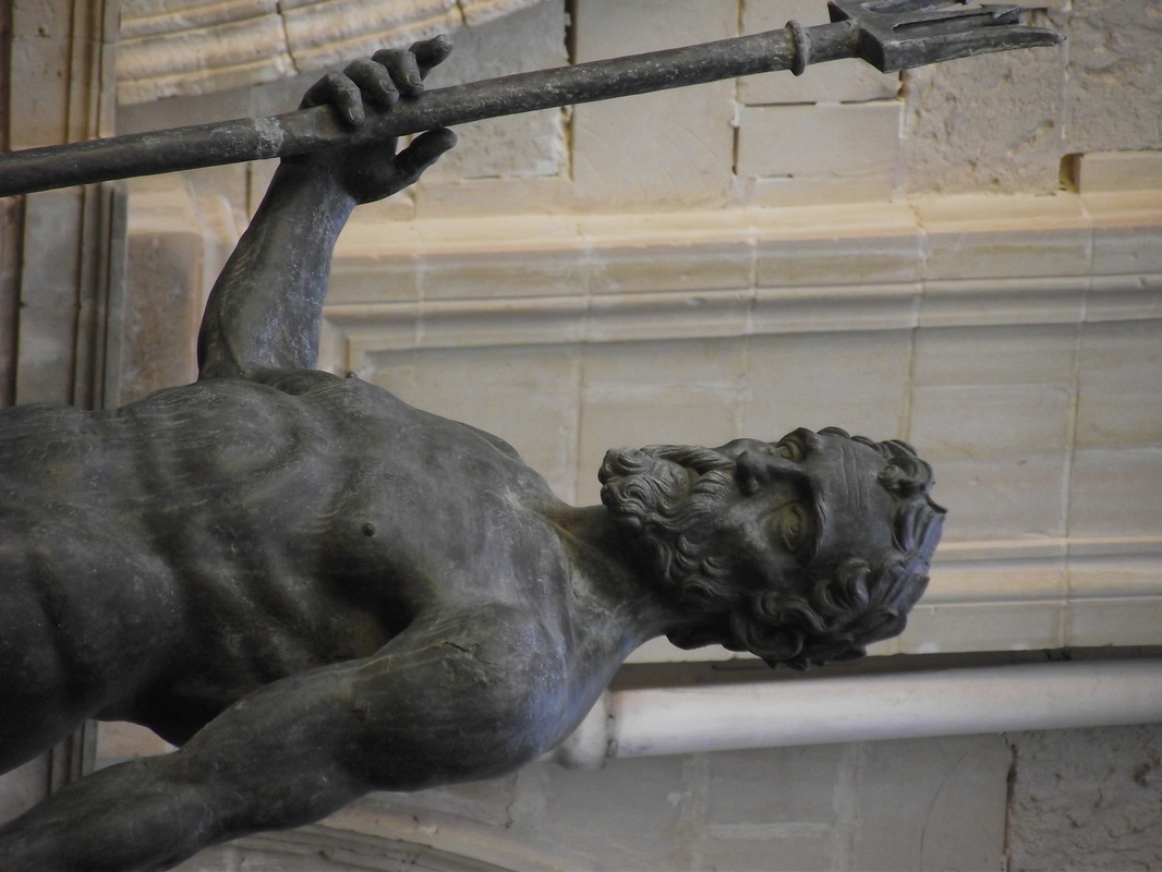
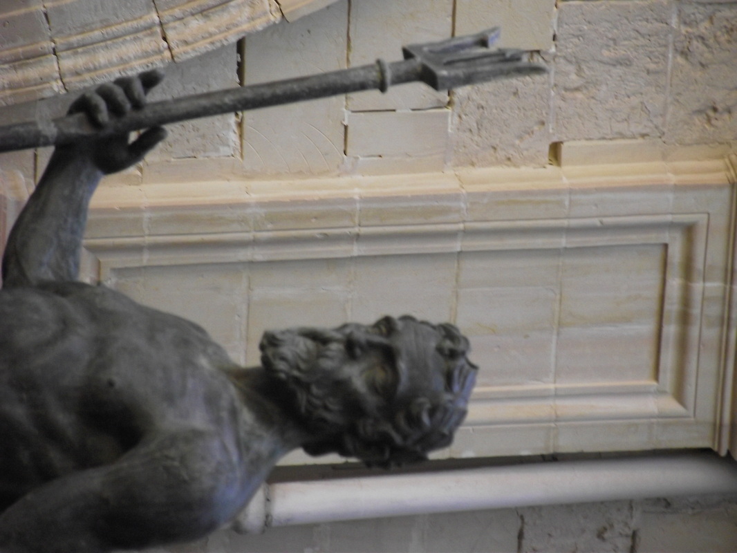
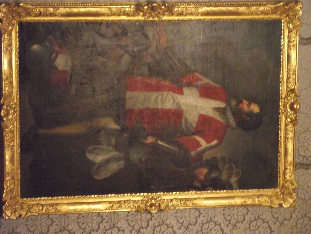
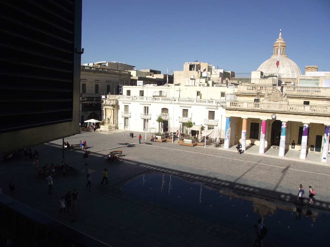
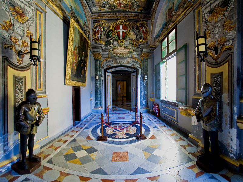
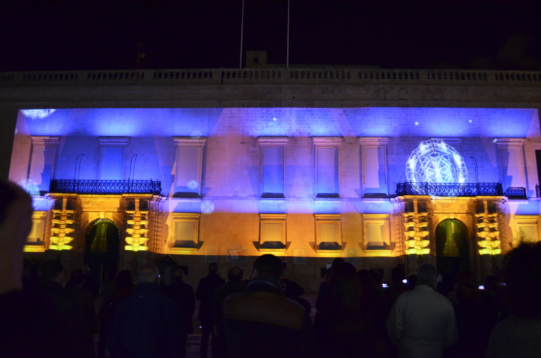
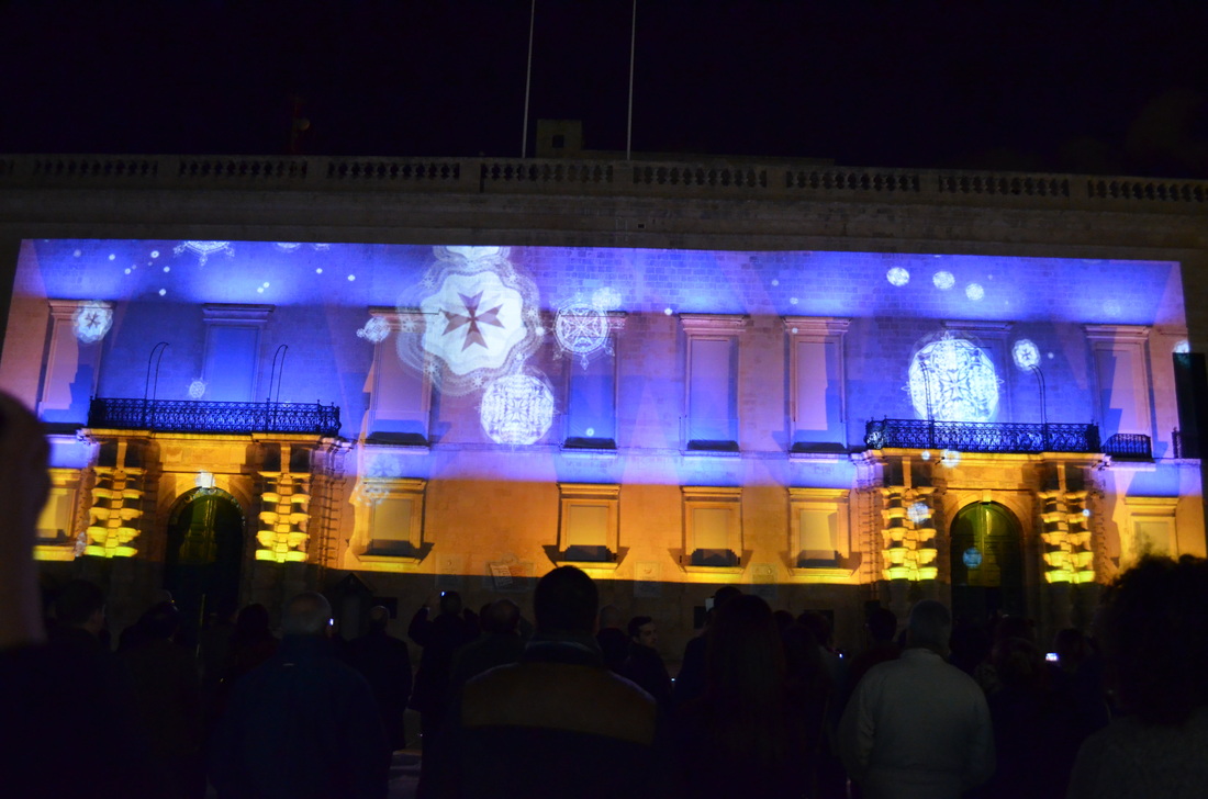
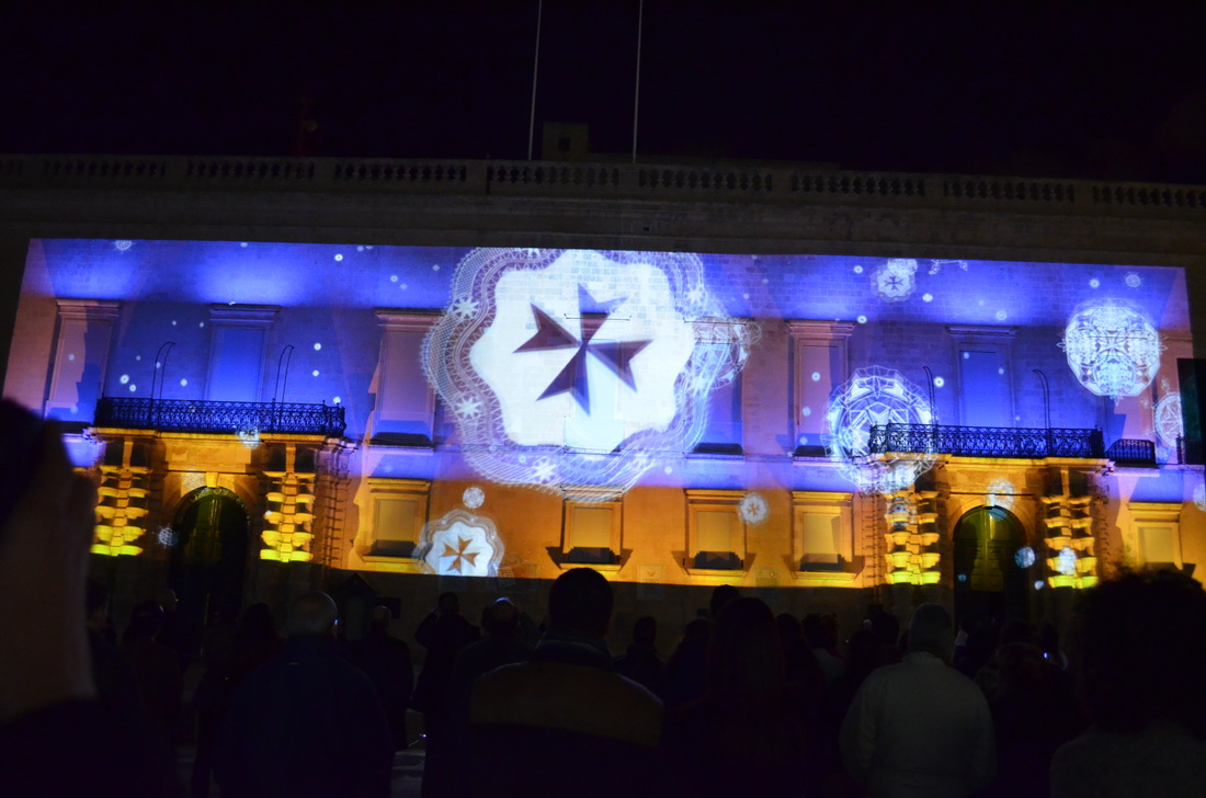
Photos from the Grand Mater Palace Valletta

Some of my sketches and storybord
Sketches and final concept for the slay
Slay concept
|
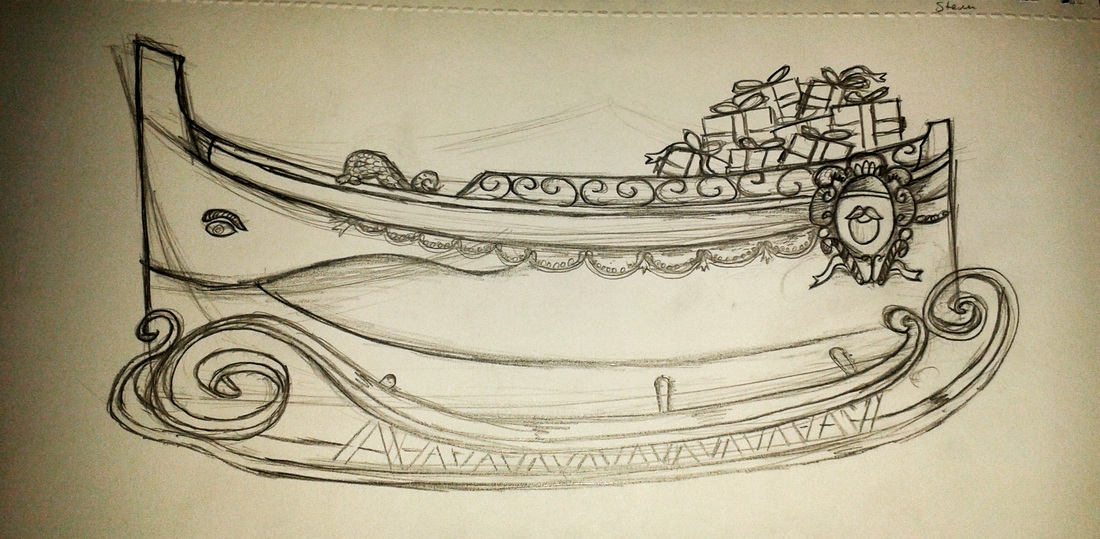
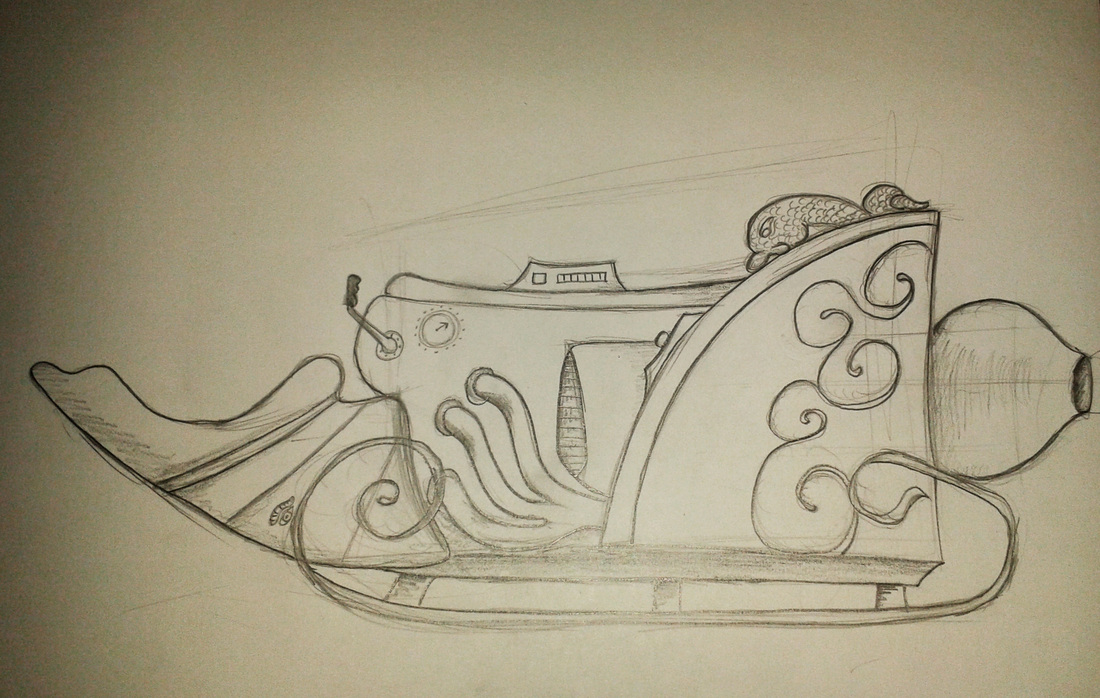
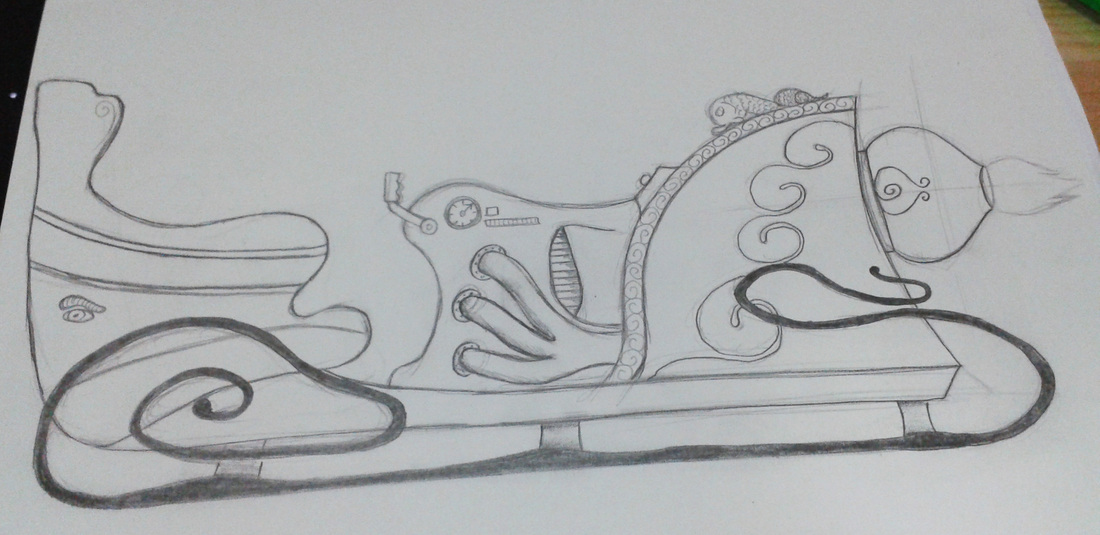
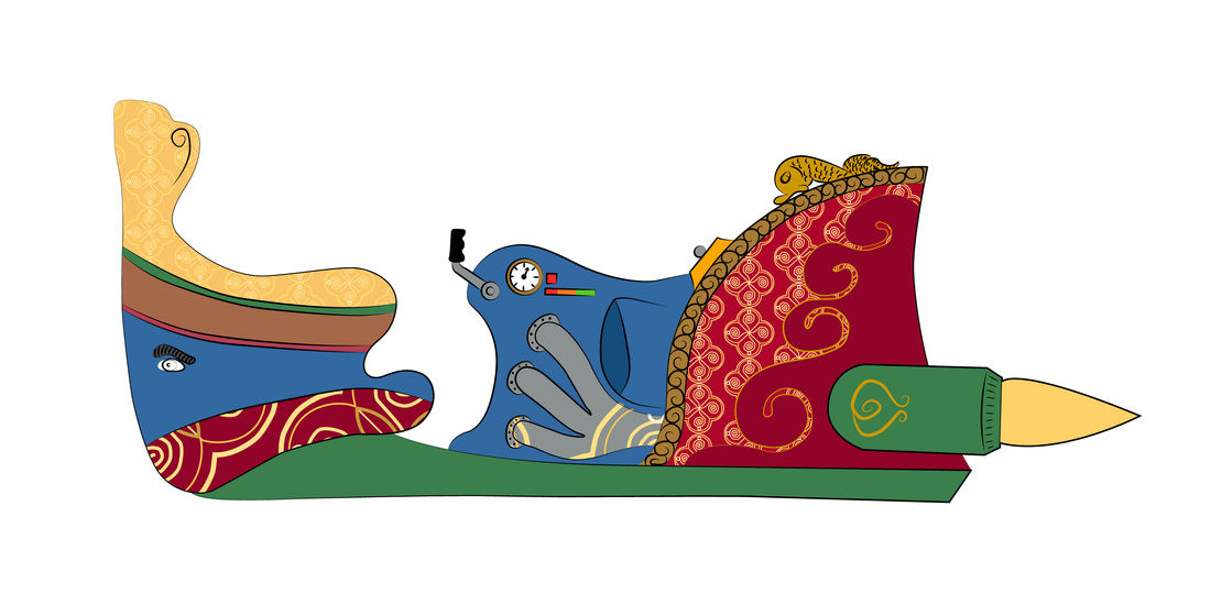
Some of the many ideas that we had for the Santa slay was a Maltese Luzzu that converts into Santa's rocket slay and I started to sketch some sketches for santa slay and I came with this Maltese Rocket Luzzu slay which it can be animated with the front of the Luzzu which can move at the front so the santa can enter and sit on the slay and he can drive the slay from the joystick that it has near the seat.
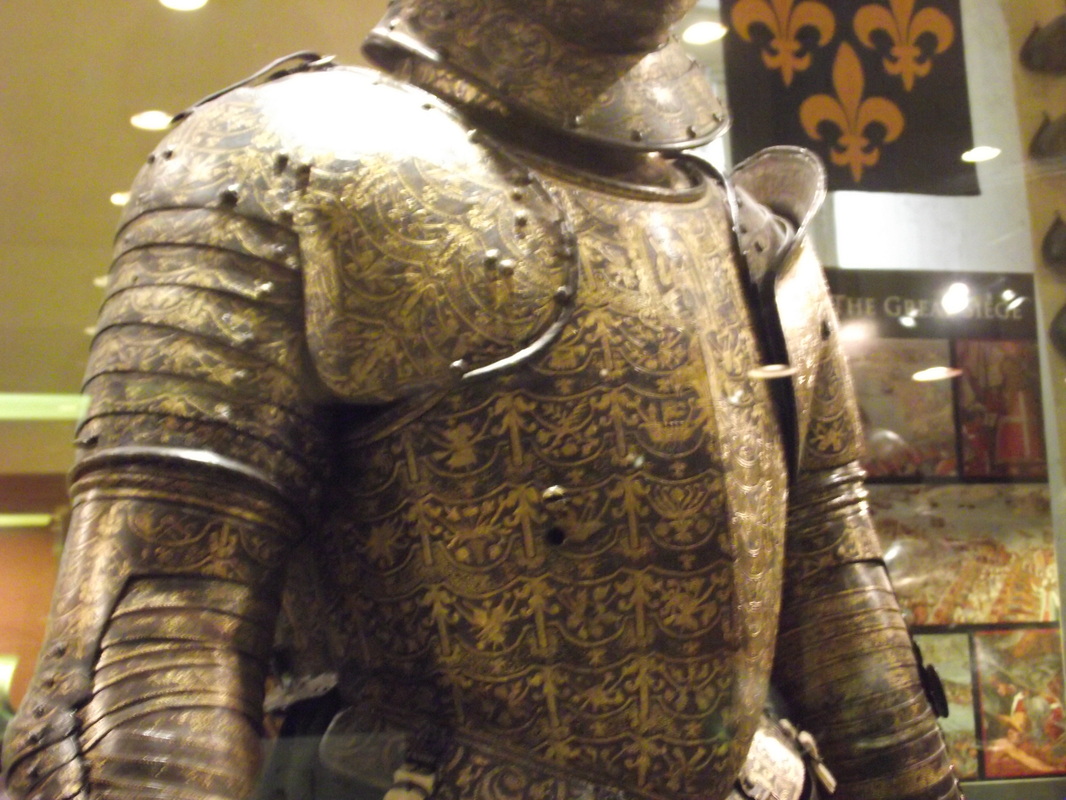
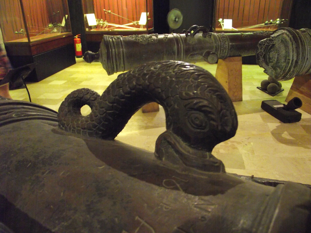
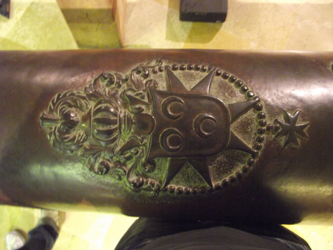
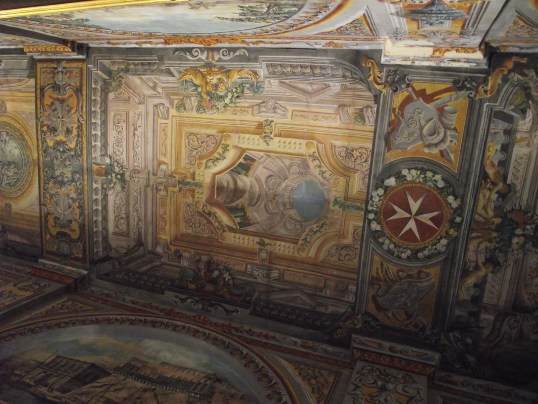
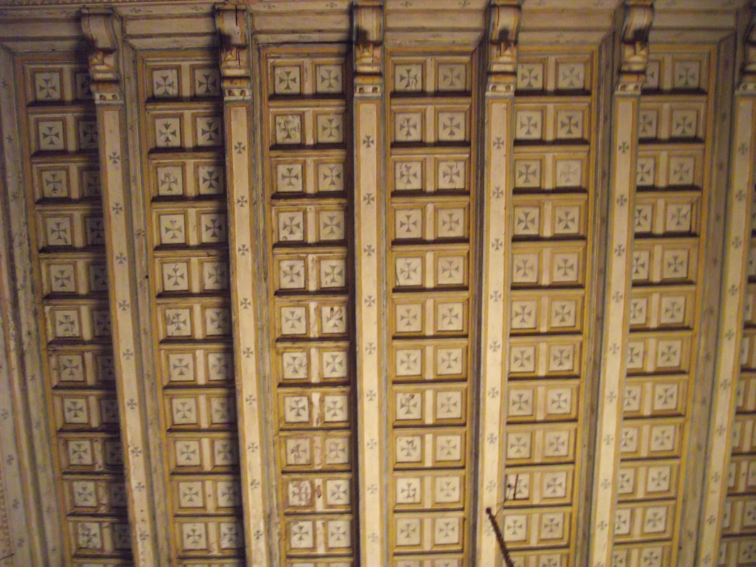
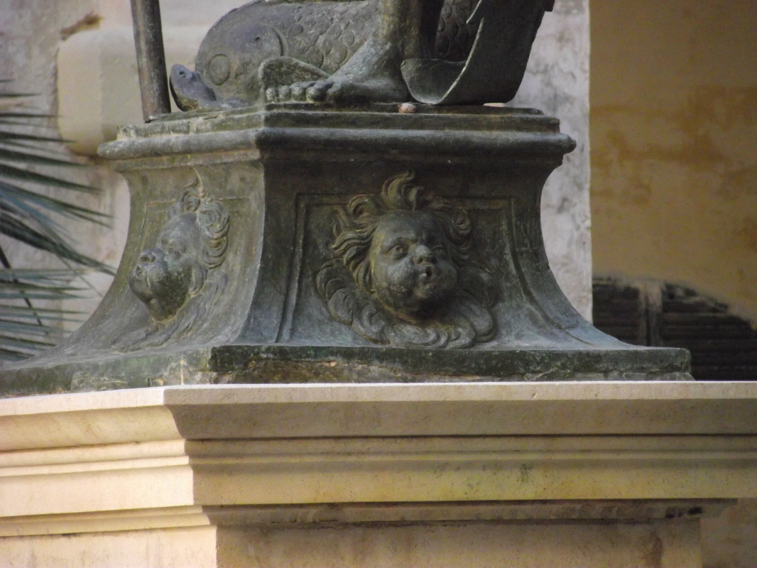
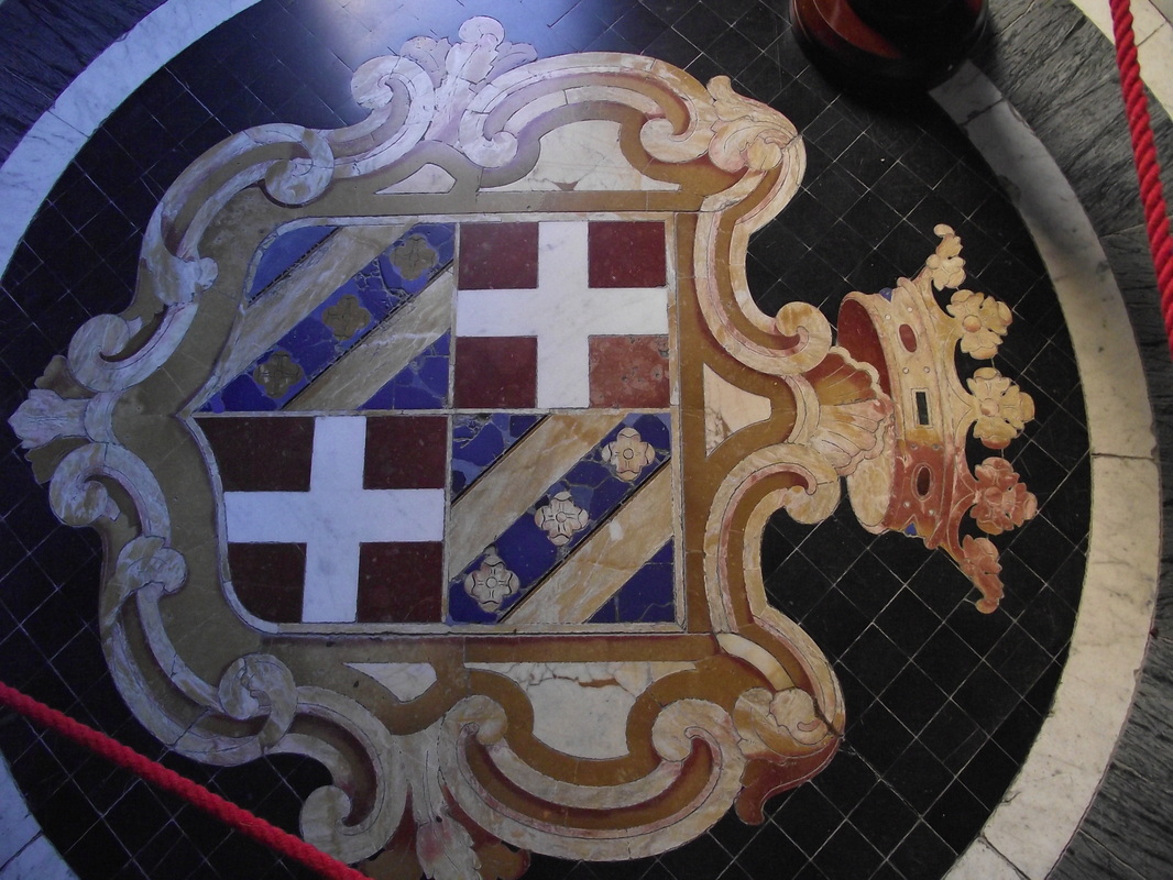
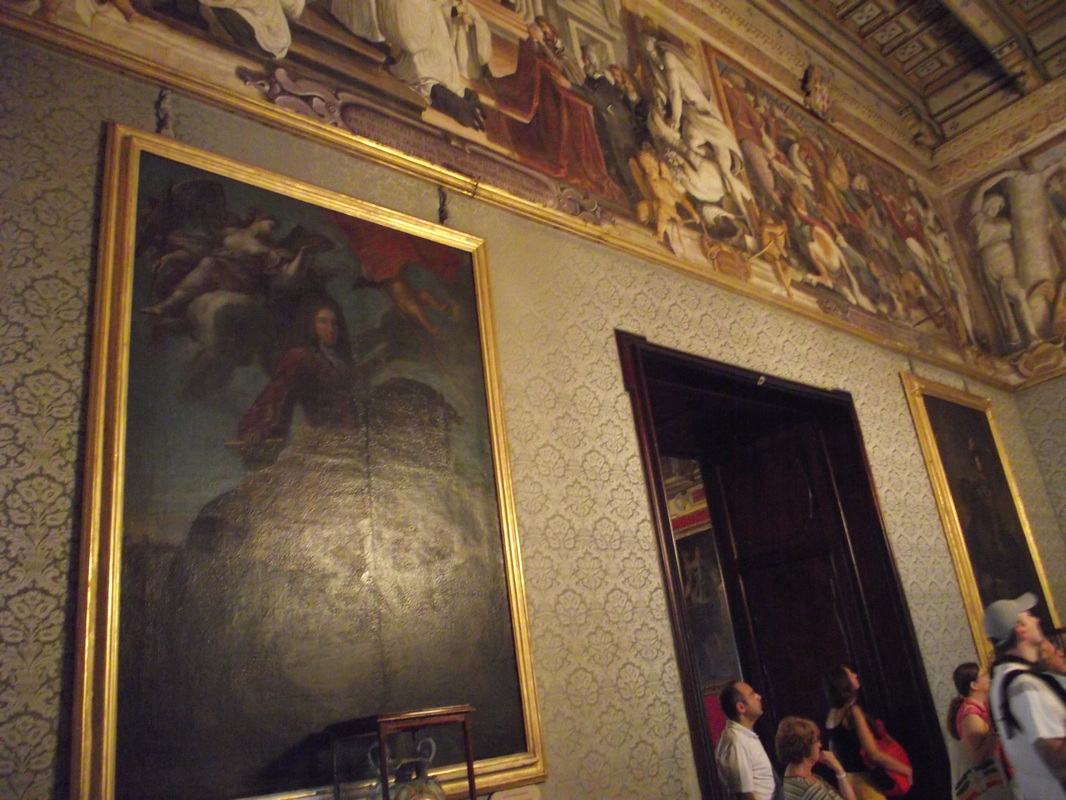
INSPIRATION My main inspiration for this slay was the Maltese Luzzu were here I tried to convert it in a way that it looks still like a Luzzu but which has a mechanical aspect and it looks like a slay. Other inspirations were the amazing petters that are found in the Grand Master Palace in Valletta. This petters has inspired me to create some other petters similar but in a way that remember the viewer in Christmas presents and decorations, So I illustrated these petters on the Santa's slay to give it more a Christmas image and a cultural feeling. |
COLOURS
I tried to use colours that are fund in the Maltese Luzzu which mainly are blue, yellow, red, brown and green and which are used as well in Christmas like the red and green. WHAT CAN BE DONE? So here the slay coluled be done more in detaile were it comes to shadows, colour shading and in some forms and shapes so it could be better and even fore the feeling of the hole image it looks a bit flat so by introducing differet shadows it will look better and a bit three dimational. (if the slay it has to look more three dimational it has to be made in 3D but the only problem if it is made in 3D, than you have to make even Santa and the presents in 3D so there will be a similarity between all the characters. |
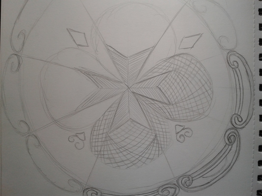
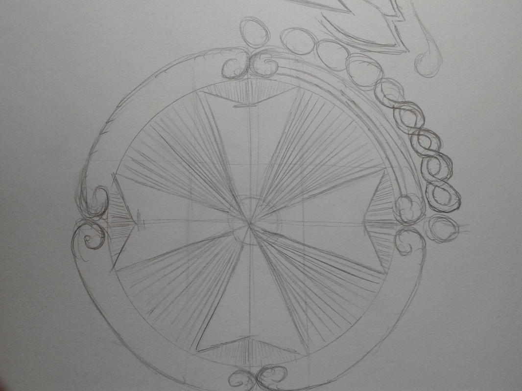
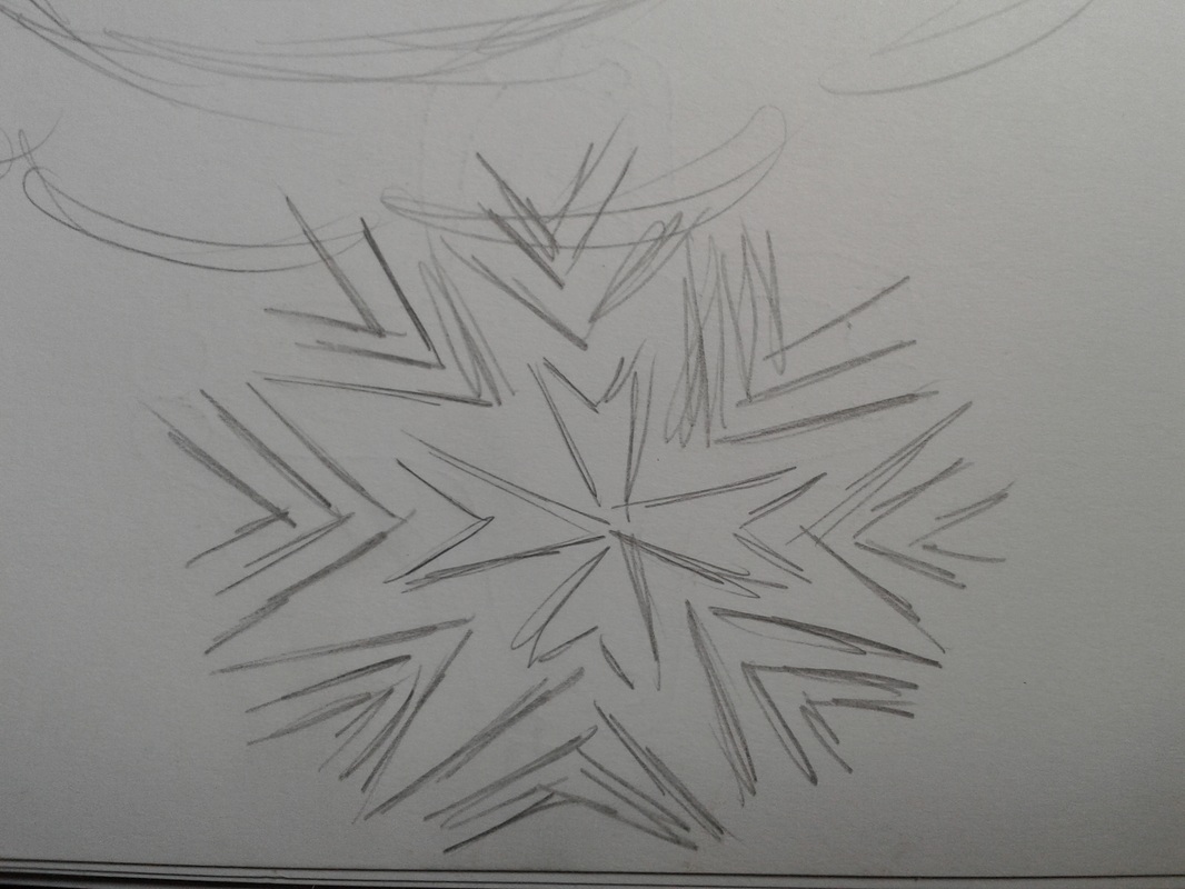
Inspirational material for the Maltese lace
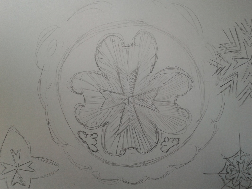
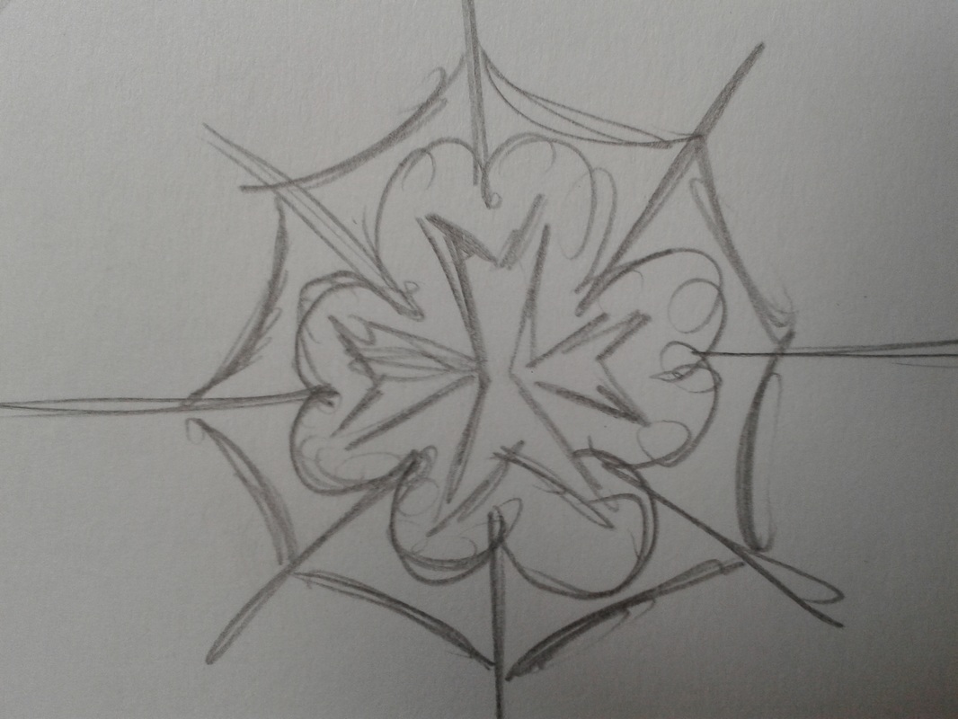
Sketches for the Maltese Snow Lace
|
Snow for the Maltese island is something which does not exist because our weather is different from the rest of the European countries so for us is impossible to see snow. But as a culture to the european, snow is associated with Christmas and many people when they say snow the first think that it comes in mind is Christmas, so the thinking was to introduce snow flacks in a way that looks Maltese cultural and than we came up with the help of Mr Camilleri to transform the snow flacks into the maltese lace. So I was given part of this task to create the Maltese lace into snow flakes.
|
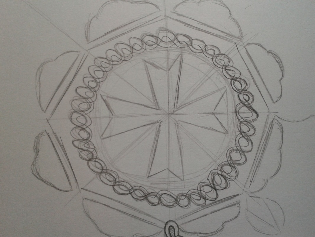
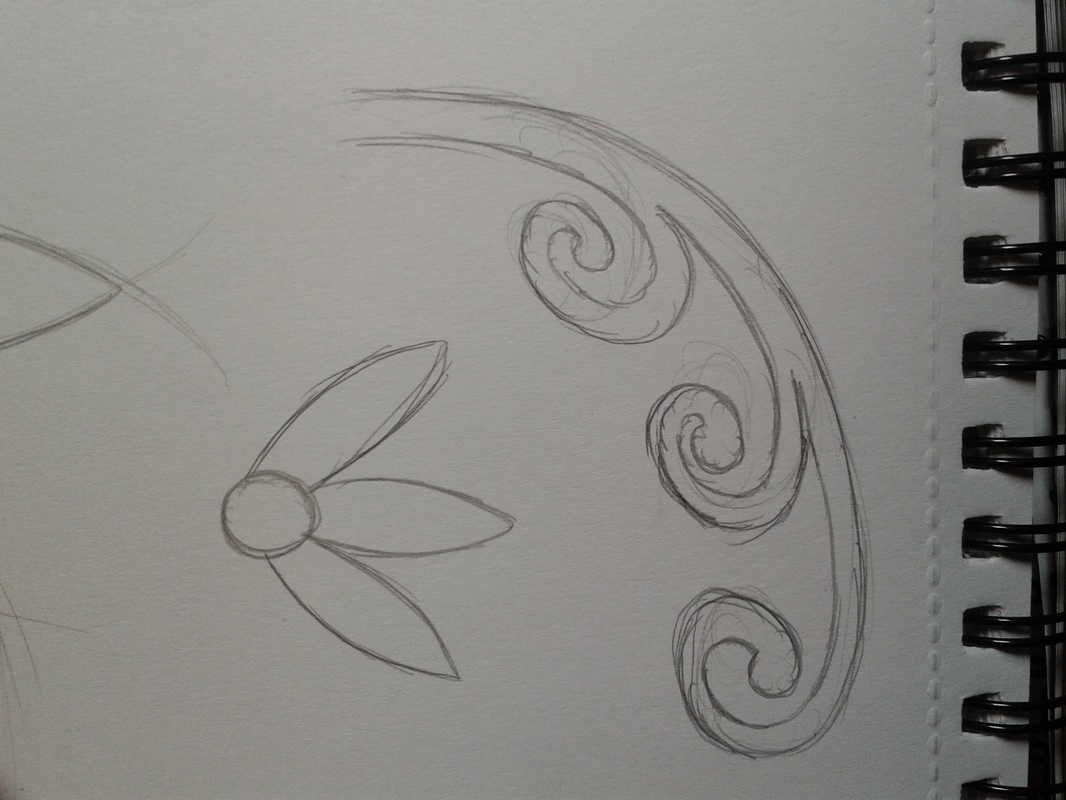
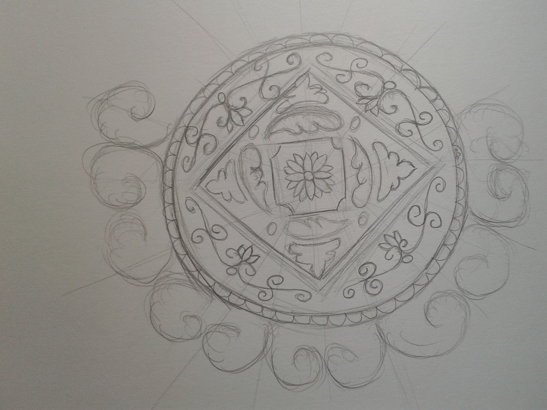
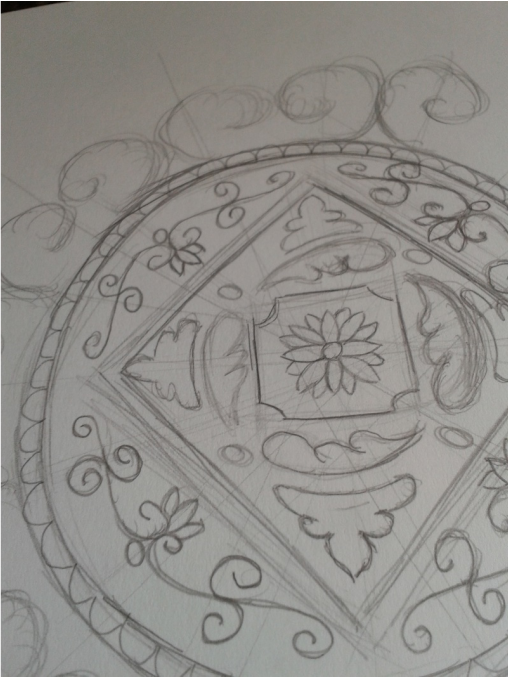
To come up with the inspiration for the Maltese lace flacks I started to look at snow flacks pictures, Maltese typical lace, Maltese tiles and other petterns that are found in the Grand Master Palace in Valletta. Than I started to sketching some ideas for the snow flacks and I have experimented with different petterns to come up with final consepts for the snow Maltese lace flacks.
Here are some of my sketches that I made for the Maltese snow lace to come up with the final consepts for the lace which is going to be used in the scene two. |
|

|
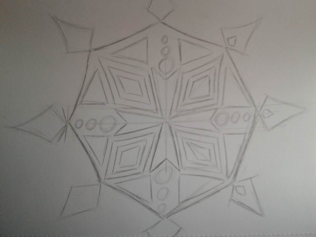
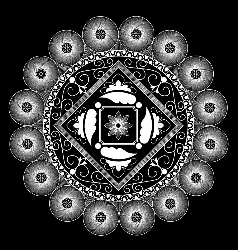
The final Concept for the Maltese Snow Lace
|
After all the sketches and inspirations that i had for the Maltese snow lace than I came up with the final concepts which I have consulted with my friend to see what they think about the design and what can be changed to make them better. After i had consulted with my friends than I had showed them to Mr Scicluna and he guided me to arrange some little things but over all he liked them a lot.
The main program that I used was Illustrator and the main reason why I used this program was to produce a design in more detail, to work more comfortable and to have a design which is vector so there will be no problems of pixels when it is being projected. TOOLS The main tools that I used for the designing of the Maltese snow lace was the Pen tool were I have made all the out lines and patterns, than I used other tools like mirror, repetition and others so to repeat pattern and lines which were difficult to be done one by one. |
So after consulting with colleagues and tutor I came up with three different concepts for the scene were it is going to be visualised in scene two were the Maltese Snow Lace falls from the sky.
When the concepts were done I have exported them in PNG so they will have a transparent background so the animation team in which i had a small part as well the can animate the Maltese Snow Lace. Here are the final concepts that I came up for the final concepts of the Maltese Snow Lace. |
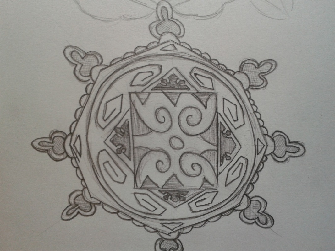
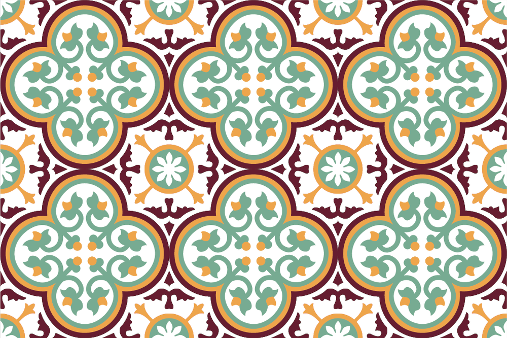
The tile inspiration Maltese lace
|
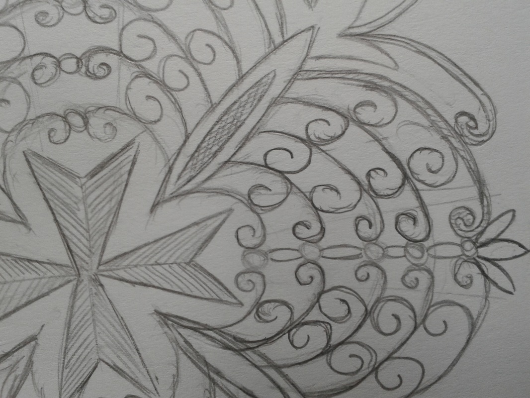
In this Maltese snow lace I was mainly inspired from the Maltese tiles, petters that are found in the Palace and from the actual lace.
The lines that I made in this Lace were made on by one because I didn't know that there is a tool that can repeat a sequence of lines. |
|
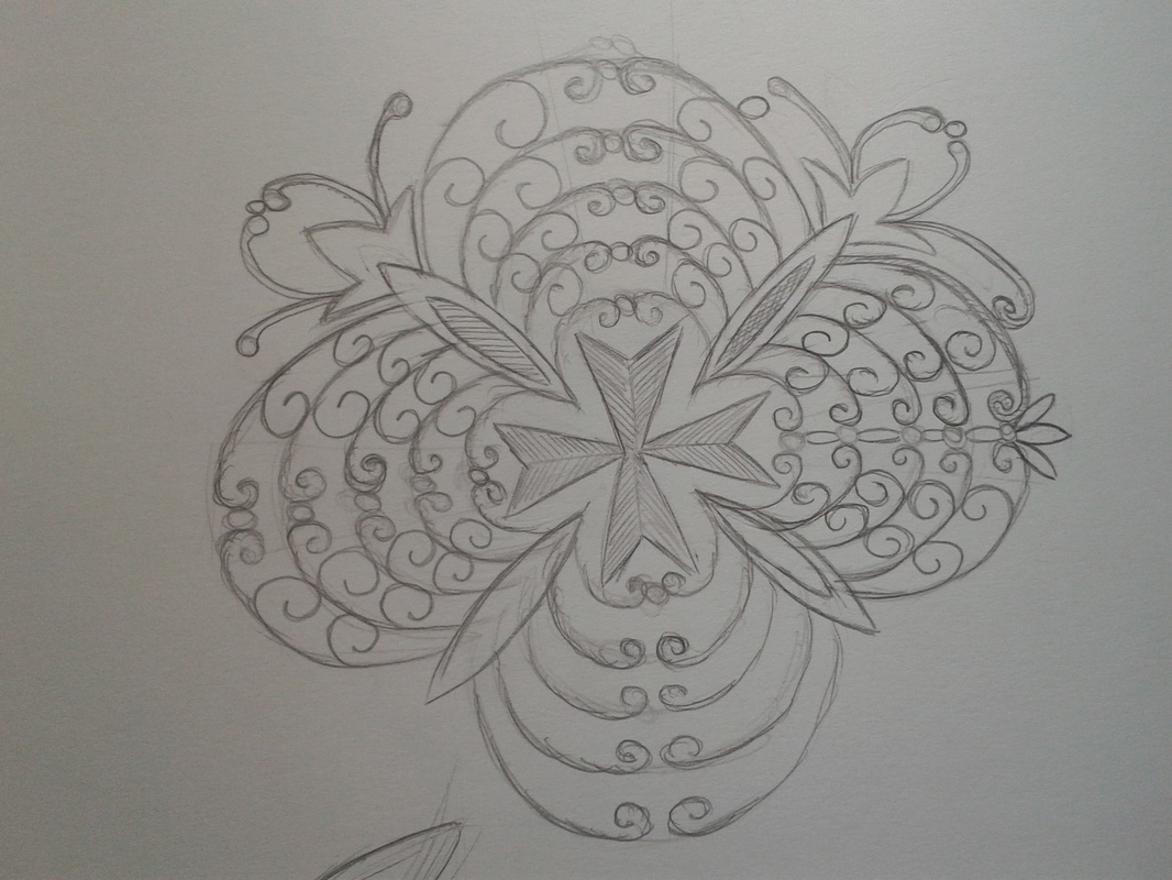
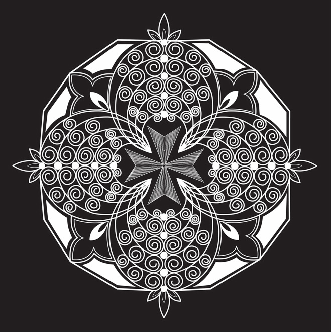
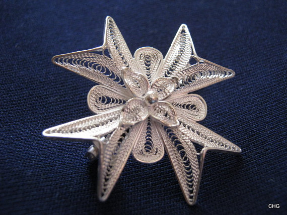
Maltese jewellery and palace petters inspiration Lace
|
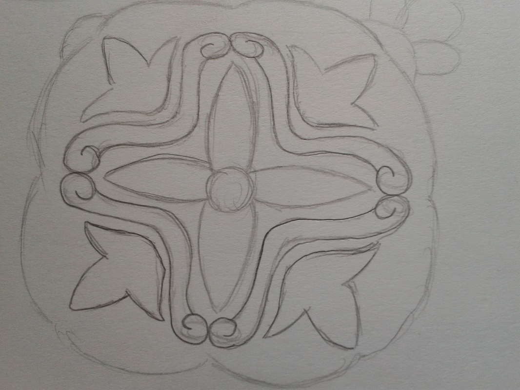
For doing and coming to this concept I was inspired by the maltese jewellery where I tried to introduce the feeling of the metal Maltese cross so than when it changed in the door knoker the transition and effect will come better.
In this lace I tried to outcome the Maltese culture and identity through the design and the petter. |
|
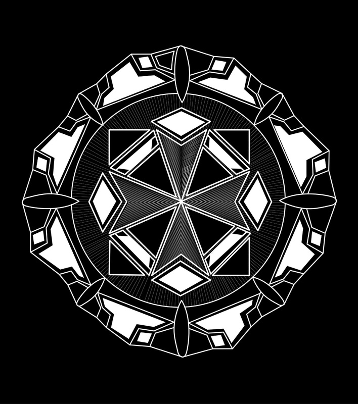
Palace tiles Inspiration Maltese snow lace
|
My main inspiration in these Lace it was the tiles that are found in the palace floors, here I tried to maintain some characteristics from an actual snow flack.
|
|
How they looked
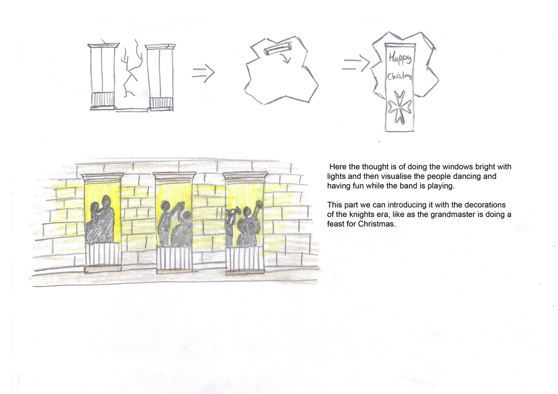
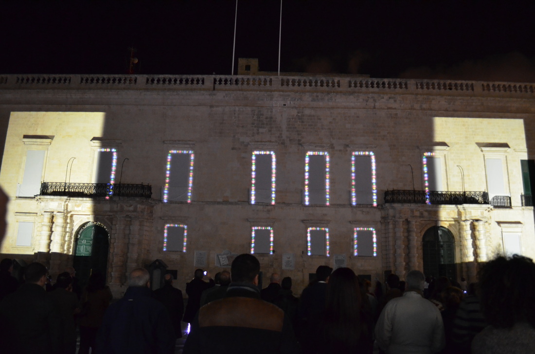
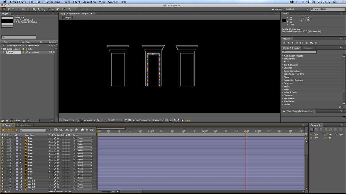
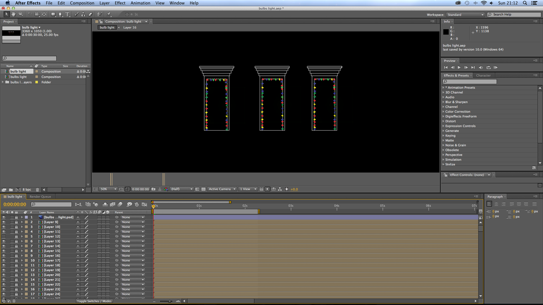
Glowing lights between scene two and three
|
Mr.Camilleri mentioned that between scene
two and three there was a long black out which looked a bit boring so Mr.
Camilleri suggested to introduce some bulbs round the windows of the Palace, so
as an introduction for the next scene of the elf factory . So i offered my self to do them.
The first thing that I made was to see how the real bulbs looks and how do they illuminate and the feel that they gives. So by seeing real bulbs I tried to make the bulbs looks closer to the real once, than an other analysis that I made was the common colour that are used in Christmas bulbs and I found that the colours of blue, green, red, and yellow bulbs are used the most than the second colour that is most used in Christmas bulbs are the yellow golden colour which is more classical then the other once. So I created two types of bulbs one with traditional bulbs coloured in different colours and an other one which are made with several golden circles that create the feeling that there are glitters or beams of light around the windows. The bulbs were created in illustrator, so to eliminate the problem of pixies when the scene is enlarged or arranged. Each set of bulbs (the once on each window and balcony) were given the same colour so when projected they will look all the same, than after applying all the bulbs on all windows on the Palace façade template, I started animating them on After Effect were |
here each set of colour bulbs was given a opacity effect and a glowing effect, (it is important to know that all be bulbs were never given 0% of opacity because bulbs are made from coloured glass and they will always be visible a little bit when the other colour bulbs are glowing) than for the glowing effect I used the options of effects, stylise and than glow affect. I started animating the glow by reducing and increasing the glow threshold, glow intensity, glow radius (were here I made the glow looks in different sizes of circus) and the glow intensity. With the glow effect I made two different colours glowing to getter and other two glowing when the others are dimed and by doing this I created an effect, which looked more like real bulbs that we use in our decorations.
I went to show them to Mr. Camilleri, and he chose the traditional coloured bulbs because he sad that they were more close to the real once and to the colours used in the Santa and elf factory, than the only suggestion that he gave was to leave some different spaces between the bulbs (the distance from one bulb or three bulbs or more have to be unformed) so the bulb set will look more sustainable with the reality. |
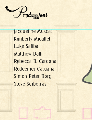
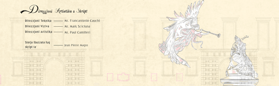
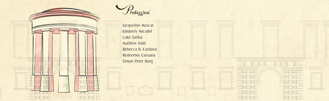
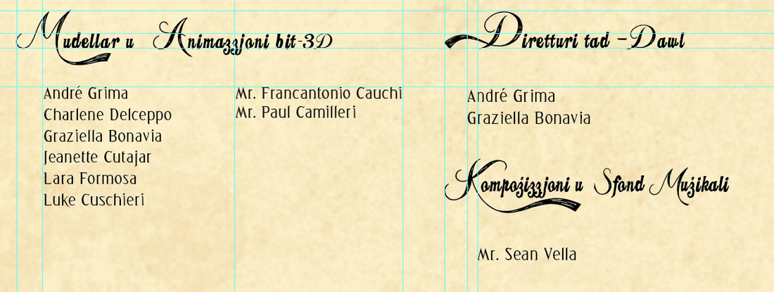
End credits for the projection mapping
|
For the credits I made some research to find how they have to come in order and in sequence.
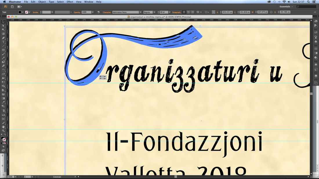
Closing credits in order of how to come Director Writer(s) Producer Executive Producer Lead Cast Supporting Cast Director of Photography Production Designer Editor(s) Associate Producers Costume Designer Music Composer Casting Director Unit Production Manager First Assistant Director Second Assistant Director Full Cast / Character List Stunt Dept Production Departments (Grip, Electric, Camera, Sound, Wardrobe, etc) Post-Production Departments (Assistant Editors, Visual Effects, Colorist, etc) Song Credits Caterer Title Designer Special Thanks Camera, Lenses and Equipment Makers Location of Final Sound Mix ("Recorded at...") Copyright © Disclaimer these credits are the most ones that I found similar to other credits and are taken from (http://hellocoolworld.com/files/TheCorporation/completecredits.pdf ) Some times the credits change from one production, film, movie and projection but they are always viewing the same information in all credits. For the credits I had to find the right typography with a good anatomy and a clear to be seen from a distance. So at this point I started experimenting and transforming different fonts that I downloaded from the internet to see which best fit together and which are the best to be used for the projection mapping credits . Here is a list of all the fonts that I found: Admiration Pains, Allura Regular, Angle, Bodoni bold and roman, Candy, Commercial Script, demo Coneria Script, fat tats, Greeb, greeting, pacific, Goudy thirty light, Lauren Script, My Skinny Jeans, The Dream Trial, Tangled, Waterfalls. |
Than I tested every font on the Palace façade template by writing them in higher and in lower case to see how the letters change so to find the best font that matches with the team of the projection and to be sustainable with the architecture of the Palace and with the art work background of the credits. So after several experiments for the right font I chose; · Admiration Pains This font is a font which is difficult to read when it is lower case but than in upper case it has some nice curly letters which they can be used for the uppercase of the titles. · Candy is a font which gives the feeling, like it is sketched by hand and its ideal to be viewed with the illustrations made for the credits and in which they compliment more the building. This is a lowercase font, which I think it is best used for the titles. · Greeting Greeting is a more classical font but at the same time it matches and can be merged with the other fonts and stay sustainable. This font was chosen to be used for the names (the body) of the credits because it has a good anatomy and the letters can be recognised well from a distance, because of its x-height and the thickness and narrowness ages of the letters. So the first two fonts were merged to getter to create one font by using Admiration Pains as the upper case letters than the Candy was used for the rest of the titles of the credits. Greetings was used as the font for the body of the credits, because of its good anatomy and because it is viewed well from a distance. |
When testing and merging fonts
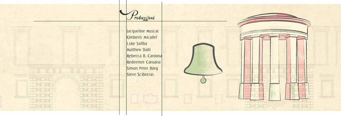
Layout for the End Credits
|
Layout is important because it makes things look polate and in order so we had to have a good laytout for the credits, but there was a problem because the credits were going to be projected on the façade which was full of windows and architecture decorations. So we had to pay attention to project the typography only on the parts that is viewed well. So the only divergence/solution that we had to take was to create a layout between the windows so all the words of the credits are visible.
|
But this solution wasn’t that easy because there was a lot of information to put under every title. So I tried reducing the size of the font but without sacrificing the legibility, than I tried to do other layout and by experimenting with different layouts and introducing the text to see how it fits than finally I came up with the final layout that enabled me to introduce all the information on one space.
|