I started off by researching other manifestos, primarily I started off by looking up ordinary manifestos but my research led me to more adventures manifestos.
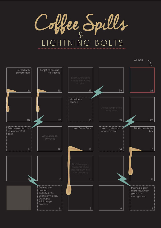
In this task I came up with the idea of having a manifesto with the same concept of the classic game snakes and ladders. This idea was mainly derived from the deadline stress I had during the time of production. The coffee spills represent the negative aspects while contrary the lightning bolts represent the positive aspects.
I researched some current trends to make sure that the poster is contemporary, colour schemes, typography and calendars to observe different layouts.
To design the poster I chose a dark background for the information to pop out. The random notes were in a darker shad than the prominent ones since these lead you to nowhere. To the lightning bolts and coffee spills I went through a short development. The aim was to give a good idea of what they are but at the same time not be over powering and create clutter on the artwork.
This manifesto is great for the students of graphic design. We give important information and share what design means to us in a fun way. It would be more fun if this artwork is printed in a size where the audience can actually stay on rather than placing a silly object on the box making it more immersive.
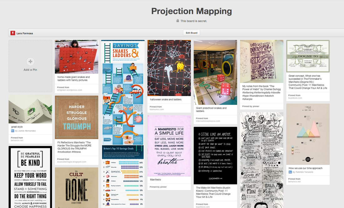
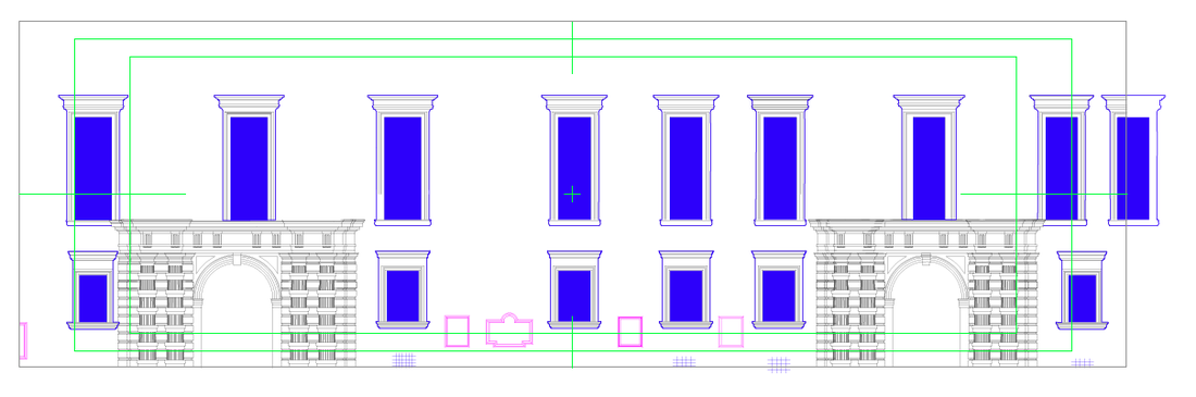
http://www.pinterest.com/laraformosa/projection-mapping/
In this task I came up with the idea of having a manifesto with the same concept of the classic game snakes and ladders. This idea was mainly derived from the deadline stress I had during the time of production. The coffee spills represent the negative aspects while contrary the lightning bolts represent the positive aspects.
I researched some current trends to make sure that the poster is contemporary, colour schemes, typography and calendars to observe different layouts.
To design the poster I chose a dark background for the information to pop out. The random notes were in a darker shad than the prominent ones since these lead you to nowhere. To the lightning bolts and coffee spills I went through a short development. The aim was to give a good idea of what they are but at the same time not be over powering and create clutter on the artwork.
This manifesto is great for the students of graphic design. We give important information and share what design means to us in a fun way. It would be more fun if this artwork is printed in a size where the audience can actually stay on rather than placing a silly object on the box making it more immersive.
http://www.pinterest.com/laraformosa/projection-mapping/


 RSS Feed
