Scroll down for the latest updates....
Past MCAST Art & Design Exhibition (2012)
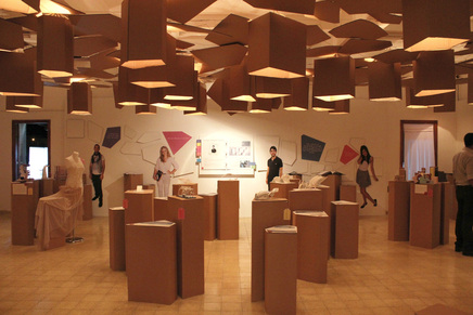
This is a section from the
MCAST annual exhibition in 2012. In the room there is not much light and
it is a pity, since the exhibition design is very interesting. The
display boxes in the middle do not have the same height and that creates an
interesting effect. The wall design is also eye catching and I like the
figure photos. They will make exhibition visitors walk towards
them. The material used is cardboard or wood. It is not that ecstatically
pleasing since it could have been painted. On the other hand it is very
economical.
I'm still trying to discover my position on my own artwork and hopefully at this exhibition someone will come and tell me. I'm open to listening to criticism.
Graham Coxon Read more at http://www.brainyquote.com/quotes/keywords/exhibition.html#4SW3l0BCC2Llsuk5.99
Interactive Robotic Exhibit - BMW
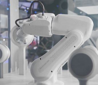
Interactive exhibit: This robotic Exhibit displays real material samples with the help of real-time driven microscopes at the robots tool. The user decides which material he wants to explore and controls the zoom factor and the position of the microscope. Additional animated illuminations on the ground area visually connecting the user interaction point with the selected material.
The MESO-Team: Sebastian Oschatz, Nils Buhlert, Katharina Mayrhofer, Nikos Mechanezidis, Johannes Lemke, Johannes Scherg, Jannis Kreft, David Brüll
Click Link for Video: https://vimeo.com/32265426
The MESO-Team: Sebastian Oschatz, Nils Buhlert, Katharina Mayrhofer, Nikos Mechanezidis, Johannes Lemke, Johannes Scherg, Jannis Kreft, David Brüll
Click Link for Video: https://vimeo.com/32265426
Ideas
These ideas were discussed in class between me, Christine, Lindsay and Jacqueline:
Ideas
Moving images: Popcorn can be served before entering the hall to watch the moving images exhibit work
Fashion show: After costumes being exhibited live on cat walk, a short movie clip must be presented and placed next to the mannequins for those viewers who didn’t manage to see the show with the audience on the grand opening.
Instead of projection mapping that took place for the last few years, other suggestions like light show or laser show should be considered to vary the opening and surprise the audience from event to another.
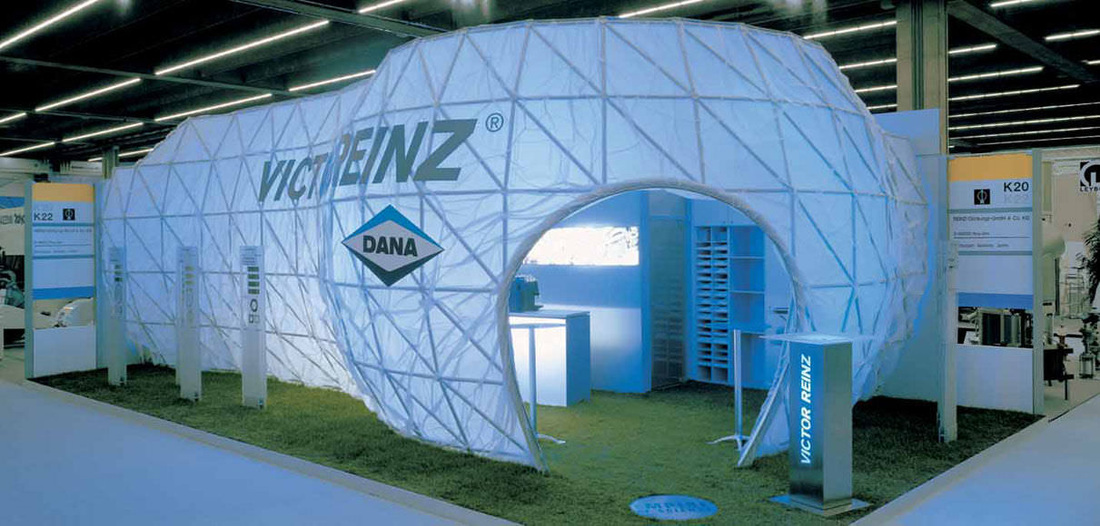
Exhibition Example 1
This exhibition looks very interesting. There are posters or images that are fixed to the wall and underneath them there is a small shelve with books standing on it. Underneath the shelf there is a description of what is hung up on the wall. On one side of the room there are also long banners stuck to the wall. There is no need of big space for this exhibition, everything looks in order and it is easy for the audience to look at the images and take a look at the displayed objects.
Exhibition Example 2
This exhibition grabbed my
attention as it is very colorful and I like colors. I think that colors make people happy and
feel better. An exhibition like this
might have more visitors as colors create a vibe. The walls are white to give more light and
the murals and boxes in the middle have colored square designs. There is also a projector in the middle of
the room, which is useful to show more images on it.
Exhibition Example 3
This exhibition display is very eye catching for me. The shelves are like sections that can separate one thing from another. To make this look more interesting the sections are not all of the same size. If I would have done this exhibition I would paint each section in different colors and make it look more colorful. In some sections, light can also be added, attached to the ceiling of the section.
Exhibition Example 4
Structure for exhibitions
This is an interesting was how one can lead the exhibition visitors. This structured 'panels' gives an interesting effect and in the same time they are leading the visitors to follow the path way.
Click link for more images: http://www.archiexpo.com/prod/mero-tsk/reception-structures-exhibitions-58120-351368.html
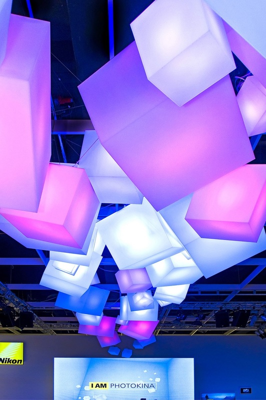
Exhibition Example 5
Illuminated cubes - #Exhibition Pavilions, Booths & Exhibits are all temporary, so should be made from materials that won’t go to a landfill. At the same time, they need to be solid, durable, lightweight and collapsible. Nice lighting effect.
Click here: blog.laqfoil.com/
Click here: blog.laqfoil.com/
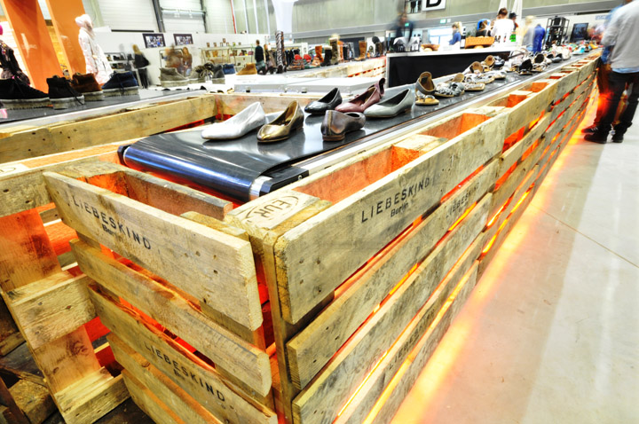
Exhibitions Example 6
PANORAMA Berlin 2013 Winter – LIEBESKIND BERLIN exhibit design #pallet #recycle
For more images: http://retaildesignblog.net/2013/03/18/panorama-berlin-2013-winter-liebeskind-berlin/
For more images: http://retaildesignblog.net/2013/03/18/panorama-berlin-2013-winter-liebeskind-berlin/
Projection Mapping Example 1
What I liked in this Projection Mapping is in its beginning. The laser effects on the outline creates an interesting vision although, in that part I think the music could have been a bit more strong. Something else I that I liked in this Projection Mapping is that not all of the tower is projected all the time, but parts of it. The stairs underneath the tower is also used at some points, which also creates a nice effect. There is also some humor in this projection where there is superman and he lifts the tower at 03:38.
Projection Mapping Example 2
This is an interesting video of laser effect in projection mapping. The laser gives a very interesting detail of the edges. This could be done with all of the school facade, not the tower only to create an interesting projection.
My alternative idea for entertainment
In my opinion fire dancers are very
interesting and entertaining, and this could be an entertaining show during the
Exhibitions opening. It is not something that we see in our everyday
life, and in Malta we rarely see these shows so for me it would be a successful
entertaining
The following videos shows an example of my idea.
The following videos shows an example of my idea.
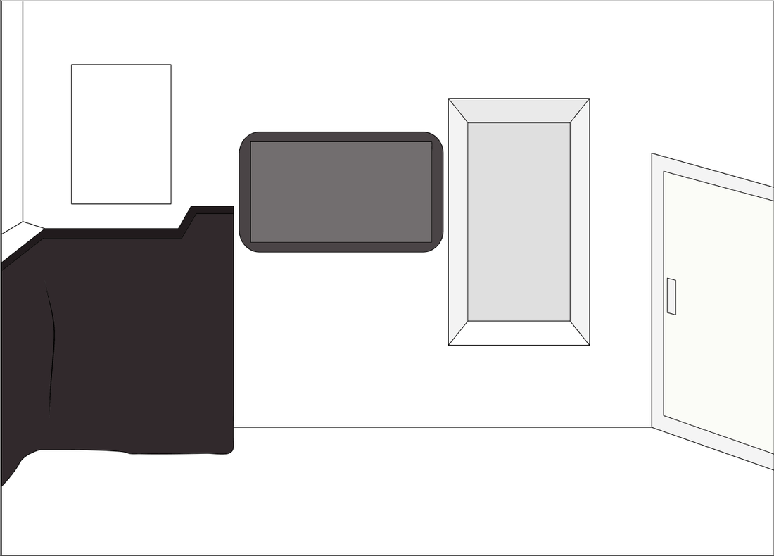
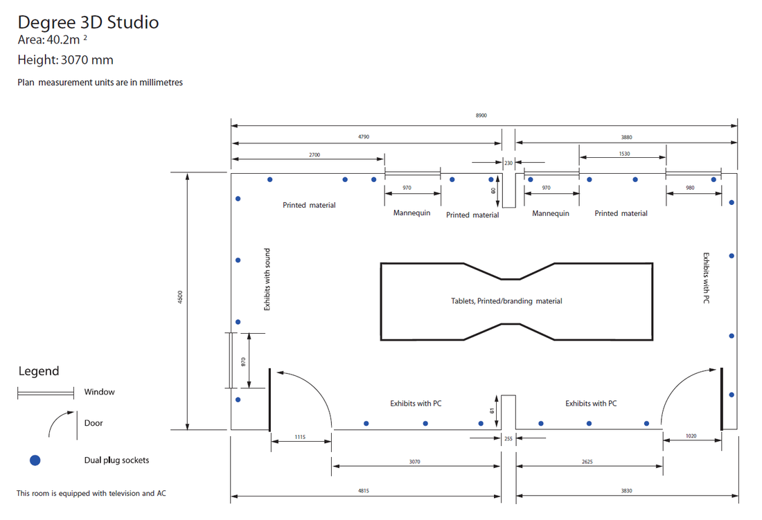
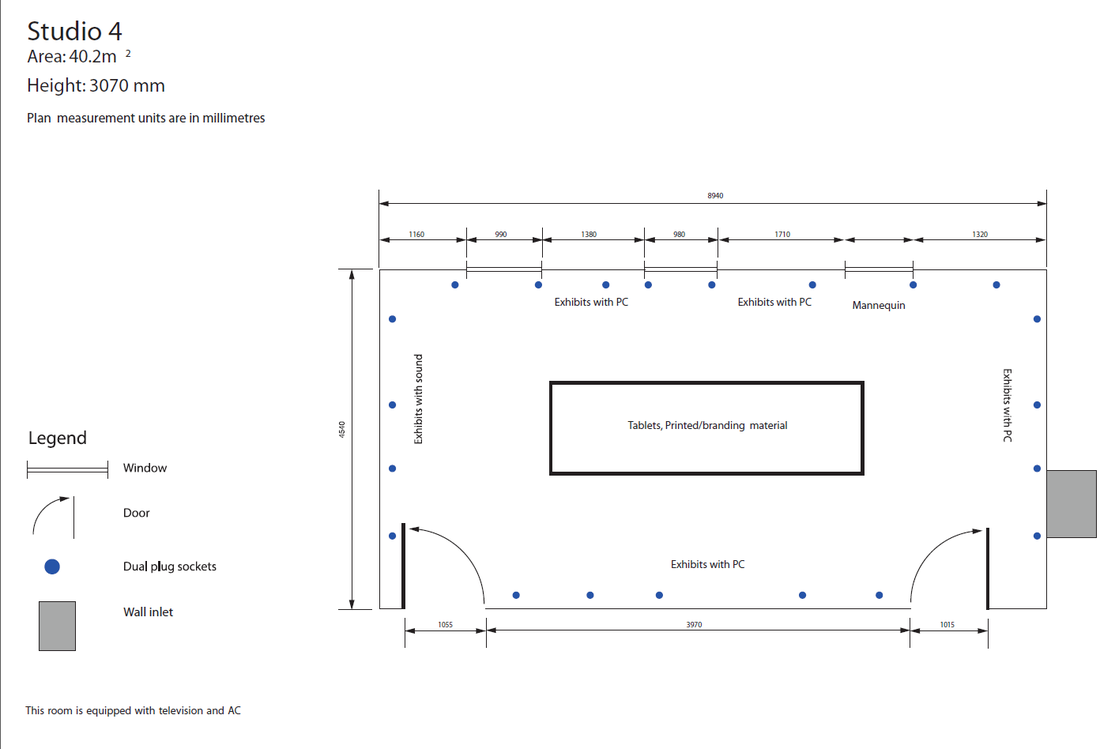
Photographic Survey of Studio 4, Degree 3D Studio & Corridor
In my opinion studio 4 and the 3D studio
are a bit small to accommodate a space for all of our course. Considering that there isn't much space my
exhibition example one (shown on top) is ideal to have posters hung on the wall
or any illustrations and underneath them shelves with portfolios. In the middle area any type of structure can
be created/built to put any other material and be used as a display area. There are two television sets provided, one
in each room. If we use them they can be
very helpful to show our Sound Design assignment on them
The corridor can also be used to hang our art works. With the aid of the corridor area the printed material can have a bigger size. The printed material that do not fit in studio 4 and the degree 3D studio can be hung up in the corridor and is visible as well. In the corridor we can also put directional signs on the wall as well stuck to the floor.
The following are photos I took for our exhibition area:
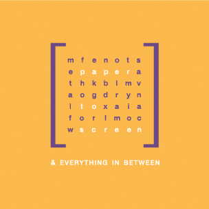
Inspirational images for the Exhibition Logo


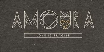
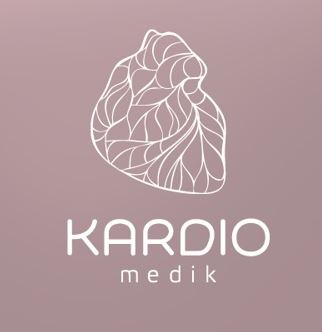
More inspiration images here:
http://www.pinterest.com/clairemarieborg/exhibition-spaces/
http://www.pinterest.com/clairemarieborg/geometrical-design/
http://www.pinterest.com/clairemarieborg/exhibition-spaces/
http://www.pinterest.com/clairemarieborg/geometrical-design/
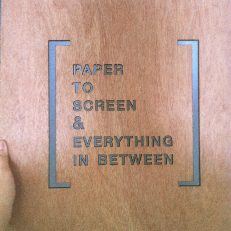
Logo Sketches
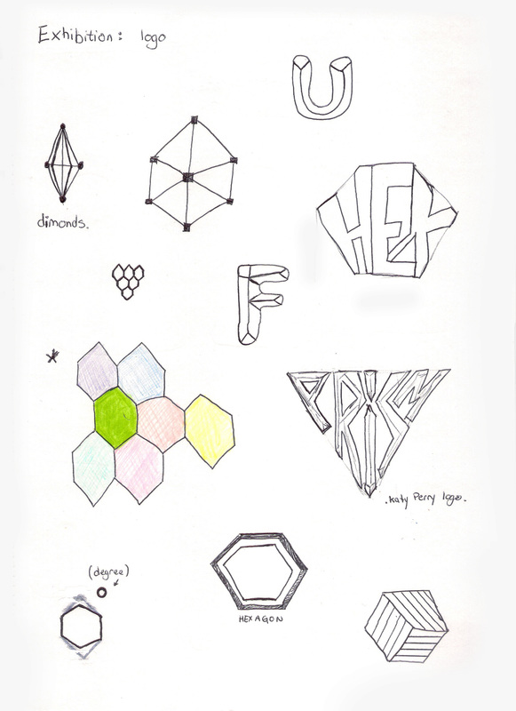
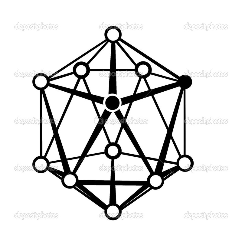
These are some primary sketches I did for the exhibition logo. The first idea was to come out with ideas related to the plexus. We also discussed to name the exhibition in Maltese, but since the Maltese language is limited in words we preferred to name it in English.
A plexus is a branching network of vessels or nerves.
The vessels may be blood vessels or lymphatic vessels.
The nerves are typically axons outside the central nervous system.
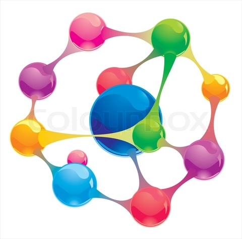
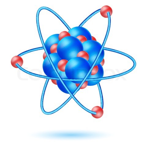
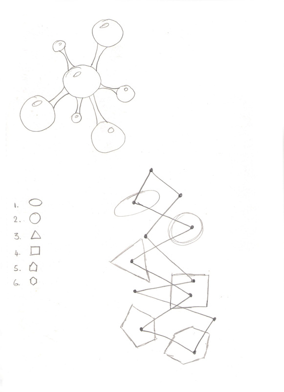
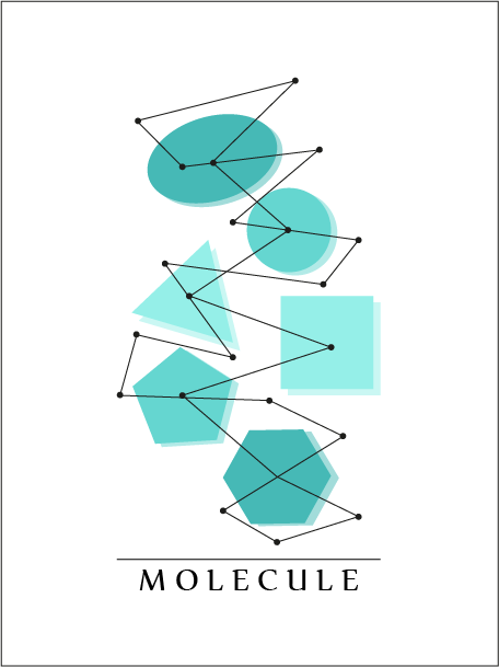
Later on we developed the idea and we named the exhibition MOLECULE. The idea behind this idea was to branch the six courses from the molecule which will have the form of atoms.
Molecules form when two or more atoms form chemical bonds with each other.
It doesn't matter if the atoms are the same or are different from each other.
A plexus is a branching network of vessels or nerves.
The vessels may be blood vessels or lymphatic vessels.
The nerves are typically axons outside the central nervous system.
Later on we developed the idea and we named the exhibition MOLECULE. The idea behind this idea was to branch the six courses from the molecule which will have the form of atoms.
Molecules form when two or more atoms form chemical bonds with each other.
It doesn't matter if the atoms are the same or are different from each other.
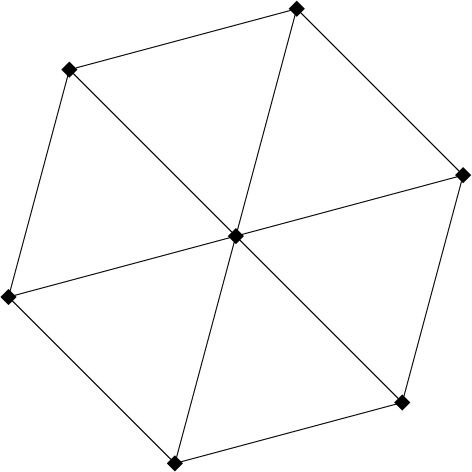
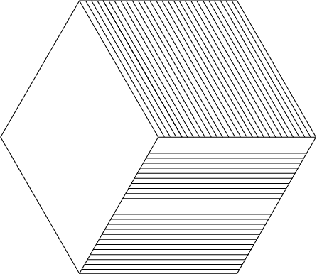
The inspiration for the logo came from the word 'Plexus'. I also did some experiments with the hexagonal shape, lines connecting to each other and forming the shape of a hexagon. After a lot of discussions, we changed our idea of inspiration to a molecule.
Logo Development (digital)
These are some experimentation I did for the exhibition logo. (including the main and the sub logos)
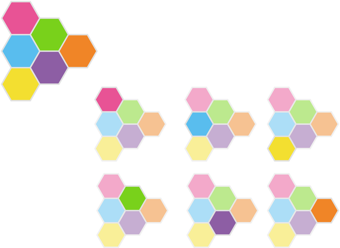
The picture above shows the main logo on the top left hand side corner. The others are the sub logos. The sub logos are the same as the main logo but only one colour for each course is bright. The other colours area faded.
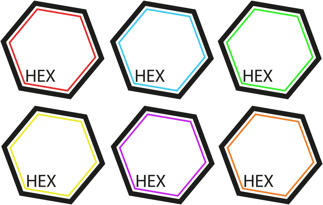
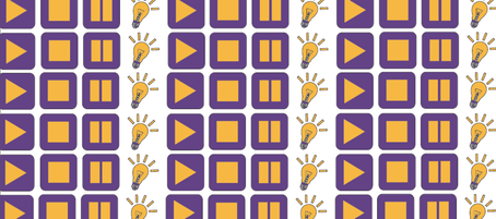
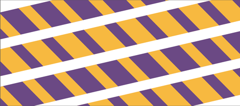
These is another experiment for the logo of the exhibition. The main inspiration is hexagons. I tried to keep a simple design, so I designed a bold stroke of black Hexagon and a lighter stroke in different colours inside the bold stroke.

These are some other experiments I did, inspired from hexagons.
This logo above I did was very similar to the one we chose finally in my group Wazijz. The foreground pattern is very similar, the background shapes was changed to 3D elements instead.
This logo sketch was similar to the one we chose expect for the shapes. I used gradient purple colours. Each different colour represents a different Art & Design course.
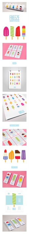
This is a brand design which I really liked. The brand is named 'FREEZE' and it makes ice-cream packaging. The illustrations are simple and interesting. It also uses contrasting colours and the shadow effect makes them look more real. The design looks very Summery.
Exhibition Space Inspiration Images
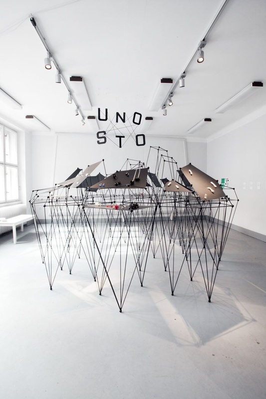
This image was very inspirational as the legs of this display are very similar to the logo MOLECULE
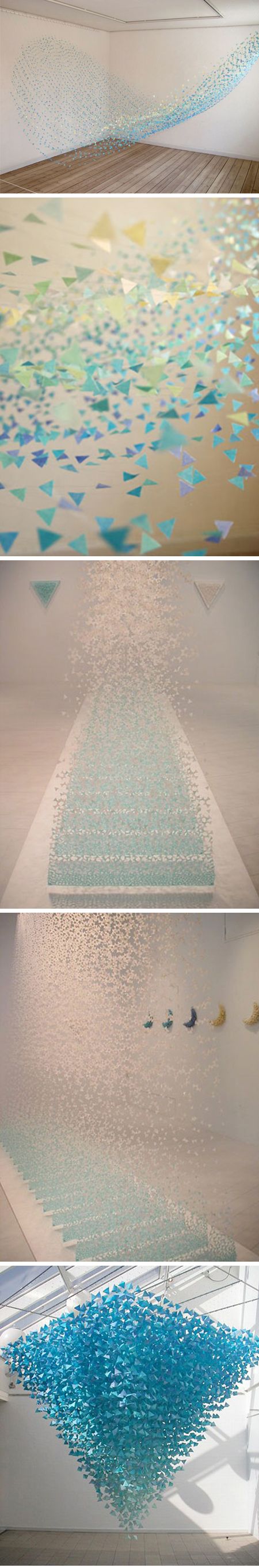
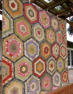
This is an idea of how we can decorate the ceiling or the plain white walls. Cut colored paper in different shapes and join them with nylon thread.
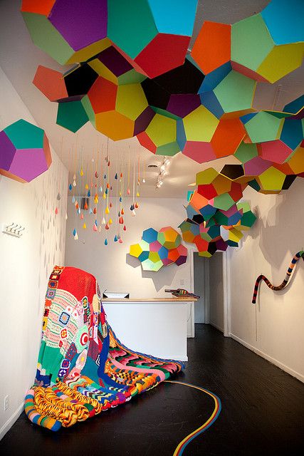
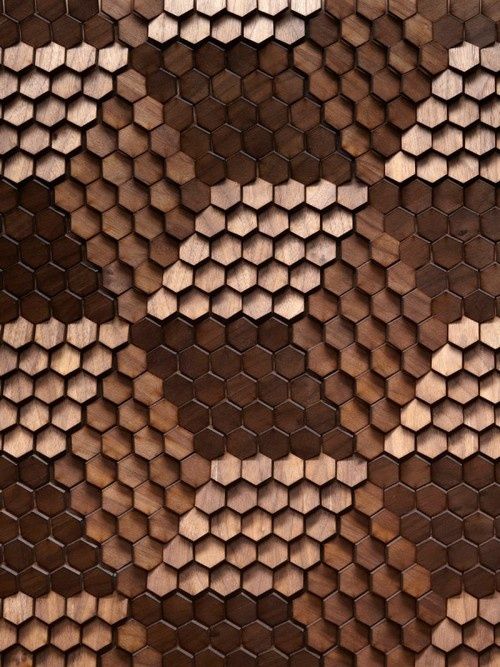
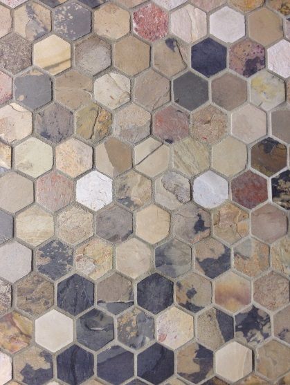
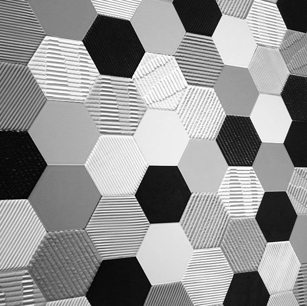
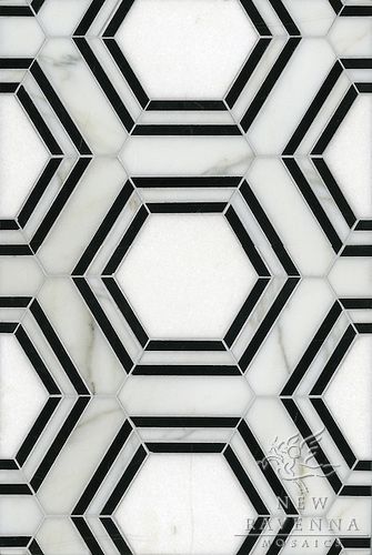
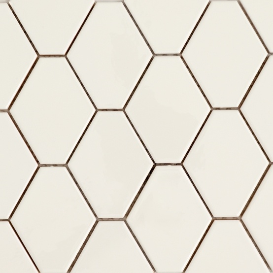
The colorful hexagons can also be an interesting theme to decorate the rooms. The shapes are also similar to the MOLECULE logo
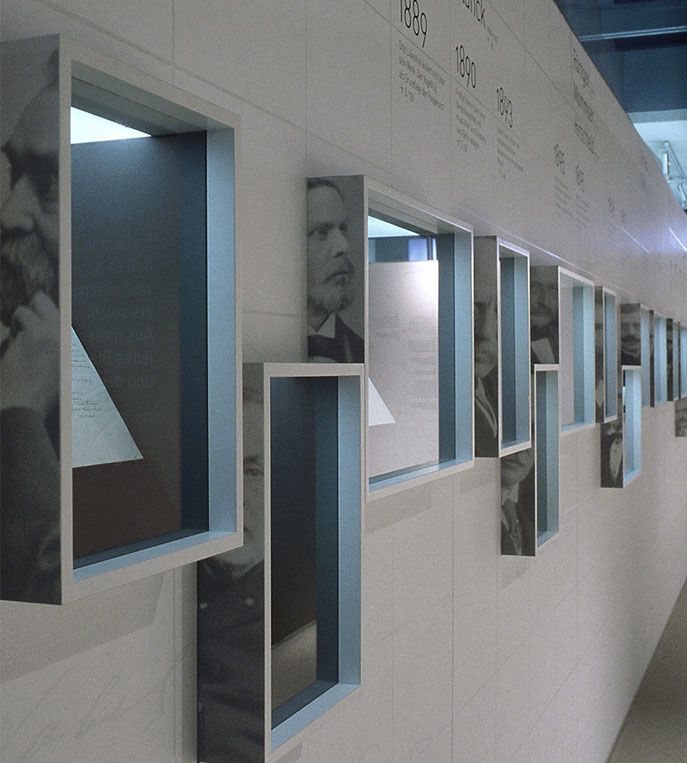
I liked this 'sectioned' exhibition space. Each student can have his or her own section with our face on the side of the section to identify each section from another.
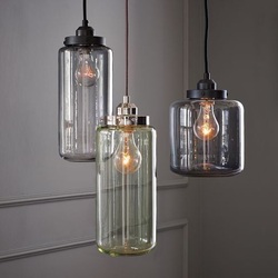
I liked these lights. They can be made of recyclable glass containers and will not be symmetrical and have all the light the same.
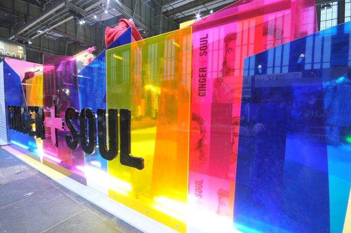
If there are sections in the room, it is interesting to separate the sections with different colored transparent plastic sheets.
These two shelving images show my own inspiration for the shelving. They are simple and cheap to do and each student can take space as much as he/she need according to their exhibiting material and products.
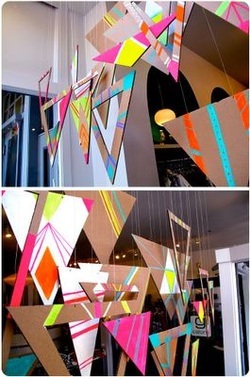
The last inspiration shows an interesting artwork that can be done using cardboard and paint and hung to the ceiling. The shapes can be hexagonal to match with the MOLECULE theme.
Exhibition Space Sketches
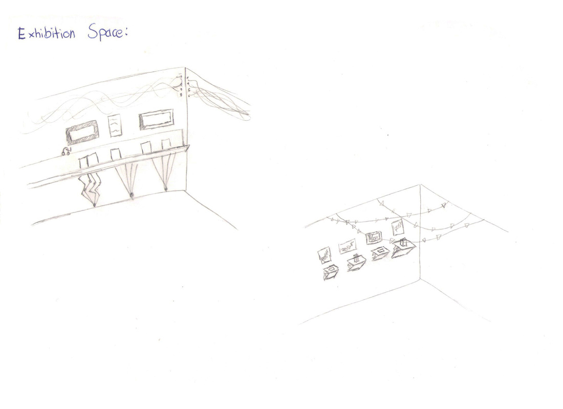
These two sketches show my initial ideas for the exhibition space. In the first design on the left hand side there is a shelf which is standing on metal rods inspired from the plexus design. On top there are designs made out of coloured tread. On the wall there can be hang screens or posters.
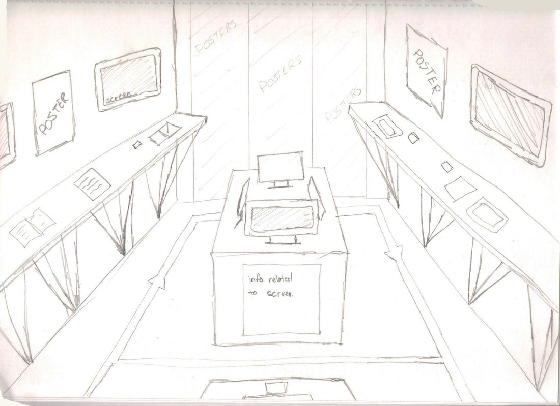
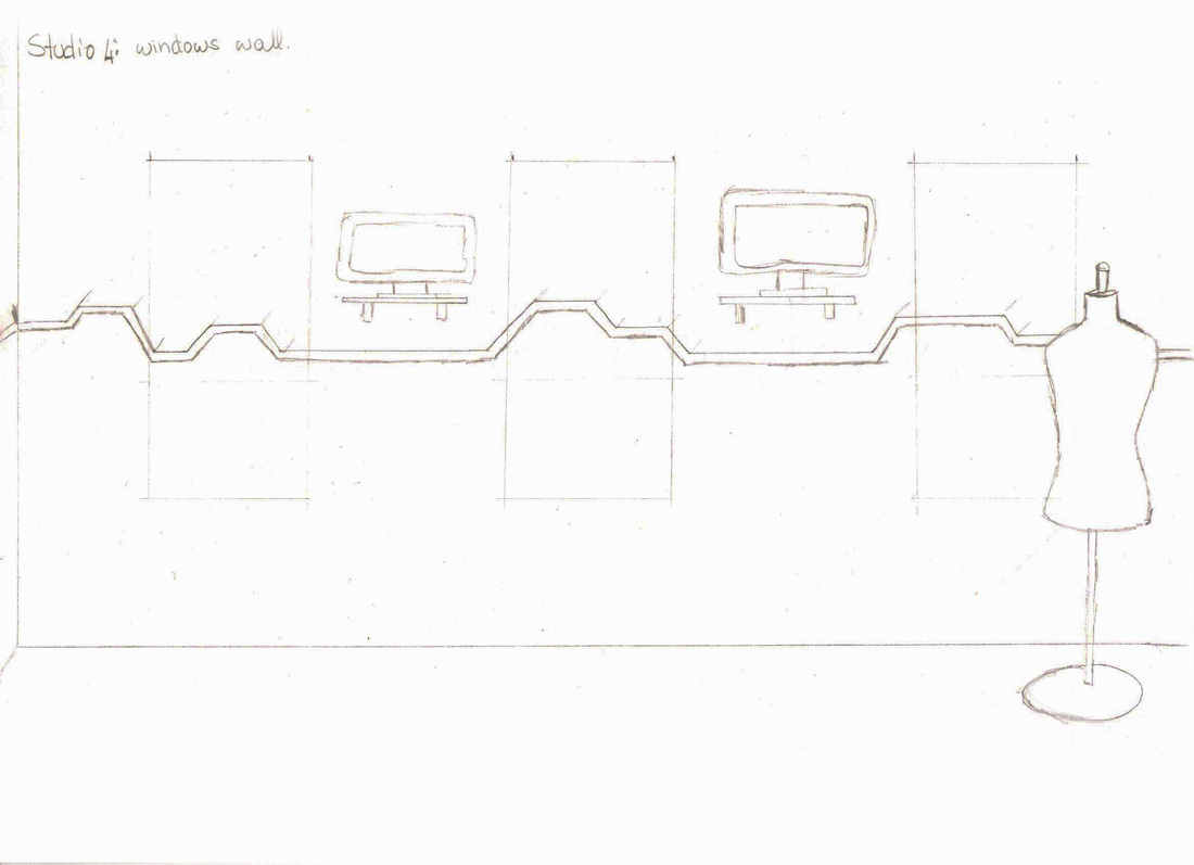
This sketch shows the first idea top view of the class room of how myself, Michela and Lindsay planed together on the classroom construction. I was in charged of sketching the layout of the class room and how it will look from different angles. I also worked in collaboration with Lorraine which was doing the 3D render of how the class room was going to look like. Shelves are on both sides of the room with posters and monitors hung on top of them. In the middle tables are made to put tablets and other student works on them. One of the walls can also have a mural of students posters.
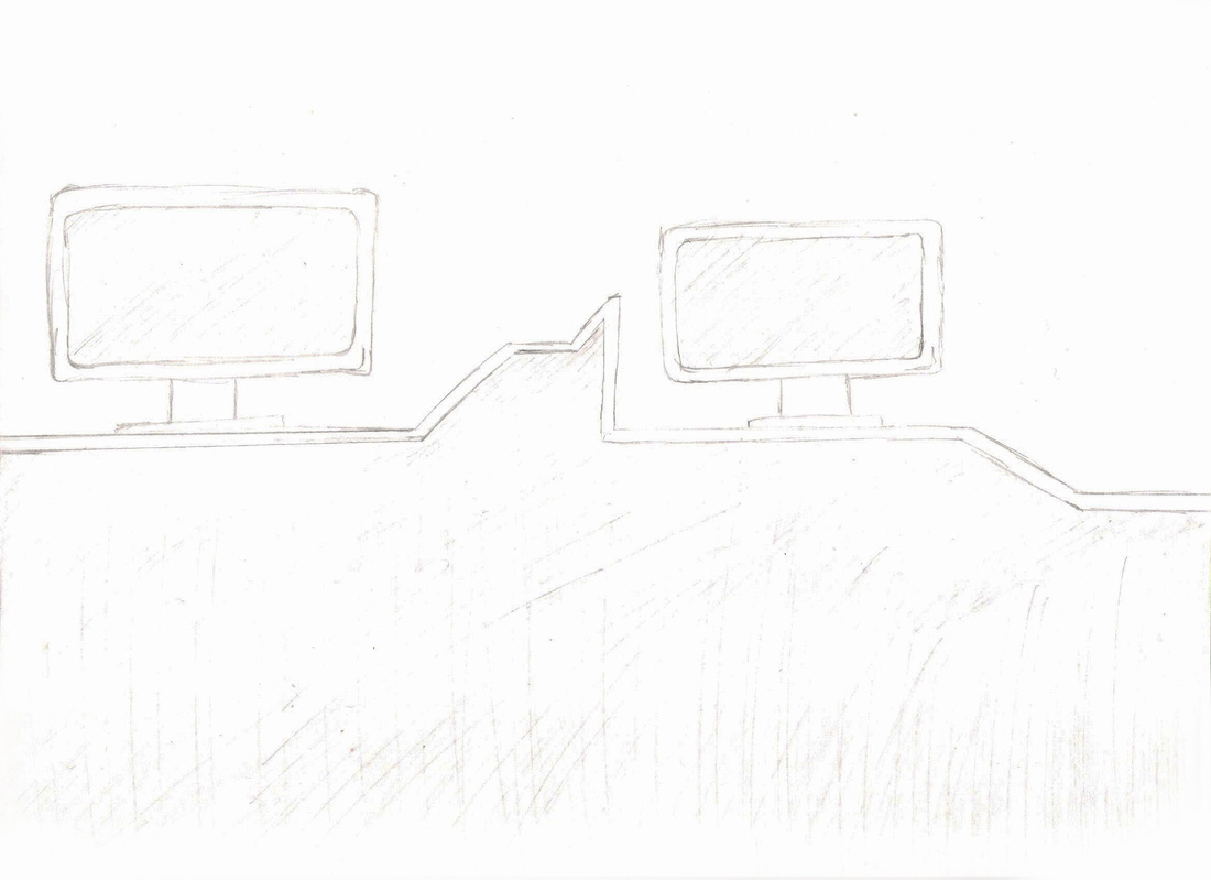
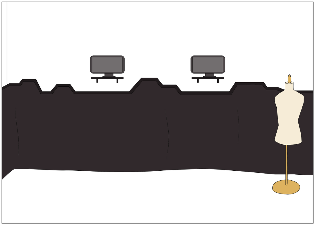
Finally it was decided that the shelves level will be uneven to match with the Molecule logo design. From the shelve upwards the room will be painted white and from the shelves under black material/fabric will be attached to the shelf to cover the computer towers etc... Like this the room will look 'divided' into two; the floor area and the ceiling area.
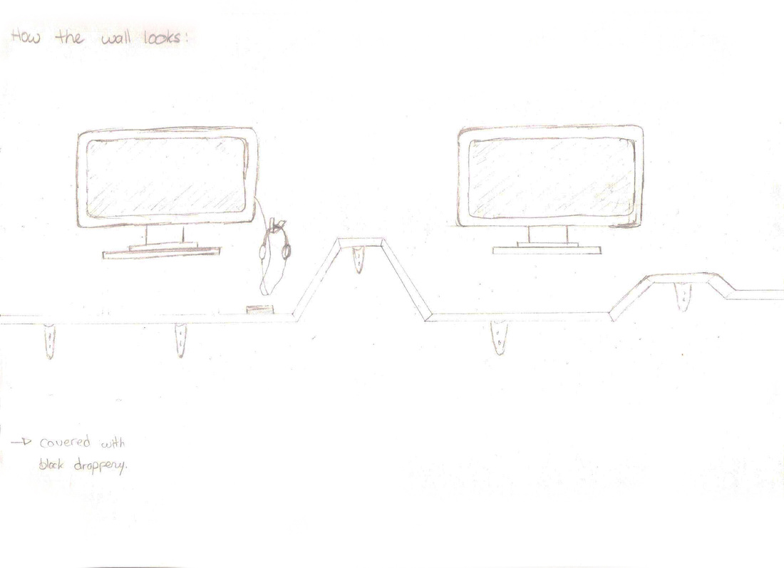
This sketch shows how the shelves are going to be fixed to the wall from underneath the black fabric using wall brackets.
The windows will be covered to make the wall look even and more clear. The wall can be covered with starched white fabric to match the wall color.
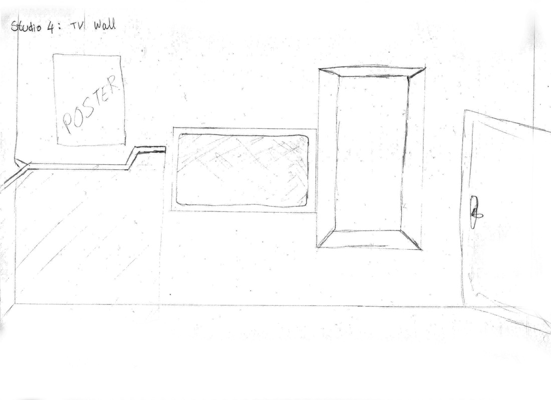
The TV can stay in the same place to view our Sound Design assignment on it
Room Plan Illustrations
These illustrations shows how the classrooms should look.
Room Plans
Plan view of how the rooms will look and each area sectioned
Task 3 - Preparing for the Exhibition
Design and Print Team:
Claire Marie Borg | Lindsay Aquilina | Michele Vassallo | Michela Mifsud | Shirley Mallia | Jacqueline Muscat
Roles:
1. Branding Guidelines
2. Poster Templates
3. Quotes for printing
4. Give away ideas
5. Booklet / Leaflet
6. Producing Merchandiser work
As a group we immediately started working on the most important things. First the logo color schemes for every course were finalized.
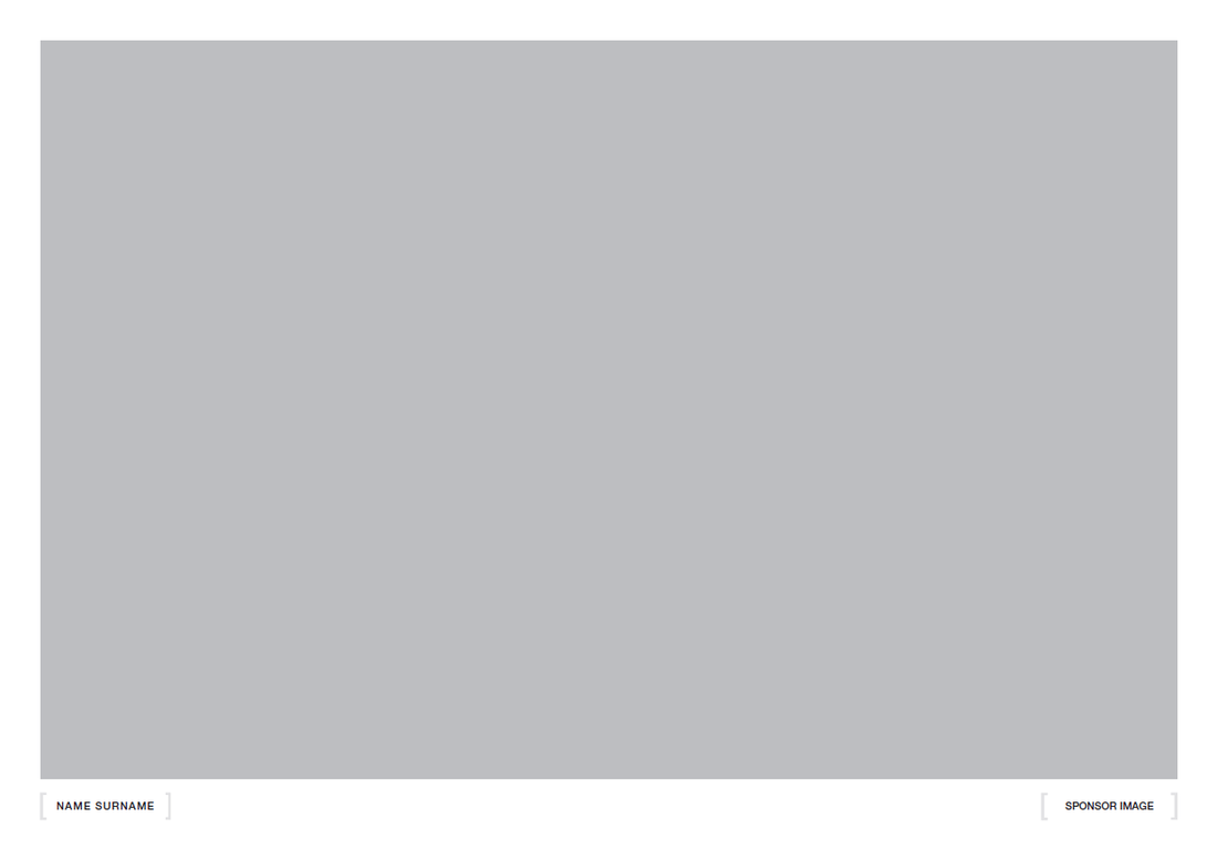
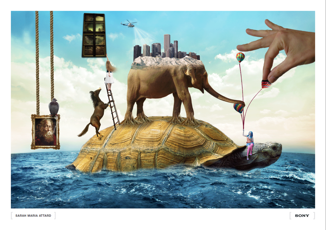
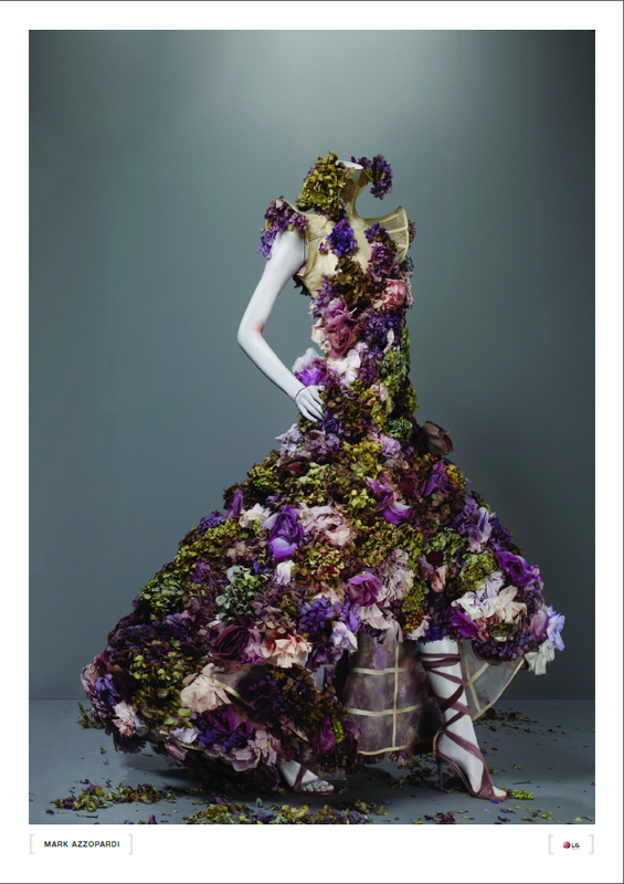
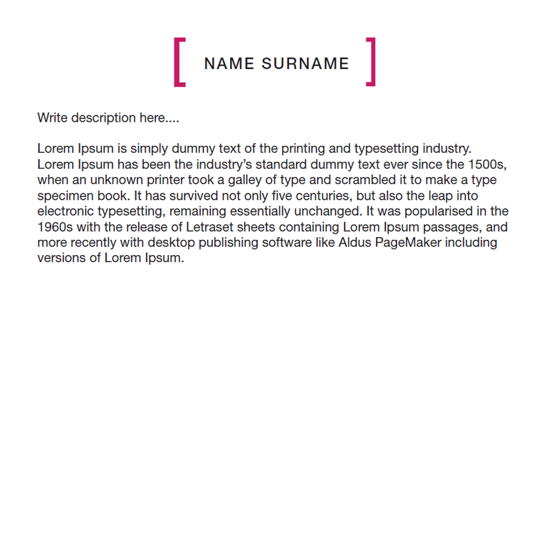
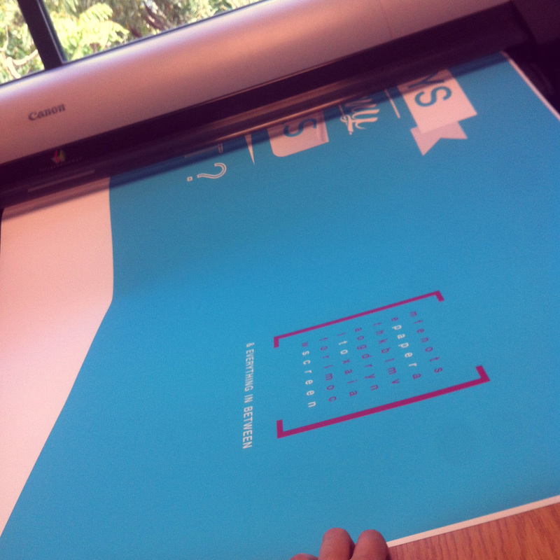
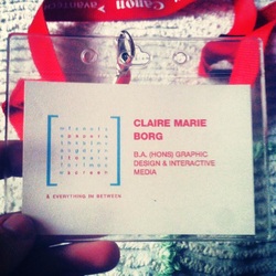
I was in charged in doing the templates. The Templates I did for now are A2 and A3 posters both horizontal and vertical. The poster has a border of about 20mm wide all round and a space between the brackets to place the students name and sponsor if needed. The bracket color will change according to the course color scheme
Claire Marie Borg | Lindsay Aquilina | Michele Vassallo | Michela Mifsud | Shirley Mallia | Jacqueline Muscat
Roles:
1. Branding Guidelines
2. Poster Templates
3. Quotes for printing
4. Give away ideas
5. Booklet / Leaflet
6. Producing Merchandiser work
As a group we immediately started working on the most important things. First the logo color schemes for every course were finalized.
I was in charged in doing the templates. The Templates I did for now are A2 and A3 posters both horizontal and vertical. The poster has a border of about 20mm wide all round and a space between the brackets to place the students name and sponsor if needed. The bracket color will change according to the course color scheme
Template Examples:
Helping Students with other Templates
Later other Courses began to give specific measurements for the templates so I did these templates according to their needs. As a Design and Print team we were helping most of the students especially Foundation student to place there images on their posters and arrange the name between the brackets according to the brand guidelines. We also helped Media students placing their music video poster on the provided template.
The following images show other templates I did:
The following images show other templates I did:
P2S_Template_Portrait_600mm x 900mm_grid
This was used mostly by the Foundation courses which later was exhibited in the corridor near the textiles work shop.
This was used mostly by the Foundation courses which later was exhibited in the corridor near the textiles work shop.

P2S_Template_Portrait_A2_Group
This template was used mostly by Media Students were they had group work assignments and had to place more than one name on the poster.
This template was used mostly by Media Students were they had group work assignments and had to place more than one name on the poster.
P2S_Template_Label_15 x 15_Fine Arts
This template was requested via email by the Fine Arts students. They needed this label 15x15cm to be placed beneath their art work with its description.
This template was requested via email by the Fine Arts students. They needed this label 15x15cm to be placed beneath their art work with its description.
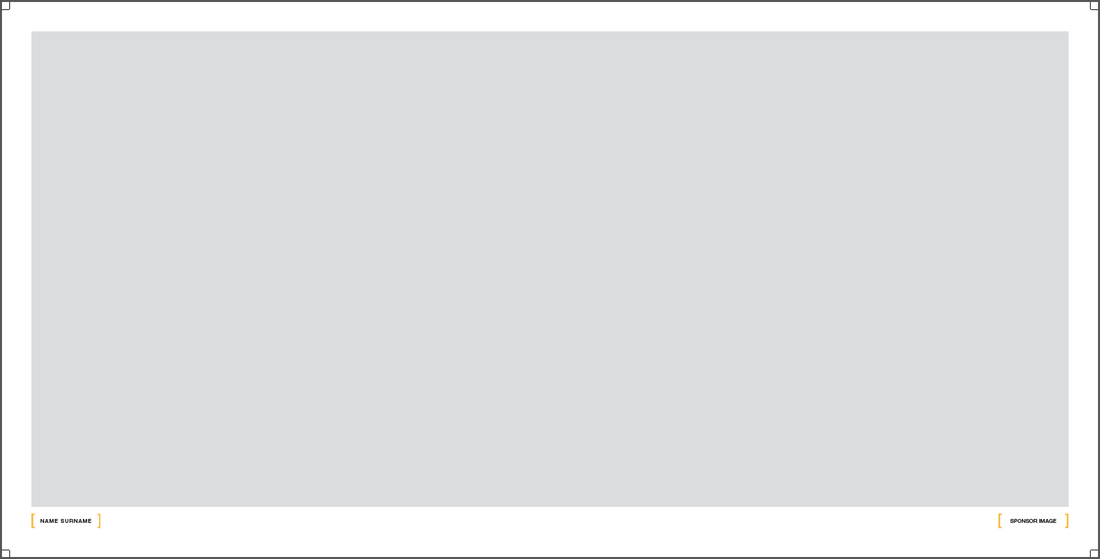
P2S_Template_1000 x 500_3D BA (HONS)
This template was requested by a Degree course to place images on it.
This template was requested by a Degree course to place images on it.
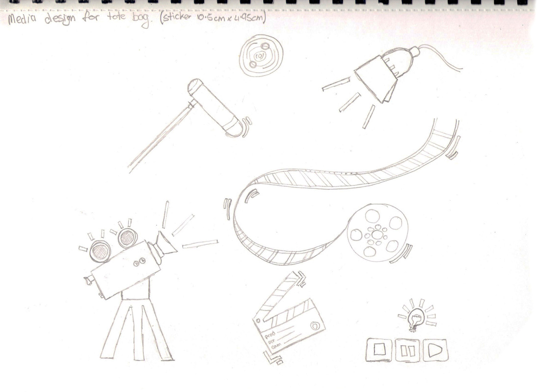
Design for tote bags
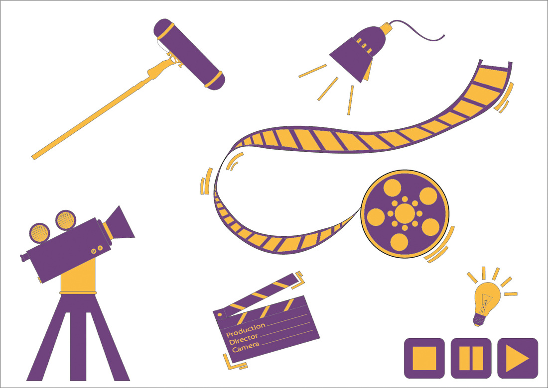
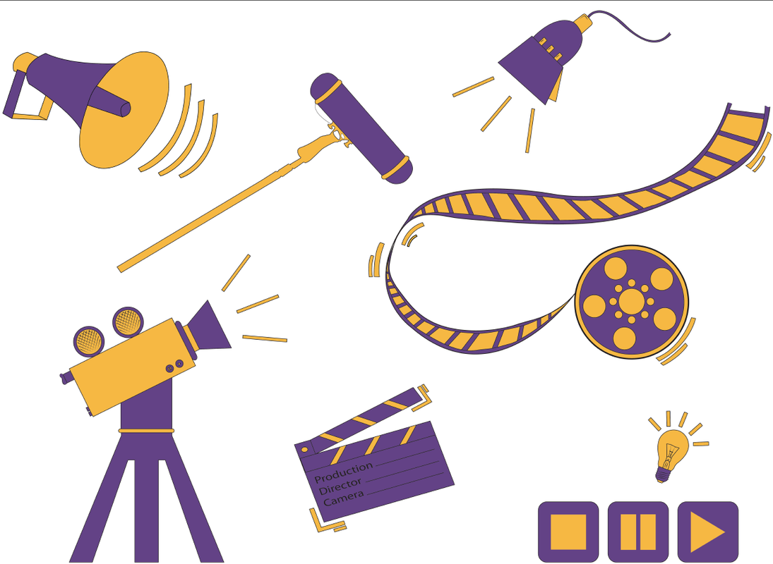
Since we were six in the Design and Print team we took 1 course each to design an image for the tote bag. I chose the Media // Moving Image course. In the design I did I designed the most important elements used in media and placed them together to form a hole design.
Logo colors for the Media Design
Sketch
First Design
Improved design
Second Design - elements shown on a film reel
Sticker Design
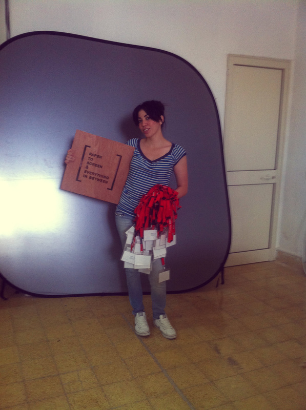
To make the visitors visit all of the exhibit rooms we designed stickers which every visitor can collect and at the end he/she will be given a freebie as a thank you gift for visiting the exhibition. I designed the Media sticker.
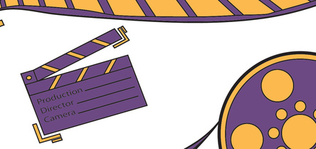
These are a few designs I did for the sticker:
These are a few designs I did for the sticker:

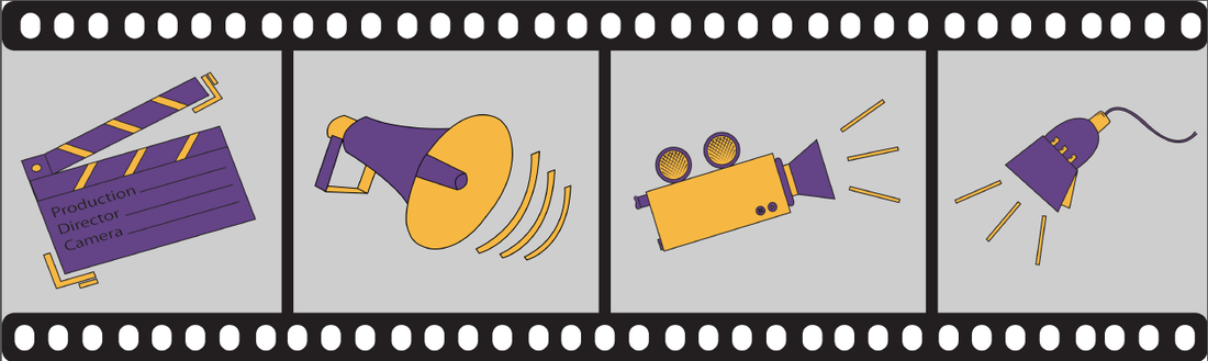
The chosen sticker - pattern inspired from film reel
|
This poster was done by the promotion team. I helped them in the layout by arranging the text and brackets according to the brand guidelines.
|
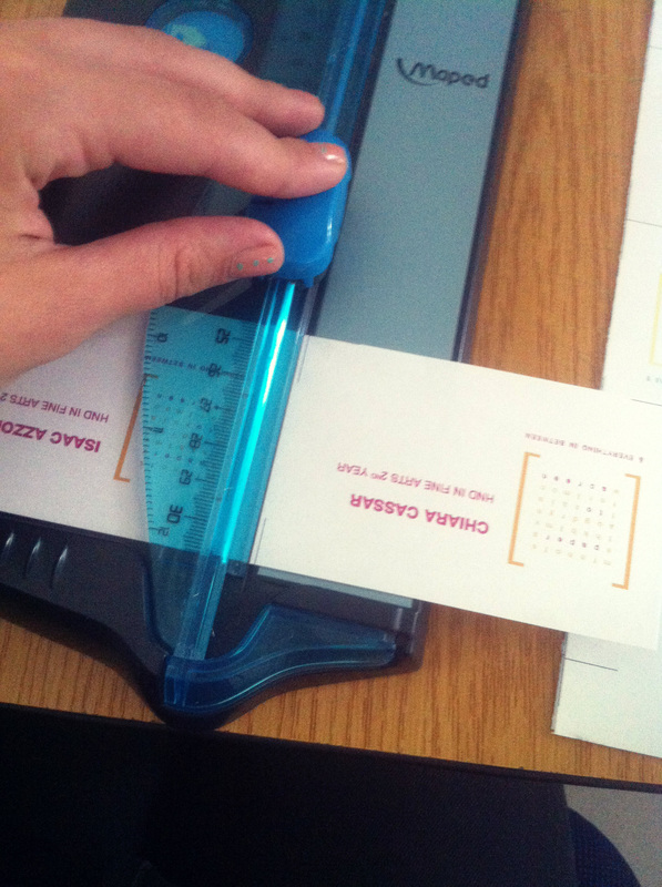
Work at hands
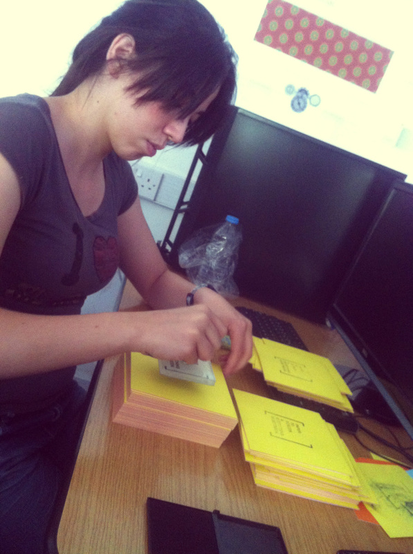
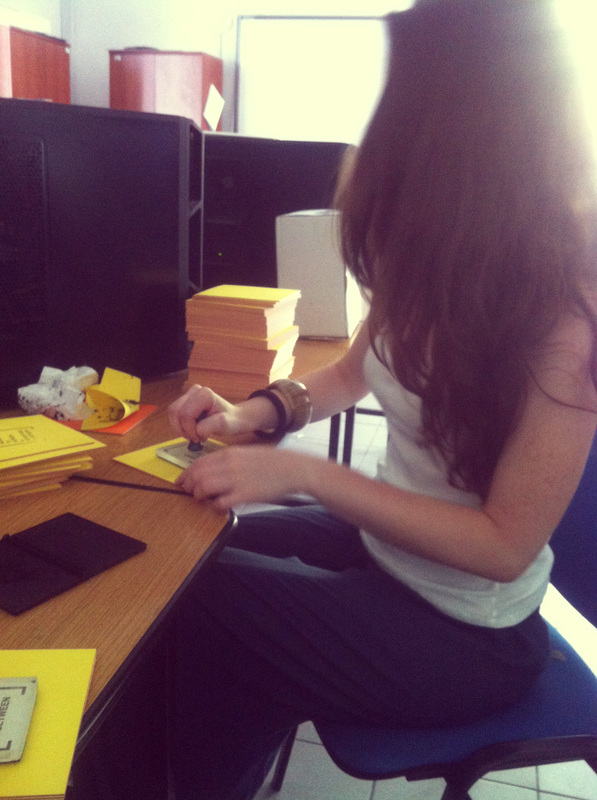
After working on the Design and Print aspects and researching for quoted it was decided to print the tags at school and cut them ourselves. The tote bags had to be sprayed one by one by us and we ordered the stamp to print it in the note pads.
|
Cutting the tags. This took us about 3 days to finish them all as we had over 1,500 to be cut.
|
The template was cut at the wood workshop. Me and Lindsay found the help of Mr Pace Oshay for this to be done for the team.
In total I sprayed around 250 bags which took quite a long time since after every seven to nine bags I had to stop to clean the stencil from paint, since the letters were becoming covered with spray.
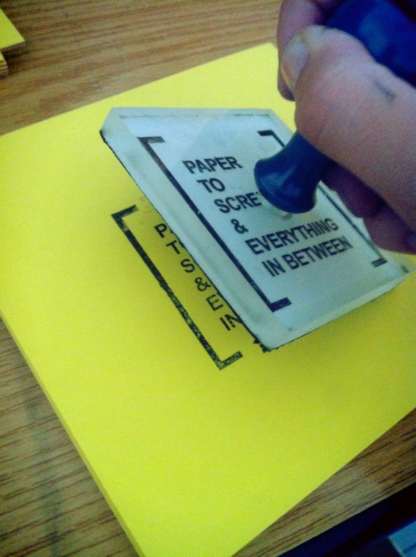
Together with Lindsay we printed over 1,500 stamps on the notepads
I found the stamps quote from Portelli Rubber Stamps in Valletta which gave us an affordable price.
I found the stamps quote from Portelli Rubber Stamps in Valletta which gave us an affordable price.
|
|
|
Before distributing the tags....
|
|
|
Helping the promotion team printing the table stands design....
|
The burger I bought from the BBQ day which was held as fundraising for our rooms exhibition costings
Although a lot of work had to be done this was a great experience. As a team we worked well together as everyone had a role and we focused on different aspects of Design and Print.
As I sad before we started working from the very beginning by finalizing the logo colors and providing poster templates. I was constantly producing different templates for different courses. To make this a bit easier Mr Mahonay organized a presentation in the hall where we explained how the exhibition brand guidelines work. In the end I gave a small tutorial on how students can use the templates and arrange the brackets according to their name and guidelines.
As I sad before we started working from the very beginning by finalizing the logo colors and providing poster templates. I was constantly producing different templates for different courses. To make this a bit easier Mr Mahonay organized a presentation in the hall where we explained how the exhibition brand guidelines work. In the end I gave a small tutorial on how students can use the templates and arrange the brackets according to their name and guidelines.
