Module 2
Task 1: Research
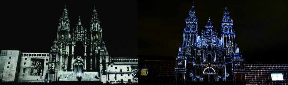
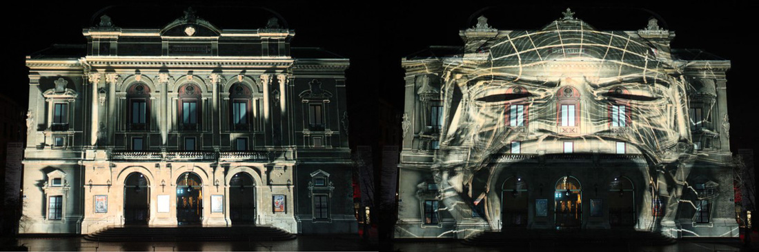
Fuegos del Apóstol, 2011
This projection mapping was done on the facade of the Cathedral of Santiago de Compostela in Spain, celebrating its 800th anniversary, marking the beginning of the celebrations of the Apostle 2011.
The concept behind this projection was to depict the Cathedral’s story, focusing on its relationship with the city and the Camino de Santiago. The aim was to present it as a visual story and not as a history lesson, thus, no voice, text or dates were added. Instead, they used concepts that are linked to symbols, forming a visual continuity. Since the visual story mainly focuses on history, they started from the beginning, thus the projection starts with a wild forest representing pre-Christian and Celtic symbols. A dragon appears, burning the wood, and the cathedral’s facade is covered with fire. Rain puts out the fire and fills up the scene, creating an interesting transition, as the next scene represents the Mediterranean sea. This scene is different from the previous scene in terms of style, since it includes 2D elements, whereas the previous ones had 3D elements. Several different sea creatures and a boat are seen in this scene, symbolising the apostle’s journey. This scene is followed with various effects, mainly focusing on the cathedral’s architecture, having sections of the cathedral being turned mechanically by gears, which symbolize mechanism, development and industrialization. The projecting then includes another transition in which the cathedral melts. A war scene is depicted next, again changing in style, this time having silhouettes of soldiers fighting and red clouds in the background symbolising tragedy and death. The palace is burnt down again and the palace contours are sketched, slowly altering into 3D blocks progressively building the cathedral. The cathedrals slowly opens to take the viewer inside, showing an altar. Incense then swings in front of the cathedral, creating an interesting effect in which the fog blocks the view of the cathedral. Once it clears the cathedral is visible again. The projection then concludes by showing various random colours forming and focusing on the cathedrals architecture giving great detail to its contours.
The projection was well-thought and although it mainly focuses on history, it wasn’t boring to watch since every scene was given great importance as regards to transitions and visuals. Different elements were included working with both 3D and 2D elements as well as different art styles. As regards to style both geometric and organic styles were included creating contrast.
Apart from having an interesting and well-planned projection the project also included a video mapping touch table, where visitors could choose the preferred sequence of the projection and watch it again.
Dimensions: Facade 100feet wide by 70 high
Use: 18 projectors x 22K
Watch here: http://vimeo.com/27358488
http://vimeo.com/29495269
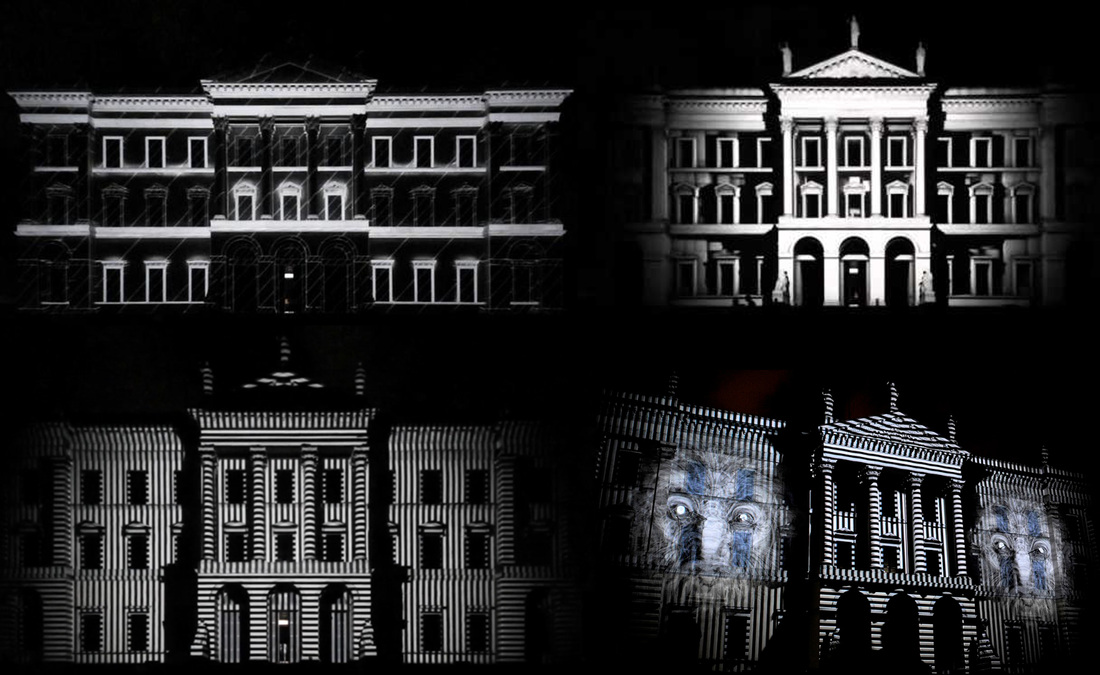
Telenokia Audiovisual Mapping at Kernal Festival, Desio, 2011
This projection mapping focuses on audiovisual mapping and was done in 2011 on the facade of Villa Tittoni Traversi, Desio in Italy, and is 9 minutes long.
The projection was created using 2D video composition software and 3D modelling software. It was projected with a 20K video beamer at 1920x1080.
Unlike other projection mapping projects, this projection focuses on sound and sound waves. The projection is very simple, focusing mainly on black and white elements. Various elements within the projection include white noise effects at different speeds and sizes. The projection also includes horizontal and vertical line elements also at different speeds and sizes. These effects were created in order to emphasize the building’s architecture using its contours and shapes, which include windows, doors and columns.
A different element as regards to the white noise included a variety of stone masks often seen on such architecture.
Special effects and story based visuals are not always necessary to create entertaining and aesthetically pleasing visual projections.
Watch here: http://vimeo.com/26047200
Perspective LyriqueThe interactive architectural mapping was projected on the facade of the Bishop House done by 1024 Architecture.
The projection mainly features various light effects highlighting the architecture’s contours. The building is first lit and then the animation changes, eventually turning into a personal character. In the first part the viewer sees an automated loop, and in the second part the viewer can participate by singing or talking in a microphone bringing the building to life with the sound of his / her voice. This is known as a system of visual distortion which responds to voice commands, thus making the projection more entertaining and effective to the viewers due to its interactivity.
The audience voice could also control the position of the light, creating circular motion around the building and making subtle soft shadows. Even though the projection is not based on a visual story it was still interesting for viewers to see due to its interactivity.
Watch here: http://www.youtube.com/watch?v=gUMkbRprqaw
What is Up? 2010
The following information and detail regarding the projection has been acquired from Vimeo.com:
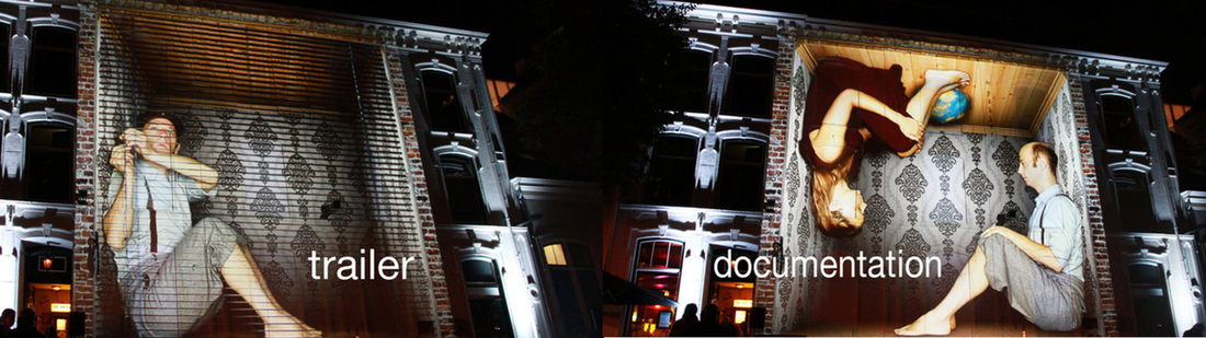
" Apart from being an architectural projection, ‘What is Up?’ is a site specific virtual theatre and documentation and was projected on a typically Dutch dwelling house in the city centre of Enschede, Netherland. It was performed during the International Festival of Arts “Grenswerk” on the 25th of September 2010.
The projection focuses on a house located in a dark street. A young man ambles along the sidewalk and returns home. He enters his own leisure area and sheltered home in order to withdraw from the outer world. In its surrealistic occurrence that space does not refer to any realistic scenario. The projection bypasses any extended borderline framing human intimacy - and gives a deep insight to our protagonist`s soul.
By means of a precise fitting projection the whole house turns into a three-dimensional vast room hosting a human being of huge proportions. The conventional physical laws appear to be repealed and strangely linked to the mental processes of the protagonist. Sudden changes of gravity or mysterious modifications of the walls take place. The house seems to have a life of its own.
The house facade thereby marks the dividing membrane between a private sphere and the public space where the audience is located. The architectural surface is staged as a boundary layer similar to human clothing - the facade acts as an interface to people’s deepest privacy. The projection screens this separating layer and provides an intimate view of the young man`s inner life to the audience.
“WHAT IS UP?” focuses on the question of how someone reacts if nothing is like it used to be. The basic idea was to reflect upon the human constructions of inside and outside. It examines the relation between defined physical boundaries of our living environment and the limits of our distinct “soul space“. Despite being challenged by extraordinary occurrences the main character deals with all unexpected effects in a playful way. He easily comes up with solutions. He dances life and simply says ‘WHAT IS UP?’. "
The projection is mainly done using 3D and green screen filming since the projection features a real man which created and interesting combination. The house architecture was also used mainly by including the windows with the projection.
Watch here: http://vimeo.com/19671005
The following information and detail regarding the projection has been acquired from Vimeo.com:
" Apart from being an architectural projection, ‘What is Up?’ is a site specific virtual theatre and documentation and was projected on a typically Dutch dwelling house in the city centre of Enschede, Netherland. It was performed during the International Festival of Arts “Grenswerk” on the 25th of September 2010.
The projection focuses on a house located in a dark street. A young man ambles along the sidewalk and returns home. He enters his own leisure area and sheltered home in order to withdraw from the outer world. In its surrealistic occurrence that space does not refer to any realistic scenario. The projection bypasses any extended borderline framing human intimacy - and gives a deep insight to our protagonist`s soul.
By means of a precise fitting projection the whole house turns into a three-dimensional vast room hosting a human being of huge proportions. The conventional physical laws appear to be repealed and strangely linked to the mental processes of the protagonist. Sudden changes of gravity or mysterious modifications of the walls take place. The house seems to have a life of its own.
The house facade thereby marks the dividing membrane between a private sphere and the public space where the audience is located. The architectural surface is staged as a boundary layer similar to human clothing - the facade acts as an interface to people’s deepest privacy. The projection screens this separating layer and provides an intimate view of the young man`s inner life to the audience.
“WHAT IS UP?” focuses on the question of how someone reacts if nothing is like it used to be. The basic idea was to reflect upon the human constructions of inside and outside. It examines the relation between defined physical boundaries of our living environment and the limits of our distinct “soul space“. Despite being challenged by extraordinary occurrences the main character deals with all unexpected effects in a playful way. He easily comes up with solutions. He dances life and simply says ‘WHAT IS UP?’. "
The projection is mainly done using 3D and green screen filming since the projection features a real man which created and interesting combination. The house architecture was also used mainly by including the windows with the projection.
Watch here: http://vimeo.com/19671005
Projection Concept
Group: Chiara Attard Portughes, Deinse Axiaq, Luana Galea, Yanika Galea, Fabian Meli
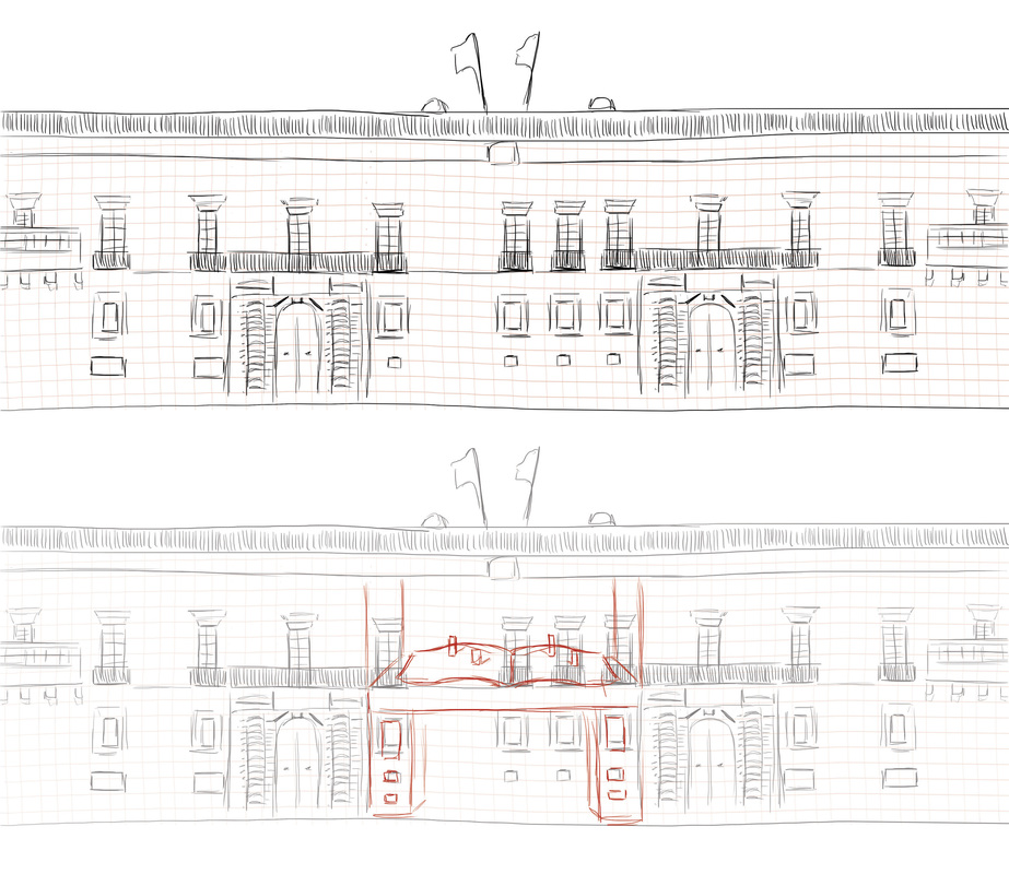
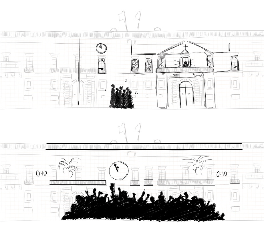
Our concept for the Grand Master’s palace focuses on its history, which will be linked with Christmas and New Year. We decided to start from the beginning, before the palace was built, thus during the great siege. Since our idea mainly focuses on history we decided to incorporate a popup book element, symbolising ‘story telling’.
The projection will start with a closed book which will be projected on one of the facade’s doors. The book will be leaning on a desk which will be formed around the door. Once open the book will be leaned backwards for a better view. The story will start with a map in the book, this is immediately zoomed spreading on the entire facade, here the book is no longer visible however all the elements and style within the projection will replicate the effects of a popup book on the building. The map will show Malta and then Valletta. The next scene will focus on the great siege battle, having knights fight against Turks. This scene will be projected as a silhouette, as a transition we decided to include the windows from which a silhouette figures will appear pouring boiling oil, the oil will fill the area allowing for the next scene to start.
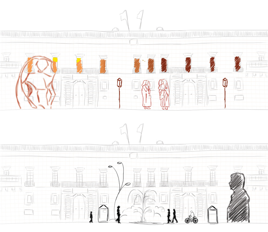
The next scene will mainly focus on the palace which will be built brick by brick. The following scenes will then focus on the slow passage of time from past to present. This will incorporate various figures from past to present as well as tradition items. In the meantime as time is seen passing by we intend to include various elements related to Christmas time, including old tradition slowly changing to recent and new traditions. These will mainly include religious Catholic traditions having the crib and various other church traditions and then showing new traditions, including Father Christmas and other fictional Christmas characters. We also intend to decorate the palace facade with various different decorations (old to new) also showing change through time.
As regards to New Year, we decided to include another silhouette scene in which a crowd will appear celebrating the traditional countdown. A large clock will appear on the facade, with digital numerals on the side of the building for the countdown. As soon as the countdown is ready fireworks will be projected on the facade.
Colour will also have an important role in our projection concept. Since we intend to show changes through time, we decided that the colours between each scene will also change, starting from black and white, slowly adding and changing to full colour.
The projection will start with a closed book which will be projected on one of the facade’s doors. The book will be leaning on a desk which will be formed around the door. Once open the book will be leaned backwards for a better view. The story will start with a map in the book, this is immediately zoomed spreading on the entire facade, here the book is no longer visible however all the elements and style within the projection will replicate the effects of a popup book on the building. The map will show Malta and then Valletta. The next scene will focus on the great siege battle, having knights fight against Turks. This scene will be projected as a silhouette, as a transition we decided to include the windows from which a silhouette figures will appear pouring boiling oil, the oil will fill the area allowing for the next scene to start.
The next scene will mainly focus on the palace which will be built brick by brick. The following scenes will then focus on the slow passage of time from past to present. This will incorporate various figures from past to present as well as tradition items. In the meantime as time is seen passing by we intend to include various elements related to Christmas time, including old tradition slowly changing to recent and new traditions. These will mainly include religious Catholic traditions having the crib and various other church traditions and then showing new traditions, including Father Christmas and other fictional Christmas characters. We also intend to decorate the palace facade with various different decorations (old to new) also showing change through time.
As regards to New Year, we decided to include another silhouette scene in which a crowd will appear celebrating the traditional countdown. A large clock will appear on the facade, with digital numerals on the side of the building for the countdown. As soon as the countdown is ready fireworks will be projected on the facade.
Colour will also have an important role in our projection concept. Since we intend to show changes through time, we decided that the colours between each scene will also change, starting from black and white, slowly adding and changing to full colour.
Sketches done by Denise Axiaq for class presentation.
Sketches depicting visuals of the 'old road' and 'new road' concept, done by Denise Axiaq for class presentation.
Sketches depicting visuals for the Christmas scene and the New Year scene, done by Denise Axiaq for class presentation.
Concept Inspiration
Two commercials done for JP Morgan are our main influence since the videos have a popup book theme and style. The adverts are about a community which unfolds out of a pop-up book. Everything within the ad is textured like paper and even the movement within the animation symbolises the pop-up book’s movement of folds. Apart from building, trees and other objects, even the characters, have the same movements. The whole animation is done in 2D, apart from the scenes in which the book is being viewed and turned from various angles.
Our idea is to have the same elements as regards to movement and style in which everything will be made out of paper and the figures movement.
Watch here: http://vimeo.com/18978783
http://vimeo.com/22041858
Our idea is to have the same elements as regards to movement and style in which everything will be made out of paper and the figures movement.
Watch here: http://vimeo.com/18978783
http://vimeo.com/22041858
Group Presentation
Research and Inspiration
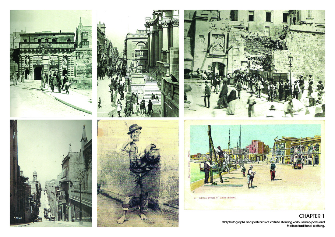
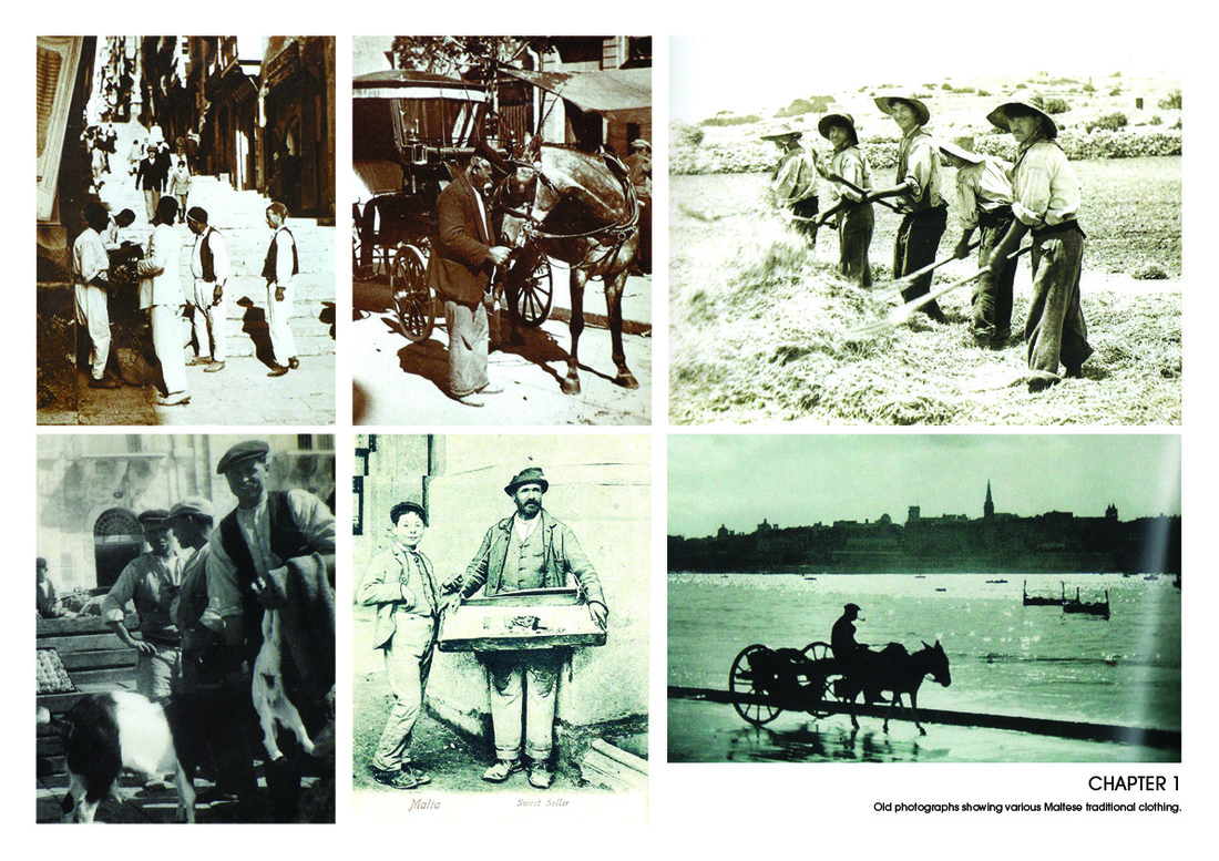
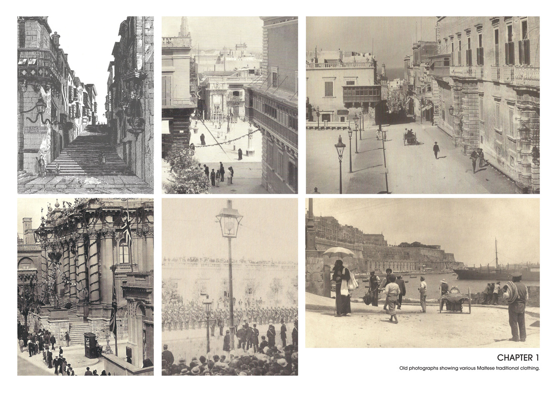
These images were taken from 'Richard Ellis The Photography Collection' , this book contains various old photographs taken by Richard Ellis in Valletta. (All Rights Reserved to Richard Ellis)
Research and Inspirations
These illustrations were done by Jian Guo. The illustrations look like stained glass and all depict a particular scene from Lord of The Rings . These can be used as a source of inspiration for the stained glass scene in our projection.
Scene 1 | Majsi Mood Boards
Silhouette video examples
Since our scene included silhouettes, I researched various different videos online of silhouette animations. I managed to find a few inspirational videos that included both animation and a short movie including actual filming. The video including animations were both in 2D and 3D and included various interesting effects. The video including people was very interesting as both animation and film were used, incorporating two different styles. I also watched the ‘behind the scene’ showing how the silhouette effect was done through filming using a green screen and lighting.
The following links include the inspirational silhouette video examples I found. (I couldn’t upload the videos due to upgrade requirement that only the owner of the site can upgrade, [email protected])
Watch here: http://vimeo.com/40239006
http://vimeo.com/27265677
http://vimeo.com/30014401
http://vimeo.com/40239006
http://vimeo.com/40535184
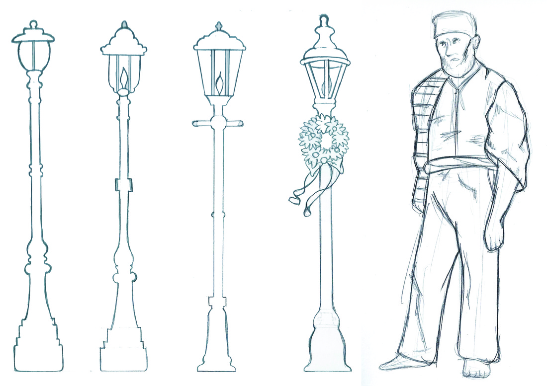
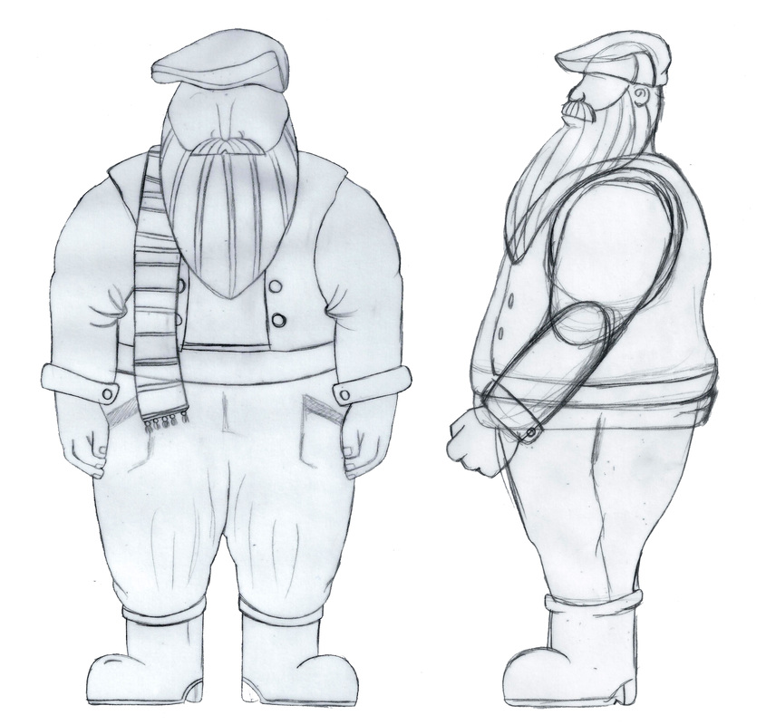
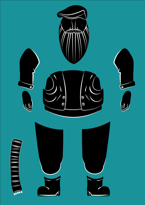
Scene 1 | Sketches & Design Process
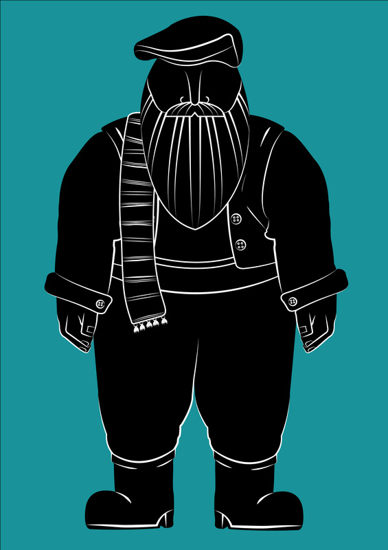
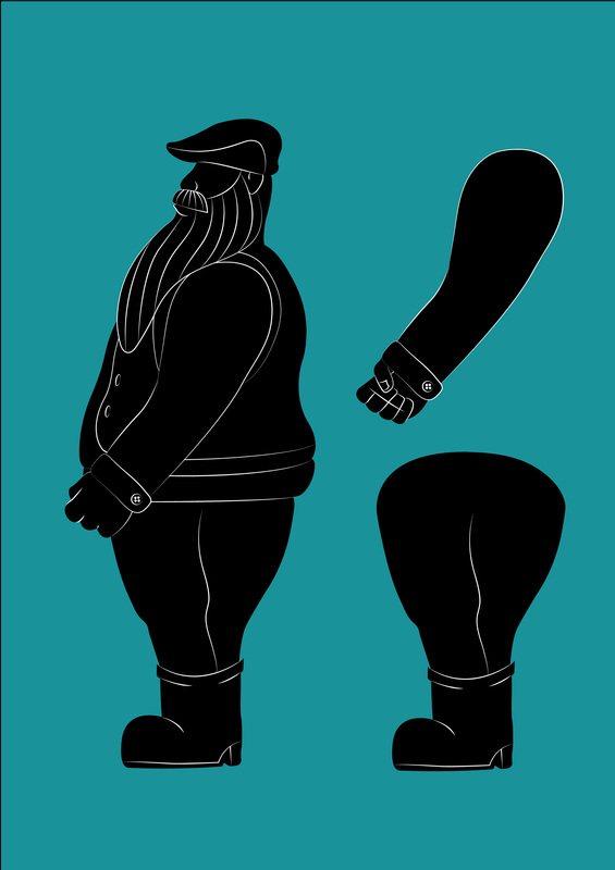
My main job was to create mood boards and concept boards for Majsi, ‘IL- Kebbies tal-Fanali’. My original ideas and thoughts were to make Majsi look like traditional Maltese man, dressed with traditional clothing. However, I was later informed that Majsi had to look like Father Christmas, whose concept art was done by Silvio, following his concept I created a silhouette version of Majsi, positioned from the front and from the side. Following the suggestions the silhouettes are simple with a few white lines to highlight some specific areas and features.
Projection Booklet Ideas & Inspirations
Besides scene 1 I am also in charge of the booklet accompanying the projection. The booklet will consist of various images and information regarding the process of our projection. It will include our script, sketches, concept art, animation development and behind the scenes photography, which consists of images of all the students working on the project.
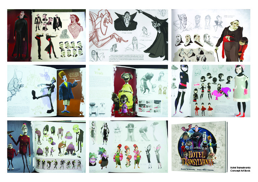
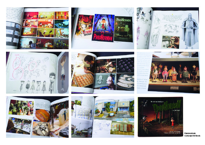
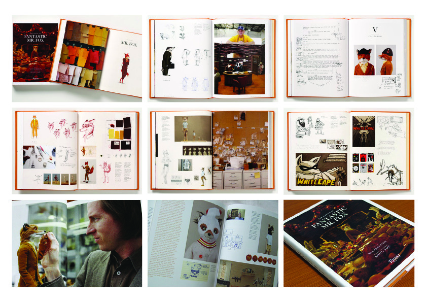
I have created 3 mood boards with examples of concept art books, as our booklet’s content will be similar. The 3 mood boards feature 3 different book/animations; Hotel Transylvania, Paranorman and Fantastic Mr. Fox.
Since the booklet has to be done professionally, most of the sketches are being redone. My idea is to take photos of all the different sketches from different angles of everyone’s sketchbook. I believe that these images would look more artistic than just scanning the sketches. Ideally, every member of the booklet theme will collect these images depending on their group. Since I was in scene 1, I will be redoing most of the sketches and taking these photos.
Projection Editorial : Ideas and Design Process
In the projection editorial we will show all the development and processes taken during the creation of the projection. Thus the book will include brainstorming, the script, initial and final sketches, digital concept art, animation processes, and photos of all the students working, which will be in a separate section entitled ‘behind the scenes’.
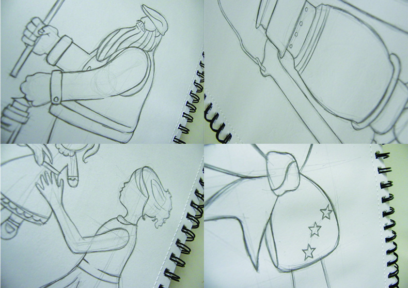
Since we need sketches for the booklet, I was assigned to re-do some sketches from Scene 1, my initial group for the projection. Besides my sketches I sketched out ‘Majsi’ with a lantern, a lantern, a mother and child, and the bow. In my sketches I decided to be faithful and stick to the final designs, as designed by the other students. These sketches were only made for the booklet. Instead of scanning these sketches I thought we could take photographs from different angles, focusing on some sketched details. These shots could make the editorial work look more artistic and less static.
The images bellow depict this idea, however the final photographs for the booklet have to be taken in better quality, as this was just a test.
Projection Editorial
Once again, the group work didn’t work as only two of us insisted in completing the book, Denise Axiaq and myself, there was no communication and inniative even though I created a ‘facebook’group which allowed us to plan and communicate. So we decided to start working on our own, and started by developing some sketches, planning and depicting how each page will be set and divided into categories depending on each section within the projection. The page layouts were built upon a chosen layout and template from ‘Blurb’ as we were instructed to use a specific template and style.
With regards to the booklet, I talked to Mr.Camilleri and he informed me that the booklet can and will be done during progress week, after all the assignments are over. This will hopefully allow each student within the group to participate in the editorial’s development. This will also allow us time to collect the ‘forward’ which will be written by Mr.Vella, Mr.Camilleri, Mr.Frankantonio and Mr.Scicluna.
With regards to the booklet, I talked to Mr.Camilleri and he informed me that the booklet can and will be done during progress week, after all the assignments are over. This will hopefully allow each student within the group to participate in the editorial’s development. This will also allow us time to collect the ‘forward’ which will be written by Mr.Vella, Mr.Camilleri, Mr.Frankantonio and Mr.Scicluna.
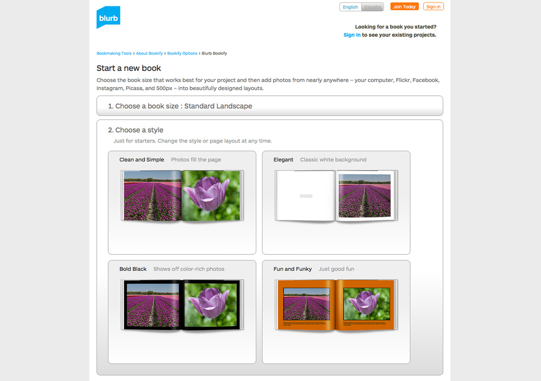
The image above represents the 4 styles we can choose for our projection editorial. Denise and I opted to use the second one titled 'Elegance'.
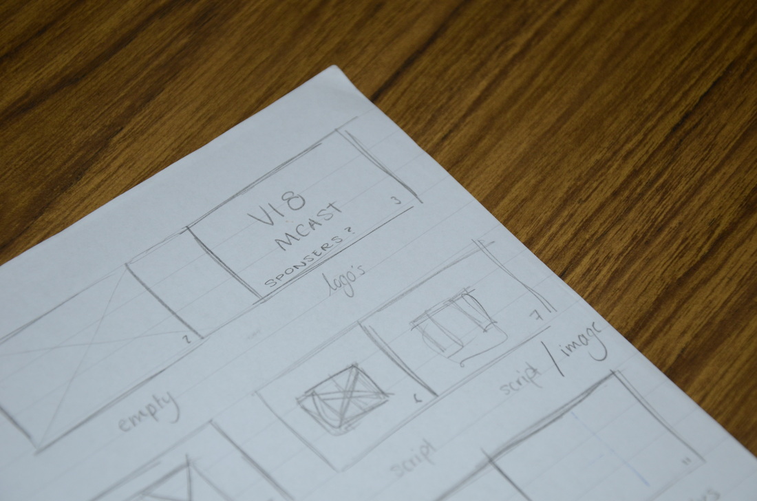
Rough sketch for 'Projection Editorial' page layout.
Task 3: Manifesto
Manifesto Research
Definition: A manifesto is a published verbal documentation of the intentions, motives and views of the issuer, be it an individual, group, political party or government. A manifesto usually accepts a previously published opinion or public consensus and/or promotes a new idea with prescriptive notions for carrying out changes the author believes should be made.
I found various examples of different interesting and innovative manifesto’s include: ‘An incomplete Manifesto for Growth’ by Hanna Viktorsson, which included typographic illustrations, ‘This is not a Manifesto’ by Eugenie de Larivere, ‘Teague Manifesto’ by Turn Style, Folch Studio Manifesto which included an interesting video and a book called ‘The Way of F**k it, small book, big wisdom’ by John C. Parkin and Gaia Pollini.
For our presentation we decided to include two examples each, I decided to choose the following: ‘Teague Manifesto’ and ‘The Way of F**k it, small book, big wisdom’.
Teague is a product design company, whose mantra is ‘Make Wally Proud’ and this refers to the company’s founder, Walter Darwin Teague. The Manifesto was done in the form of a magazine to show employees the current and important principles of the company. Each spread withing the magazine contains a key word and a paragraph explaining the company’s views and values.
‘The way of f**k it, small book, big wisdom’ was written by John C. Parkin and Gaia Pollini. The book offers short inspirational thoughts about life. Each spread within the book includes tips and statements inspiring people to follow their dreams and by happy. The book states that following this way can transform one’s life to be happier. Each statement within the book is accompanied by a minimal illustration.
Manifesto Research
Group Presentation
For our presentation we decided to include two examples each, I decided to choose the following: ‘Teague Manifesto’ and ‘The Way of F**k it, small book, big wisdom’.
Teague is a product design company, whose mantra is ‘Make Wally Proud’ and this refers to the company’s founder, Walter Darwin Teague. The Manifesto was done in the form of a magazine to show employees the current and important principles of the company. Each spread withing the magazine contains a key word and a paragraph explaining the company’s views and values.
‘The way of f**k it, small book, big wisdom’ was written by John C. Parkin and Gaia Pollini. The book offers short inspirational thoughts about life. Each spread within the book includes tips and statements inspiring people to follow their dreams and by happy. The book states that following this way can transform one’s life to be happier. Each statement within the book is accompanied by a minimal illustration.
Design Process
I come up with a few ideas and concepts for the manifesto rules, however these will be revised and changed:
1. Be ethical and never stop learning. (little book of inspiration)
2. Erase it! Less is more. (rubber)
3. 2B’s. Be Brave. Be Bold. (2B Pencil)
4. Sketch: Process is more important than the outcome.(sketchbook)
5. Stay up late. (coffee)
6. Coffee Breaks. (coffee)
7. Make mistakes. (rubber)
8. Think Less. Sketch more. (sketchbook)
9. No Google. (little book of inspiration/library)
We started our manifesto by gathering information and brainstorming ideas for the object that will be placed in out ‘graphic design survival kit’. We wanted to include everyday objects and incorporate a short quote to go with them. Our final chosen objects and quotes are:
Object: Eraser/Rubbber
Rule: Erase It, Less Is More
Object: Pen
Rule: Good Ideas Are Permanent
Object: Dice
Rule: Risk It Don’t Be Afraid To Make Mistakes
Rule: Take Risks, Challenge Yourself
Object: Graphics Pen
Rule: Say Hello To New Brushes
Object: Sharpener
Rule: Sharpen You Designs
Object: Pendrive
Rule: No Excuses Back It Up
Object: Chocolate And Music
Rule: When You Are Stressed, Eat Chocolate And Listen To Happy Song
Object: Coffee Beans
Rule: Work Harder, Stay Up Late
Object: Sketchbook
Rule: Think Less, Sketch More
Object: Pantone Colour Swatches
Rule: Say Yes To Pantone
Object: 2B Pencil
Rule: Be Brave Be Bold
Object: ruler
Rule: Rules Are Made To Be Broken, EVEN Grids
After deciding our rules, which were discussed by everyone, we though it would be best to divide the work, some one working and creating the illustration and ‘survival kit leaflet’ and someone working on the sketch book box and its interiors.
Denise and Jeanette were in charge of the object illustrations, leaflet and manifesto poster, and I was in charge of covering the box and cutting the black foam accordingly depending on the object. We decided to use black foam since it is ecstatically pleasing; the objects were placed onto the foam, marked and cut. This had to be done multiple times, as for my first trial the cut out pieces in which the objects fit were to big. The second time, helped by Denise, we decided to cut smaller slots in order to have a more neat and organized interior with the objects fitting perfectly.
Our leaflet, which will be found within the box/survival kit, will include all the objects as represented in the box. We decided to call our manifesto: ‘Weapons of Mass Creation’ as the objects allocated within the box are all used by the three of us, as graphic, to do our work. And our slogan is: ‘These objects do exactly what they need to, nothing more and nothing less’.
From this module, I personally preferred the last task, as we were given the opportunity to work on any concept and idea we wanted, and if we were allocated more time to this task, I personally believe that my groups work would have been much better, as we were constrained with time, due to the other projects.
