We are halfway with the preparations and everything, but there's still a lot to do. The logos are not finalised yet, and the exhibition space is still in discussion. I am responsible for the exhibition space along with two others, and the main problem we are facing is how are we going to distribute everyone's work evenly without making it look overdone and crammed....
|
These are some logo concepts I sketched which I will present to the rest of the group later on this week. I am working on the mesh concept. The 'mesh' concept came up following an intensive brainstorming session with the rest of the group to come up with a name.
First week in with the new group. Being quite a large group, a lot of time was spent showing and explaining our research to each other. I showed them my three main branding ideas (the cobweb, the jigsaw puzzle and the six-disciplines make up the hexagon) to the rest. The liked the rationale behind the cobweb concept very much, and they were also familiar with the fact that the school covers six different visual art disciplines, hence they agreed that this idea should be incorporated in the branding concept, however it may not necessarily be in the form of a hexagon.
Surprisingly, everyone seemed to agree on the concept straight away. However, we are still not officially decided as we planned, that whoever did not come up with a concept is to come up with one, and those who had some concept ideas, can continue working on their ideas and present them for the next meeting. The following are plan drawings of the exhibition areas that we will be using to showcase. They will be very useful later on in this project. There are all the measurements needed, indication where the doors and windows are, as well as plug outputs.
Studio 4The room is quite a spacious one and does not have as obstructing walls n the middle (unlike the staff's kitchenette). The walls seem to be in good condition and the monitor in the classroom can be used to our advantage. As the room as two doors, they can be used to improve the crowd flow to minimise congestion in the passages. The lighting of the classroom may need to be improved as it is quite dim and there are currently no projectors installed. The window blinds are not very appealing either, therefore a creative way of: either incorporating the blinds of replacing them, needs to be devised. BA (Hons) 3D Design studioThis room is a little smaller than this one, but the layout is very similar to the other room. This room is also equipped with a monitor and plug sockets are evenly distributed around the room.
The lighting also needs replacement as it is quite dim. I tried sketching some exhibition concept ideas. I took photos of the room and sketched over them. some are a bit too sketchy, but some of them make a good feature in the room.
The following are three installations that use string as a medium. Although they look good as a stand alone installation, they can also be an interactive installation. For instance, the first two images of the installation are actually a project and 'the individual and the crowd' by Lateral Office. In a nutshell, the visitors were given a serrated ring, and when they walked into the installation, they were bound to find a clearing somewhere in the middle of it. There, they then grab as much string as they like and tie it with the serrated ring. It's a simple yet interesting project. The third image is that of a decorated staircase. The yarn weaving of the staircase in the picture is purely for decorative purposes, but a similar installation can be made for the school staircase, and it can be used to hang leaflets about the exhibition which the visitors can take home with and it can be also used to hang little feedback notes from the visitors. The forth and fifth images are a huge typographic installation. This can be an installation placed in the school grounds for decorative purposes or it can also be part of a light show. The yarn can create various shadow patterns that would look great on any surface the light hits. 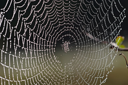 The above concept can also be incorporated into the branding of the exhibition. Say that the mind of the creative person is chosen as a starting point. A creative person's mind is constantly coming up with new ideas and connecting them with what he or she sees.
It is the weaving of a masterpiece, just like a spider weaves its web, which is one of nature's masterpieces. Connecting the verticals with the horizontals that converge at the center. 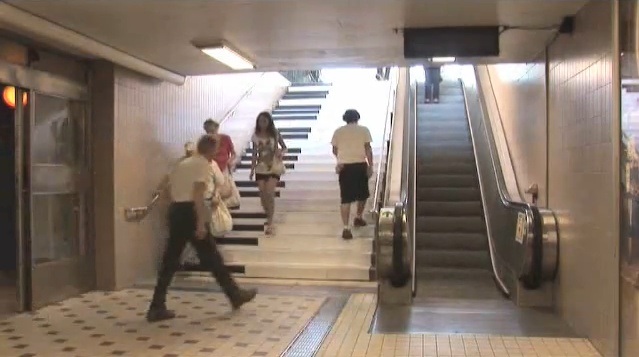
Volkswagen, in collaboration with the Fun Theory, built the Piano Staircase with the aim of encouraging people to use the stairs instead of the escalator. A note was heard every time someone stepped on the stairs, and each step was a different note, just like a real piano.
Interactivity can take many forms, and simplicity is often the most important element to encourage people to interact. Although the purpose of this project is very different from that of the School Exhibition, this same concept can be used as an installation in the school grounds, or as a replacement of the mapping. This concept can also be extended to sound and visual as opposed to just sound. Anamorphic Illusions -- Felice VariniAnamorphic illusions are simple yet very beautiful works of art. Their beauty is in the execution rather than the final product, as they require precision and dedication to properly produce such an illusion. In their simplicity, they still attract the viewers, for the viewer would attempt to understand what tricks the eye, try to find the best vantage point, or even try to defy the illusion. The following are various examples of anamorphic illusions used in various environments. These illusions are painted by Swiss artist Felice Varini, an artist who specialises in large scale anamorphic illusions.
Corridors and asymetric spaces are the best canvases. They can be used as transition artworks from one exhibition area to another rather than having that abrupt change of atmosphere from one room to the other. 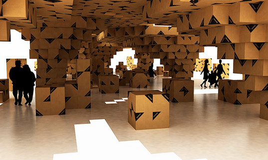 Cardboard is one of the best mediums to work with when one has a budget on exhibition design. As it is lightweight and a flexible material, one can make all sorts of things that are suitable for an exhibition space. Moreover, it is a recyclable material that can be easily acquired and disposed of without harming the environment. My Cardboard City -- Vicky KnyschMy Cardboard City was a project created by Vicky Knysch for the Sofia Design Week 2011. As one can see, everything is made from cardboard, even the most basic features. In addition, My Cardboard City is not just a city were visitors can only walk in its streets... they can be part of it too. The visitors can interact with the item, say there is an apple tree, one can pick the apples from the tree, can drive a car, post a letter and the like. d-torso® at the ICFF 2011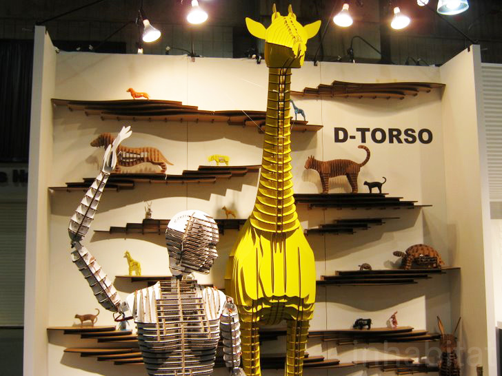 This cardboard giraffe is part of an exhibition at the International Contemporary Furniture Fair (ICFF) in 2011. d-torso® are a series of cardboard craft figures created by the Aki Corporation in Japan. These cardboard figures are cut with precision laser cutters and one piece fit to another without the need of using glue or scissors. There is a similar distinctive feature in various areas of the exhibition that makes the overall exhibition more than just a room with showcased work. It makes the various areas of the exhibition parts of a whole, which is something that makes an exhibition stand out as one large creative work of art. Such a concept can be linked to this year's exhibition branding and applied to our school exhibition spaces. As the work exhibited will be from various disciplines of art and design, there needs to something that connect each area to another. It also makes a great furnishing that can be appreciated after the exhibition is over. Link to d-torso® website: http://d-torsoshop.com/en/ Similarly, simple decorations can be used to accent the uniformity of the exhibition space. Something like this: 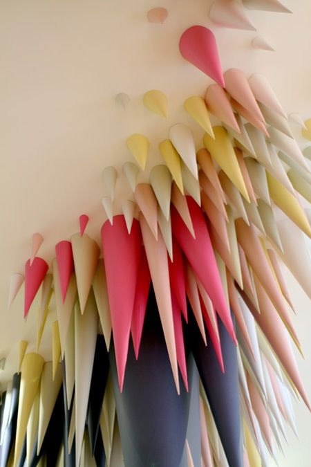 |
 RSS Feed
